Analytics for Ecommerce: A POD Store Owner’s Playbook
You can feel it on Monday morning. The ad account looks busy, Shopify is full of charts, GA4 has another pile of events, and none of it answers the only question that matters: which design should you scale, which one should you kill, and where's the margin going?
For a POD apparel store, analytics for ecommerce isn't about staring at dashboards. It's about making sure every creative test, every product page, and every ad dollar has a clear job. The operators who win don't worship numbers, they use them to move faster with less guessing.
Table of Contents
- Why Every POD Store Owner Lives and Dies by the Numbers
- What Analytics for Ecommerce Actually Means
- The POD KPIs That Actually Move the Needle
- Setting Up Tracking and Your First Dashboard
- Reading the Numbers Without Fooling Yourself
- Profitability Analytics and the Post-iOS Reality
- Your Weekly Analytics Routine and the Road Ahead
Why Every POD Store Owner Lives and Dies by the Numbers
The classic POD morning looks like this. You've got three designs that got clicks, one that got a few carts, and a Shopify dashboard that says revenue moved, but not whether that movement was good, bad, or just noisy. That's where most beginners get stuck, because raw data feels active while still being useless.

The value of analytics for ecommerce is that it turns chaos into direction. A market roundup puts the ecommerce analytics market at $22.4 billion in 2025 and projects $58.1 billion by 2033, a 12.6% CAGR source. That growth makes sense when you look at checkout behavior, because the same roundup says the average cart abandonment rate is 70.19%, meaning nearly 7 in 10 carts never finish, and it estimates more than $4.6 trillion in abandoned merchandise annually source. If you're running paid traffic into POD offers, even tiny improvements in the funnel matter.
Guessing gets expensive fast
A dead design still eats testing budget. A weak landing page still leaks traffic. A misleadingly “good” ad can still hide margin loss if you're only watching surface-level revenue.
Practical rule: if a number doesn't tell you what to do next, it's decoration, not analytics.
That's why serious operators treat data like a seatbelt, a steering wheel, and a rearview mirror at the same time. You need to know where traffic came from, what happened on the page, and whether the order was worth the cost of getting it. In a POD business, the goal isn't to track everything. It's to stop wasting time on the wrong things.
The upside is bigger than most beginners expect. Analytics doesn't just catch problems, it finds repeatable winners, and repeatable winners are what compound into real scale. That's why the market keeps expanding, because every store owner eventually learns the same lesson, the fastest path to growth is usually the clearest path to measurement.
What Analytics for Ecommerce Actually Means
Think of ecommerce analytics like a fitness tracker for your store. Traffic is your heart rate, it tells you how much activity you're getting. Conversion rate is workout intensity, it tells you how hard that activity is pushing toward sales. AOV is stride length, and CLV is the long-term condition of the business, not just today's pace.
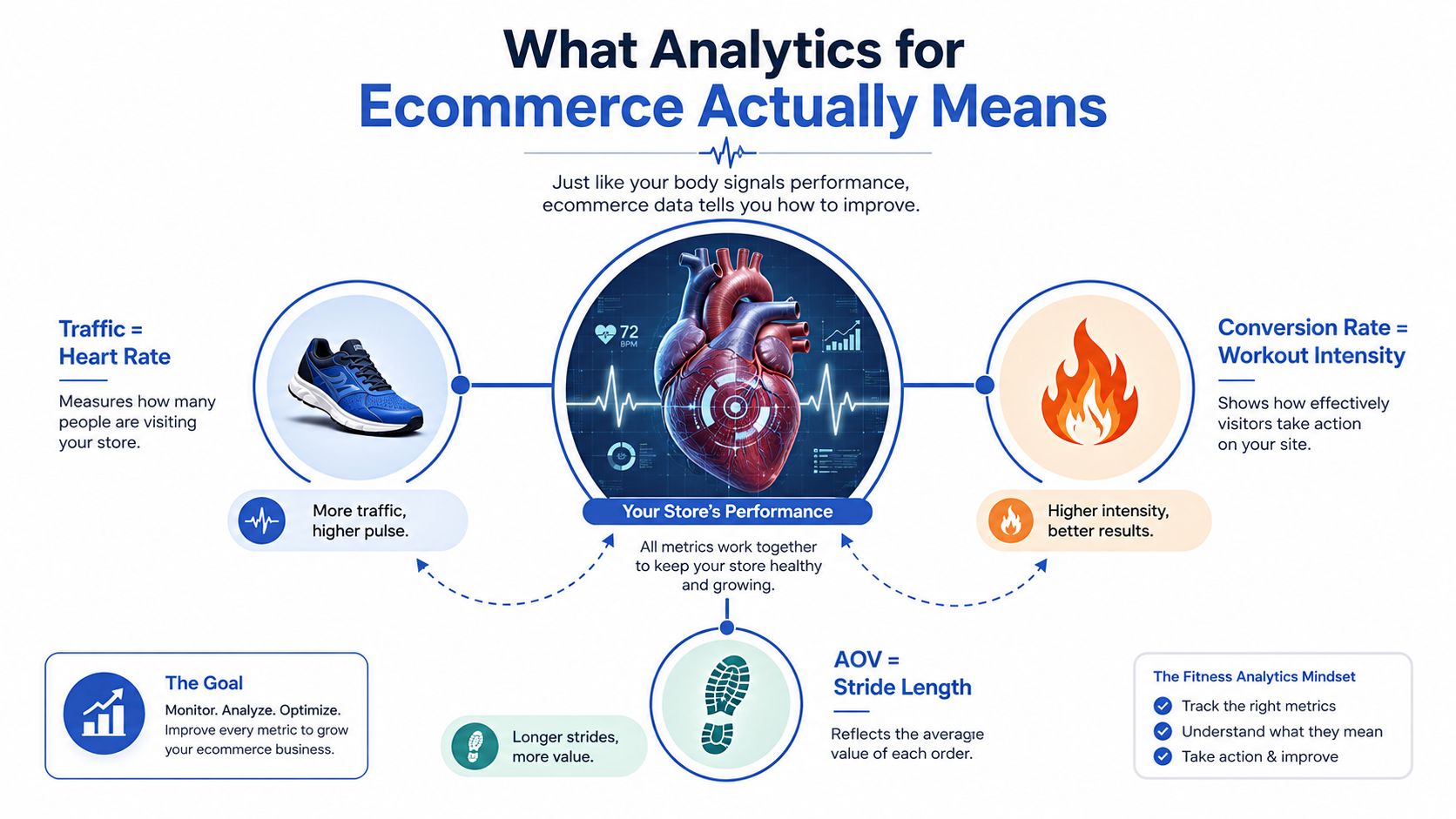
That's the simplest way to understand the category. Ecommerce analytics collects and interprets signals from your store and marketing channels so you can see what happened, why it happened, and what to do next. A general ecommerce guide from Improvado describes it as the system that connects marketing spend to revenue, and notes that priorities shift by stage, from launch to growth to scale source. That stage-based shift matters because a POD store with three winning shirts doesn't need the same dashboard as a multi-country brand with several audiences and ad sets.
The three layers that matter
Descriptive analytics answers what happened. If your shirt launched and got traffic but no carts, the descriptive layer shows the drop. In Shopify or GA4, that's the first clue that the offer, the creative, or the page is off.
Diagnostic analytics answers why it happened. Maybe the traffic came from one audience that clicked out of curiosity, not buying intent. Maybe one design style got attention while another underperformed. In POD, that's where you start comparing product page engagement, add-to-cart behavior, and checkout completion instead of celebrating visits.
Prescriptive analytics answers what to do next. If one design attracts the right traffic and another doesn't, you shift budget, change creative, or cut the loser. The dashboard becomes an operator's tool instead of a scoreboard.
For a broader lens on measurement frameworks, a useful contrast is local service business marketing metrics. The context is different, but the logic is similar, measure the path to revenue, not just the noise around it.
A lot of beginners assume analytics is just reporting. It isn't. It's decision support. The best tools don't merely show numbers, they help you decide which designs deserve another test, which traffic source deserves more spend, and which part of the funnel needs fixing first.
The POD KPIs That Actually Move the Needle
The biggest mistake POD operators make is tracking every metric they can find. That feels productive until the dashboard gets so crowded that nothing stands out. The smarter move is to rank metrics by business stage, because the right question changes as the store grows.
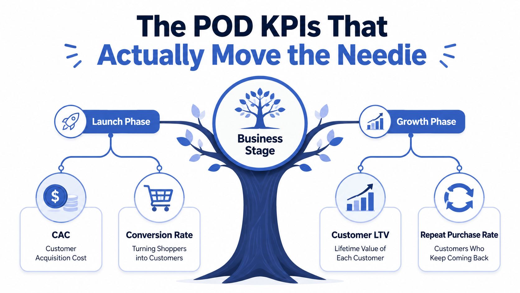
Launch phase
At launch, focus on CAC, conversion rate, AOV, and repeat purchase rate. Those four tell you whether people are responding to the offer and whether the economics make sense. If you're testing a single-garment shirt at $38 AOV, that means something very different from a bundle-heavy store at the same AOV. The bundle store may be buying margin with volume, while the single-item store needs cleaner acquisition and stronger conversion.
Growth phase
Once the store has consistent traffic, add CLV by cohort, channel ROAS, and cart abandonment by stage. Design-level ROAS matters more than listing-level ROAS here, because POD testing lives and dies on creative. A shirt can underperform as a broad listing but win hard inside one audience or angle, so the signal is often at the design and cohort level, not the storefront level.
Scale phase
At scale, the dashboard should lean into gross margin by segment, churn prediction, and product affinity. That's where you protect profit instead of just chasing top-line sales. A fashion benchmark source notes that stores in the $50M-$100M range often benchmark around 32% retention and about $480 customer lifetime value, and it recommends reading metric conflicts diagnostically, such as when conversion rises but revenue falls because lower-value SKUs are taking a bigger share source. The lesson for POD is simple, a single good-looking metric can hide a bad mix shift.
If you want a deeper profit lens, keep contribution margin calculation in your toolkit and always compare order economics against channel performance.
Operator takeaway: choose metrics that change a decision, not metrics that just make the dashboard look complete.
A second useful filter is stage priority. Start with acquisition efficiency and conversion. Add retention and cohort behavior after you know the store can sell predictably. Then graduate to margin and product mix once the catalog has enough signal. That sequence keeps you from overbuilding reports before you've earned the data.
Setting Up Tracking and Your First Dashboard
Start with the lean stack. For POD, the basic setup should include the Meta Pixel and Conversions API for ad-side attribution, Google Analytics 4 for behavior, Shopify Analytics for store data, and a simple Looker Studio dashboard or spreadsheet that ties it together. If you've ever tried to scale with fragmented reporting, you already know why this matters.
The event names matter more than beginners think. ViewContent should mean a product page view. AddToCart should mean the shopper added the item. Purchase should mean a completed order, not a checkout start, not a payment attempt, and not a duplicate event from a bad setup. If those names are messy, your reporting gets muddy fast.
Build a clean event taxonomy
Use one naming convention and stick to it everywhere. That means the ad platform, GA4, and Shopify should all describe the same customer action the same way. The goal isn't sophistication, it's consistency.
A practical setup looks like this.
- Meta Pixel and CAPI: capture ad interactions and recover visibility when browser tracking gets weaker.
- GA4: watch sessions, engagement, funnel drop-off, and page behavior.
- Shopify Analytics: check orders, revenue, AOV, and customer behavior in the store itself.
- Looker Studio or a spreadsheet: pull traffic, conversion, and profit into one weekly view.
The dashboard layout should be simple enough to read in under five minutes. Put traffic on the left, conversion in the middle, and profit on the right. Then add a row for the best design, the worst design, and the highest-spend channel. If a chart doesn't help you decide whether to scale, pause, or test again, it doesn't belong on the first dashboard.
Keep setup honest
The fastest way to ruin your reporting is to let duplicate events, inconsistent UTMs, or missing purchase values slide for weeks. Fix the event plumbing early, then verify against Shopify before you trust the numbers. That discipline saves you from making decisions off broken data.
For ad-side implementation, this Facebook Pixel setup guide for print on demand is a solid reference point when you're wiring the stack.
Once the stack is live, the Monday routine gets easier. You're not hunting through tools anymore, you're reading one system that tells you what sold, what stalled, and what deserves another test.
Reading the Numbers Without Fooling Yourself
Good dashboards still mislead people when the reader treats every metric as a standalone truth. Skill is comparing numbers against each other. That's where POD operators separate signal from noise.
A rising conversion rate can still be a bad week. If revenue falls while conversion improves, the store may be shifting into lower-value designs or smaller basket sizes. In other words, more buyers can still mean less money if the mix changes.
When metrics disagree
A high ROAS campaign can also be a trap. It may look profitable until shipping, refunds, payment fees, and discounts are included. Then the campaign that looked like a winner on the ad platform turns into a weak or negative order after the full economics are counted.
A strong repeat purchase rate can hide a weak front end. If your existing customers keep coming back but new buyer conversion is soft, the brand may be doing a decent job retaining fans while the checkout flow leaks fresh demand. The two can coexist, and they often do.
Metric conflict checklist
- Conversion up, revenue down: check AOV and SKU mix first.
- ROAS up, profit down: pull in shipping, refunds, fees, and discounts.
- Repeat rate strong, new customer flow weak: inspect checkout, offer clarity, and traffic quality.
- Traffic up, orders flat: compare landing page relevance and add-to-cart rate.
- Carts rising, purchases flat: isolate the checkout step where drop-off starts.
The checklist saves time because it forces diagnosis before reaction. Too many store owners either celebrate a good-looking number or panic over a bad one without asking what changed around it. That's how people end up scaling the wrong design or killing the right one.
Use the dashboard like a conversation between metrics. Revenue asks whether the store is growing. AOV asks how much each order is worth. Conversion asks whether the page is convincing. Margin asks whether the business is healthy. When those numbers line up, you've probably found a real lever.
Profitability Analytics and the Post-iOS Reality
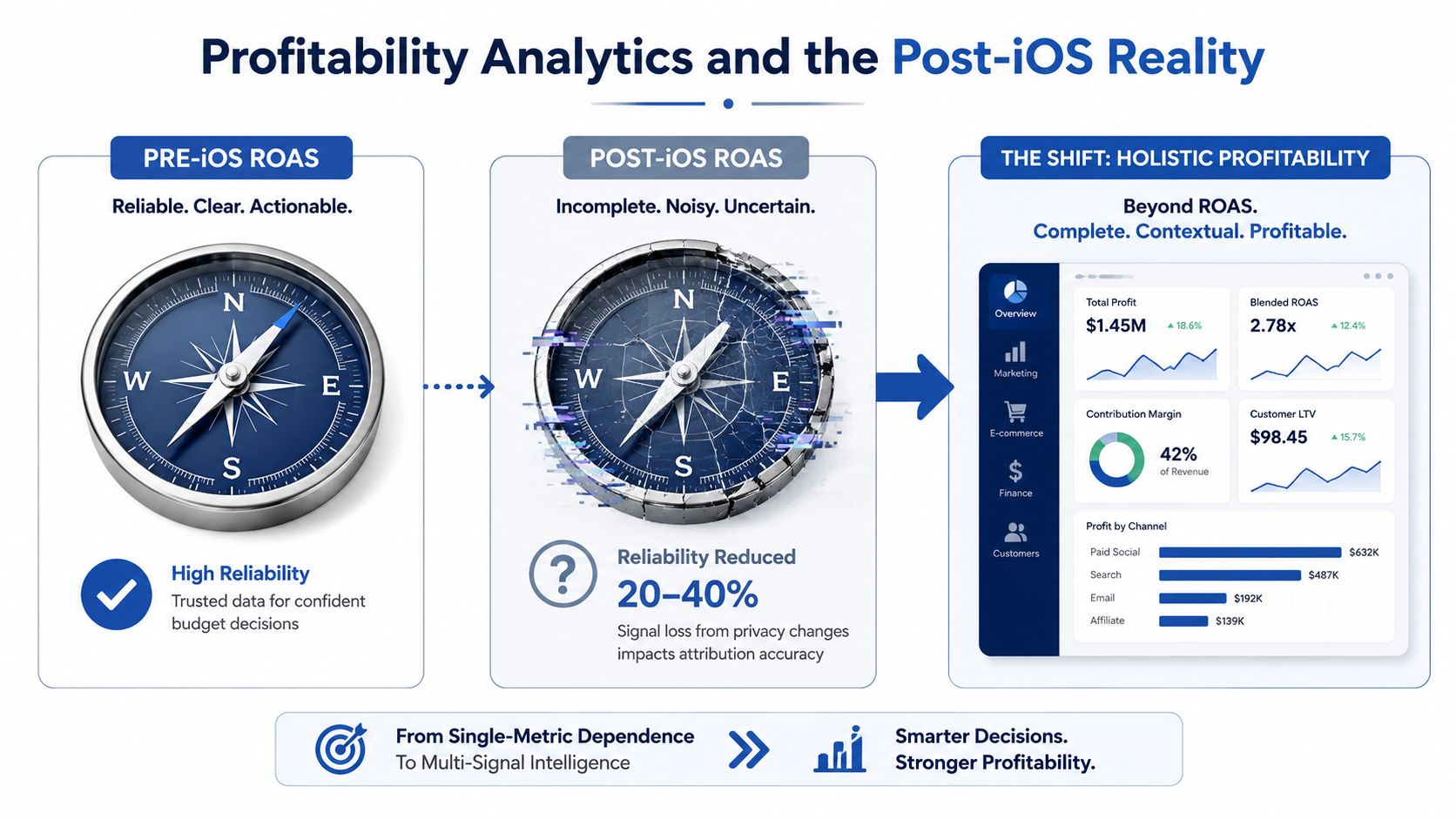
ROAS still matters, but it's no longer the whole story. The privacy shift after iOS 14.5+ reduced the reliability of marketing-only dashboards by an estimated 20-40%, and that's exactly why contribution margin became a key tool for operators who care about profit source. When attribution gets foggier, the stores that connect commerce data with accounting data get a much clearer picture than the stores staring at ad dashboards alone.
What belongs in contribution margin
A real contribution view should include product cost, printing, shipping, payment fees, refunds, discounts, and ad spend. Leave any one of those out and you'll overstate performance. That's especially dangerous in POD, where a shirt can look efficient on ads but still lose money after the full order stack is applied.
The bigger problem is that too few smaller brands are doing this work. One 2026 analysis says only 23% of sub-€5M brands calculate true contribution margin by channel source. That gap is a competitive edge for anyone willing to do the boring math early.
Why the old ROAS habit breaks
A campaign can post a healthy-looking return and still be weak after costs. If the order mix is heavy on discounts, if refunds are high, or if shipping eats the margin, the campaign is not strong. The point isn't to abandon ROAS. The point is to place it inside a broader profit system.
If you want a practical benchmark for break-even thinking, use how to calculate break-even ROAS for print on demand. That kind of check keeps you from falling in love with a campaign that can't carry itself.
Simple truth: revenue pays for scale, but margin pays for survival.
For POD owners, that's the shift after iOS. The brand that knows its true contribution margin can bid more confidently, cut losers sooner, and scale winners without pretending every sale is equally valuable. That makes the whole business calmer and a lot more profitable.
Your Weekly Analytics Routine and the Road Ahead
Keep Monday simple. Open the dashboard, review last week against the launch, growth, or scale KPI set, flag one winning design and one underperformer, check contribution margin by channel, and decide on one test for the week. That's enough to keep momentum without turning yourself into a full-time analyst.
The future of ecommerce analytics looks more useful, not more intimidating. AI-assisted anomaly detection will surface weird behavior faster. Predictive LTV modeling will help you know which buyers deserve more budget. Automated creative-level attribution will make POD testing even sharper, especially for stores that live on rapid design iteration.
What matters most is the habit. The operators who build a weekly analytics rhythm now are the ones who'll be ready when the tools get smarter, the ad environment gets noisier, and the competition gets sharper. In POD, data doesn't kill creativity, it protects it.
If you want to build a POD business that makes decisions faster and wastes less, Skup is built for that exact job. Visit Skup to see how our training, coaching, and tools help store owners turn numbers into profitable next steps, especially when the dashboard starts getting busy.