8 Shirt Design Tips for Better POD Apparel
The most effective POD shirts usually aren't the most complicated ones. They're the shirts that connect a clear audience insight with a message people can understand quickly, recognize in a search thumbnail, and feel comfortable wearing in public. That principle has deep roots. Screen printing began in China's Song Dynasty era, was patented in modern form by Samuel Simon in England in 1907, and became broadly adopted for garments during the 1960s and 1970s, when production favored bold shapes, high contrast, and limited color separations (Printavo's screen-printing history).
That same production logic still matters in digital-first POD. The best workflow is practical: understand a niche, study proven patterns ethically, build a readable composition, adapt it across colors and placements, create realistic mockups, collect customer feedback, and improve the next version. You don't need perfect instincts at the beginning. You need a repeatable process that turns each design into a useful learning opportunity.
These shirt design tips will help you move from vague ideas to focused concepts that can compete in real product listings. You can also explore how apparel can help express your game with Tattoo Golf, where a shirt becomes part of a broader identity rather than an isolated product.
Table of Contents
- 1. Master Niche-Specific Design Language
- 2. Use Proven Design Patterns and Adapt Trending Elements
- 3. Use Strategic Text Placement and Readability
- 4. Balance Complexity With Visual Impact
- 5. Create Emotional Connections Through Design Storytelling
- 6. Optimize Design for Multiple Shirt Colors and Placements
- 7. Test Design Variations Systematically Before Full Launch
- 8. Collaborate With Your Customer Base to Inform Design Decisions
- 8-Point Shirt Design Tips Comparison
- Turn Better Concepts Into Your Next POD Launch
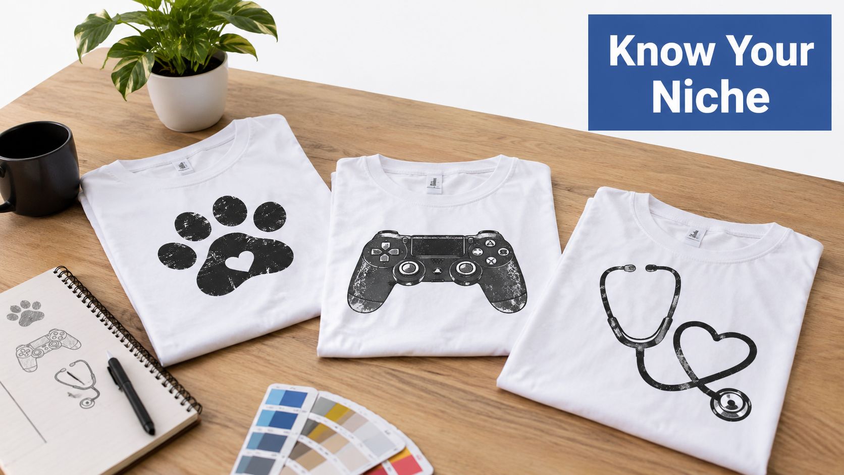
1. Master Niche-Specific Design Language
A niche isn't just a product category. It's a shared vocabulary, set of references, sense of humor, and collection of experiences that make one audience feel understood. A generic “dog lover” graphic may be pleasant, but a design built around the habits, frustrations, and inside jokes of a specific breed community can feel personal.
Start by spending time where the audience already talks. Look through Facebook groups, subreddits, Discord servers, and forums. Pay attention to repeated phrases, common complaints, identity markers, and the moments members celebrate. A network engineer might respond to precise IT terminology and inside humor. Bourbon enthusiasts may connect with vintage visual cues and authentic whiskey culture references. Single parents may recognize messaging built around balancing work, family, and exhaustion.
Build a niche language file
Keep a working document with categories such as:
- Common phrases: Record language people use naturally, not wording invented by an outsider.
- Emotional triggers: Note what creates pride, laughter, belonging, or recognition.
- Visual references: Track symbols, objects, colors, and styles that appear repeatedly.
- Avoidance list: Remove clichés, sensitive topics, and phrases that feel forced or inaccurate.
Study existing products for patterns, but don't copy protected artwork, logos, slogans, or distinctive brand identities. Ethical adaptation means learning why a composition resonates, then creating a different message and visual treatment. The graphic tee design guide from Skup can help you think through the relationship between audience, concept, and wearable execution.
Once you understand the language, use AvatarIQ to generate several concept directions and mockups quickly. The software is most useful after the audience insight is clear. It can help you explore different illustrations, layouts, and visual moods without replacing the research that makes a design feel authentic.
2. Use Proven Design Patterns and Adapt Trending Elements
Originality starts with a repeatable process, not a blank canvas. Study products that attract attention, identify the structure behind them, and build a different version for a defined audience. Useful patterns include centered graphics, vintage textures, humor paired with a specific callout, and clear three-line text arrangements. The goal is to understand why a composition works without reproducing another seller's artwork, slogan, logo, or distinctive identity.
Create a swipe file organized by pattern type. Save examples of layouts, message structures, illustration styles, and color treatments that recur in your niche. For each example, record what it communicates quickly, what mood the typography creates, and whether the composition stays visible in a small product image. Then turn those observations into several original directions.
Use trends without letting them control the product
Trends can add current energy, but they also become dated quickly. Keep the audience, core message, and readable structure stable while testing a current texture, palette, font mood, or humor style. A timeless foundation gives the design a longer selling window, while a limited trend element makes testing more focused.
Review your swipe file each week alongside bestsellers and niche conversations. Note which visual choices are changing and which continue to signal identity. Build 3 to 5 pattern directions before producing a larger collection, then compare variations instead of committing the entire launch to one experimental concept.
Practical rule: Borrow the framework, not the expression. Change the wording, illustration, composition details, and visual identity so the result stands on its own.
AvatarIQ can accelerate this workflow by generating mockups and multiple interpretations of a proven structure. Use it for speed, then apply manual judgment to check originality, readability, print practicality, and audience fit. A familiar pattern still needs a clear reason to exist. Reviewing nature graphic tees for trailside conversations can also show how wearable identity turns a simple graphic into a conversation starter.
3. Use Strategic Text Placement and Readability
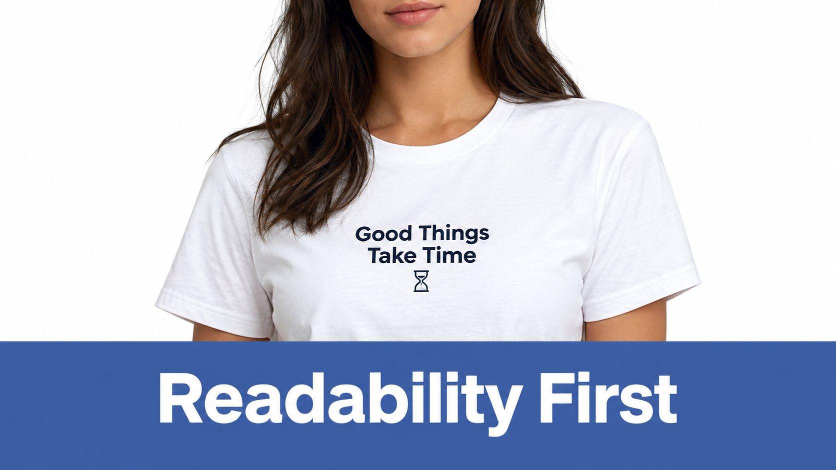
A shirt's wording must work before the artwork gets attention. If shoppers cannot understand the main phrase in a thumbnail or from a few steps away, the design loses selling power.
Choose one short primary message, ideally 5 words or fewer when the idea permits. Give it the strongest size, weight, and position. A dog shirt might place the breed name at chest level, with a smaller supporting phrase below. For a professional audience, put the job title on the front and keep a quieter tagline on the back.
Contrast determines whether that message survives different viewing conditions. Accessibility guidance recommends a minimum 4.5:1 contrast ratio for normal text, so check the lettering against the actual garment color, not only a bright design canvas (apparel readability guidance). Review the artwork in color, grayscale, at arm's length, from 3 feet, and at thumbnail size. Thin strokes, cramped spacing, and muted colors can fail in one view even when they look fine in another.
Build a readable type hierarchy
Set 3 to 4 levels of importance:
- Primary message: The phrase shoppers should read first.
- Secondary message: Context that adds meaning.
- Tertiary detail: Small elements that reward closer inspection.
- Background structure: Texture or framing that supports the message.
Adjust leading and letter spacing until the type has room to breathe. Compare centered and off-center layouts, especially when folds or the model's pose may cover part of the print. Placement guides commonly put center-chest and full-front artwork about 2.5 to 3 inches below the collar. Left-chest logos are often around 3 to 4 inches wide and positioned down and inward from the shoulder seam (Printful's placement guide).
Use AvatarIQ to generate several on-body views before finalizing the file. A flat composition can seem balanced while worn text curves across the torso or vanishes into a fold. Check those mockups at thumbnail size, then create a few placement or wording variations for customer validation.
4. Balance Complexity With Visual Impact
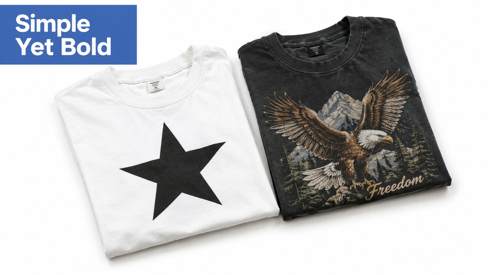
A shirt can fail in two opposite ways. If it's too simple, it may look interchangeable with thousands of other listings. If it's too complex, buyers may not understand the idea quickly, and the artwork may become difficult to adapt across colors, placements, and production methods.
Begin with a one-sentence concept. If you can't explain what the design communicates in one sentence, the artwork may still be searching for its focus. Choose one dominant element, then use supporting details to create depth without creating competing focal points.
A detailed illustration can work when it has generous negative space and a clear visual center. A vintage design can use distressing and color variation without turning every area into texture. A professional niche may respond better to a restrained emblem that feels legitimate than to an overloaded collage of symbols.
Check the design at working size
Create a version at 2 inches wide and inspect it. The goal isn't necessarily for every tiny detail to remain visible. The core concept, silhouette, and main lettering should still make sense. If they disappear, simplify the structure or strengthen the contrast.
Keep the working palette within 3 to 5 colors when possible. More colors can be appropriate for digital printing, but every added color introduces another decision involving contrast, garment compatibility, and visual hierarchy. Digital printing is expanding faster than traditional screen printing, which makes clean edges and production-aware artwork increasingly useful for creators building digital-first POD listings (Printful's industry statistics).
Test the design on light and dark shirts. Add an outline where it improves separation, not as a reflex. With AvatarIQ, generate alternate mockups and compare how the focal point behaves at listing size. The best version often isn't the most detailed one. It's the version that keeps its identity when the buyer sees it quickly.
5. Create Emotional Connections Through Design Storytelling
A shirt earns attention when the wearer recognizes their own identity, experience, or humor in it. Pride, belonging, inspiration, and shared struggles can turn a basic garment into a public statement.
Start with the customer's feeling, not the artwork. Decide what they should feel when putting on the shirt, what another person might ask about it, and why displaying it feels natural. A nursing design could acknowledge the hidden difficulty of the job. A parent design could turn a familiar struggle into shared humor. A hobby design could signal membership in a community that outsiders may not understand.
Find the story in customer language
Use interviews, reviews, comments, and community conversations to identify the details people already use:
- Pride: What part of this identity do people defend or celebrate?
- Humor: Which recurring experience makes members laugh because they have lived it?
- Belonging: Which words or symbols show that someone is part of the group?
- Representation: Which experiences do outsiders commonly misunderstand?
Specific references create stronger emotional designs. “Be positive” is broad and easy to forget. A phrase connected to a real challenge, ritual, or community reference gives the buyer a clearer reason to care. Humor should sound like the niche itself, rather than a marketer imitating it.
Turn one emotional insight into several controlled design directions. Test a phrase-led version, a symbol-led version, and a design that combines both. Keep the message readable and printable, then use realistic AvatarIQ mockups to see whether the idea still feels authentic on a person, not only on an artboard.
Show the concepts to people who belong to the audience before launch. Their reactions can expose wording that feels proud, funny, accurate, or awkward. Ask what they think the shirt means, who they believe would wear it, and whether they would display it publicly. Those answers help separate a genuine community signal from a design that merely describes the niche.
The best shirt designs don't just describe a community. They let someone announce that they belong to it.
Let one clear message carry the emotional weight. Put extra context in the product description and imagery, then carry the strongest variation into your POD workflow for customer validation and launch.
6. Optimize Design for Multiple Shirt Colors and Placements
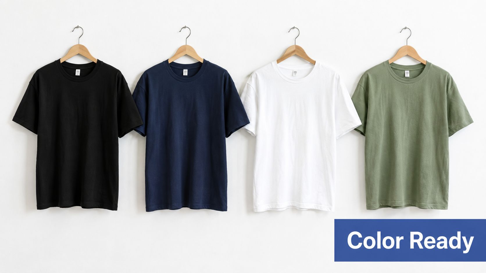
A graphic that looks excellent on navy can lose its edge on black. A light design may disappear on white, while a colored outline that works on one garment can muddy the same artwork on another. Professional POD design starts by treating color and placement as part of the concept, not as decisions made after the file is finished.
Build mockups on 4 to 5 foundational shirt colors, including black, navy, white, gray, and one color that fits the niche. Compare the visibility of the primary message first. Then inspect the illustration, outlines, small details, and negative space. If the graphic needs a completely different treatment for every garment, consider creating a light-shirt version and a dark-shirt version rather than forcing one file to do everything.
Separate location from placement
The print area is the total available zone. The print location is the general garment region, such as front, back, or sleeve. Placement is the precise position inside that region (Printify's placement terminology). Keeping those distinctions clear prevents designs from drifting too close to seams, collars, or underarms.
Back graphics are commonly positioned about 2.5 to 4 inches below the neckline in standard layouts, while sleeve graphics are often centered with about 1 inch of seam clearance (screen-print placement guidance). Use these as starting points, then inspect the artwork on the actual garment and body shape.
The Skup t-shirt graphic size guide is useful when preparing artwork at its final size and checking whether it remains readable across shirt sizes. AvatarIQ can then generate alternate colors and placements quickly, so you can judge the full product family instead of approving one hero mockup.
Document which colors and locations receive the strongest response. That record becomes useful design intelligence for the next niche collection.
7. Test Design Variations Systematically Before Full Launch
Personal taste can start a concept, but customer behavior should guide the launch decision. A design that feels obvious to its creator may attract little attention, while a quieter version can perform better because the message reads faster.
Set up each test around one meaningful change. Keep the illustration fixed while changing the wording, compare centered with left-aligned composition, or adjust the palette from light to dark. You can also test different creative directions for the same niche, such as humorous, inspirational, and factual treatments. The point is to learn which pattern communicates best, not to prove that one personal preference is correct.
Record the experiment before publishing:
- Change: Describe the exact difference between versions.
- Assumption: State what the change should improve.
- Response: Track clicks, sales, add-to-cart activity, and reviews where available.
- Learning: Explain why one version may have gained or lost attention.
Create several variations together when practical, while keeping the comparison fair. Use realistic AvatarIQ mockups because customers judge the listing presentation, not an isolated artwork file. The split-testing explanation from Skup can help you structure cleaner comparisons. Give each version enough traffic and observation time to produce a useful signal, then avoid changing several factors before that signal appears.
Testing is a risk-control step, not a reason to delay the launch. Once one version shows clearer customer interest, refine that design, expand its strongest options, and apply the same workflow to the next concept. Keep the record, because each result improves future niche decisions.
Testing principle: Change fewer variables, record the reason, and let customer behavior challenge your assumptions.
8. Collaborate With Your Customer Base to Inform Design Decisions
Customer feedback can improve a shirt concept before it becomes inventory. People active in a niche know which phrases sound natural, which experiences deserve recognition, and which visual references already feel dated. Their input gives you practical evidence for choosing a concept, while participation can strengthen trust in the brand.
Meet customers where they already gather. Share two or three clearly different mockup options in the relevant community, then ask one focused question: which design feels most accurate, or which phrase would they actually wear? Specific choices produce more useful responses than a general request for opinions. Respect community rules, and do not ask members to leave their existing space for your survey.
Use the responses to guide decisions, not to outsource them. A simple feedback record can capture:
- Concept preference: Which direction received stronger support?
- Language check: Did the phrase sound natural, forced, or incomplete?
- Customer stories: Which experiences could shape later designs?
- Revision reason: What changed because of the feedback?
- Business judgment: What concerns remain after the poll?
Google Forms and social polls make responses easier to collect consistently. If a community member contributes a phrase or story, ask permission before naming or crediting them. Transparent recognition can strengthen the relationship without implying that one response guarantees a product launch.
Show participants realistic AvatarIQ mockups rather than raw artwork. A centered print may look balanced on a canvas but crowded on a body. A restrained back print may appear premium in a flat preview yet disappear in a listing thumbnail. Context helps customers identify presentation problems before production.
Customer input still needs a filter. Check readability, print compatibility, audience size, and whether the listing communicates the product's value. When feedback conflicts, prioritize evidence from the buyers you intend to reach, then release a small set of variations and observe actual response. Collaboration works best as a repeatable step in the POD workflow: gather insight, revise the design, validate the presentation, and carry the useful learning into the next concept.
8-Point Shirt Design Tips Comparison
| Strategy | 🔄 Implementation Complexity | ⚡ Resource Requirements | 📊 Expected Outcomes | 💡 Ideal Use Cases | ⭐/💡 Key Advantages & Drawbacks |
|---|---|---|---|---|---|
| Master Niche-Specific Design Language | 🔄 Medium–High, deep niche research & immersion | ⚡ Moderate, time, community access, research tools | 📊 High conversion, repeat buyers, premium pricing | 💡 Passion-driven niches (e.g., gamers, nurses, pet owners) | ⭐ Higher relevance & loyalty; 💡 Smaller addressable market per niche, time-intensive |
| Leverage Proven Design Patterns & Trending Elements | 🔄 Medium, disciplined pattern analysis & trend monitoring | ⚡ Moderate, analytics, swipe files, trend tools | 📊 Faster initial conversions, reduced design risk | 💡 Fast-moving niches; new sellers wanting predictable results | ⭐ Accelerates profitable launches; 💡 Can date quickly and risks imitation if unethical |
| Use Strategic Text Placement & Readability | 🔄 Low–Medium, iterative layout & typographic testing | ⚡ Low, mockups, typography knowledge, contrast checks | 📊 Clearer messaging → higher CTRs and fewer returns | 💡 Text-forward designs, thumbnails-critical listings | ⭐ Improves click-through and trust; 💡 Limited space and requires fine-tuning for legibility |
| Balance Complexity with Visual Impact | 🔄 Medium, requires design skill and user feedback | ⚡ Moderate, design tools, mockups, iteration time | 📊 Premium feel, better thumbnail performance, fewer production issues | 💡 Brand-focused or multi-color catalogs needing versatility | ⭐ Premium-looking, versatile designs; 💡 Hard to master, risk of unintended clutter |
| Create Emotional Connections Through Design Storytelling | 🔄 High, deep empathy, interviews, authentic storytelling | ⚡ Moderate, community research, testing, realistic mockups | 📊 Strong UGC, organic sharing, long-term brand value | 💡 Community-driven brands, evergreen emotional niches | ⭐ High shareability and loyalty; 💡 Subjective impact, must be genuine to work |
| Optimize Design for Multiple Shirt Colors & Placements | 🔄 Medium, planning for contrasts and placements across SKUs | ⚡ Moderate–High, many mockups, POD specs, color testing | 📊 Multiplied SKUs → higher revenue potential and color-data insights | 💡 Sellers scaling catalogs and offering many color/options | ⭐ Multiplies sellable SKUs and reduces complaints; 💡 More upfront testing and management overhead |
| Test Design Variations Systematically Before Full Launch | 🔄 Medium–High, set up A/B tests and measurement processes | ⚡ Moderate, mockups, testing tools, possible ad spend | 📊 Higher hit-rate, less wasted spend, faster scaling decisions | 💡 Launch phase or when validating multiple concepts | ⭐ Data-driven selection and reliable scaling; 💡 Time-consuming, risk of analysis paralysis |
| Collaborate With Your Customer Base to Inform Design Decisions | 🔄 Medium, community engagement & feedback filtering | ⚡ Low–Moderate, surveys, polls, community time | 📊 Increased conversion, advocacy, and authentic UGC | 💡 Niche communities, brands building loyalty | ⭐ Builds advocates and reduces miss-hits; 💡 Time investment, potential conflicting feedback |
Turn Better Concepts Into Your Next POD Launch
The eight tips work best as a single operating process. Start with one specific niche, then document its language, humor, values, visual references, and recurring experiences. Study proven products ethically and separate the structure from the expression. You're looking for repeatable signals, not permission to copy someone else's work.
Next, choose one focused concept and write the message before polishing the artwork. Check whether the main idea remains recognizable at thumbnail size, at arm's length, and from 3 feet. Review contrast against the actual shirt color, give the primary phrase enough space, and remove details that compete with the focal point.
Prepare variations deliberately. Create light-shirt and dark-shirt treatments where needed, then review front, back, left-chest, and sleeve possibilities. Standard placement guidance gives you a useful starting point, but realistic on-body mockups will expose problems that a flat file can't show. AvatarIQ helps accelerate this part of the workflow by generating design directions and product mockups without requiring a separate photography process for every concept.
Then ask people from the niche for targeted feedback. Don't ask whether they “like” the design in a general sense. Ask which phrase feels most authentic, which version they'd wear, whether the lettering is easy to read, and which color feels right for the community. Launch the strongest version, record what customers do, and use the results to improve the next release.
The broader apparel opportunity supports this practical approach. T-shirts became a major apparel category after the U.S. Navy adopted them as underwear in 1913, entered mainstream fashion in the 1950s, and became a major canvas for self-expression during the 1960s (Printful's T-shirt history). One industry estimate values the global T-shirt market at about $185.2 billion and projects it to reach $221.5 billion by 2032, so clear design decisions can matter across a large commercial category.
You don't need to produce dozens of unrelated ideas. Build a focused concept, make it readable, adapt it intelligently, test it with real people, and keep the learning loop moving. The Apparel Cloning System is a relevant next step for beginners who want structured guidance on identifying proven products and developing unique designs in underserved niches. It won't replace the work, but it can give that work a clearer sequence.
Skup also publishes practical POD resources, while AvatarIQ supports the design-to-mockup workflow. Used together with customer research and disciplined testing, those resources can make launching feel less mysterious and more manageable. The opportunity is real, and the path becomes more exciting when every new design gives you a better understanding of your audience.
Skup offers practical POD education and tools for researching apparel ideas, creating designs, and preparing realistic product mockups. Visit Skup to explore the Apparel Cloning System and build your next shirt collection with a clearer, testable workflow.