Color Psychology in Design for POD Apparel That Converts
You're staring at two POD mockups that look nearly identical. The shirt color is close, the design placement hasn't changed, and both images seem good enough to upload. Then comes the uncomfortable question: which one earns the click when it's reduced to a small thumbnail beside nine competing products?
That's where color psychology in design becomes practical. In POD apparel, color has to carry three jobs at once. It needs to reinforce the brand, attract attention in a crowded feed, and help shoppers understand the design before they've read the title. A controlled palette can support recognition, while poor contrast can make an otherwise strong graphic disappear.
The best color choice isn't the one that looks most impressive on a large monitor. It's the one that survives the 600-pixel frame, the mobile crop, the ad background, and the buyer's first glance.
Table of Contents
- The Color Decision That Quietly Runs Your POD Store
- How Color Actually Works in Design
- What Buyers See in the First Two Seconds
- Why Universal Color Rules Break Down Fast
- Building an Apparel Palette That Sells
- Contrast and Accessibility as Conversion Tools
- Picking CTA Colors That Earn the Click
- Test, Ship, Repeat Your Way to Better Designs
The Color Decision That Quietly Runs Your POD Store
The seller uploads the black-shirt mockup because it feels safer. The alternate version uses a warm cream background and a mustard detail, but it seems slightly less dramatic on the design workspace. Both thumbnails look polished. Neither has an obvious flaw.
That small decision can shape the entire listing's first impression. On a category page, shoppers aren't studying each product for minutes. They're scanning, filtering, and deciding which thumbnail deserves a closer look. Color often operates before the buyer has processed the slogan, niche reference, or product description.
A widely cited benchmark in design and branding research states that color can increase brand recognition by 80%, which explains why repeated color use across logos, packaging, and interfaces is treated as an identity asset rather than decoration. The same marketing-oriented research is commonly paired with the finding that 62% to 90% of product snap judgments can be driven by color alone, as summarized by Colorlib's overview of color psychology facts.
For a POD operator, that doesn't mean a particular hue automatically converts. It means color deserves a deliberate place in the upload workflow.
Practical rule: If the buyer can't understand the product's visual promise at thumbnail size, the color decision has already failed.
The useful levers are concrete:
- Hue helps signal whether a design feels playful, rugged, nostalgic, premium, or energetic.
- Contrast determines whether the artwork survives a busy mockup and a small crop.
- Saturation controls intensity, from quiet and understated to loud and impulsive.
- Brightness affects legibility and how the garment separates from its background.
- CTA color gives ads and storefront elements a clear action hierarchy.
- Palette structure keeps multiple designs recognizable without making every listing look identical.
- Testing reveals whether the color works in real traffic, not just in a design review.
A thumbnail doesn't get the luxury of explanation. It has to communicate quickly, and the right color can turn a scroll-past into a click, a click into an add-to-cart, and uncertainty into confidence.
How Color Actually Works in Design
Color psychology starts with associations, but practical design decisions depend on more than naming a color. Hue, saturation, and brightness each change how an apparel image feels and how clearly a shopper can read it.
Hue sets the visual direction
Hue is the basic color family. Shift a shirt graphic from teal to mustard and the same typography can move from modern and cool to vintage and optimistic. A deep navy tee may fit a quiet outdoor niche, while a warm orange print can make the same product feel more active or seasonal.
Hue helps shoppers make a fast category judgment. It can suggest a product's niche, occasion, or price position, but it doesn't communicate a fixed meaning in every setting. A 2025 review found that hue, saturation, and brightness shape emotion and cognition differently depending on culture, age, personality, and neighboring colors, so color works best as part of a broader visual hierarchy. The review is available through this research on context-dependent color effects.
Saturation controls intensity
Saturation describes how vivid or muted a color appears. A highly saturated red can create energy in a hero mockup, but a full palette of intense colors may make the thumbnail tiring to process. Lower saturation can support a premium, heritage, or minimalist position, especially when the garment itself already provides visual weight.
For POD, saturation is a useful niche filter. Bright colors can suit humor, youth, fitness, and festival concepts. Muted tones often make room for detailed typography and lifestyle photography.
Brightness affects separation
Brightness determines how light or dark a color appears. A light garment against a light background can lose its edge, while a dark shirt with a dark print can flatten into one shape. Brightness changes whether a design remains recognizable when the image is compressed or displayed in an ad placement.
Use the supplied infographic as a quick visual reminder of the relationships between color theory, harmony, psychology, and application.
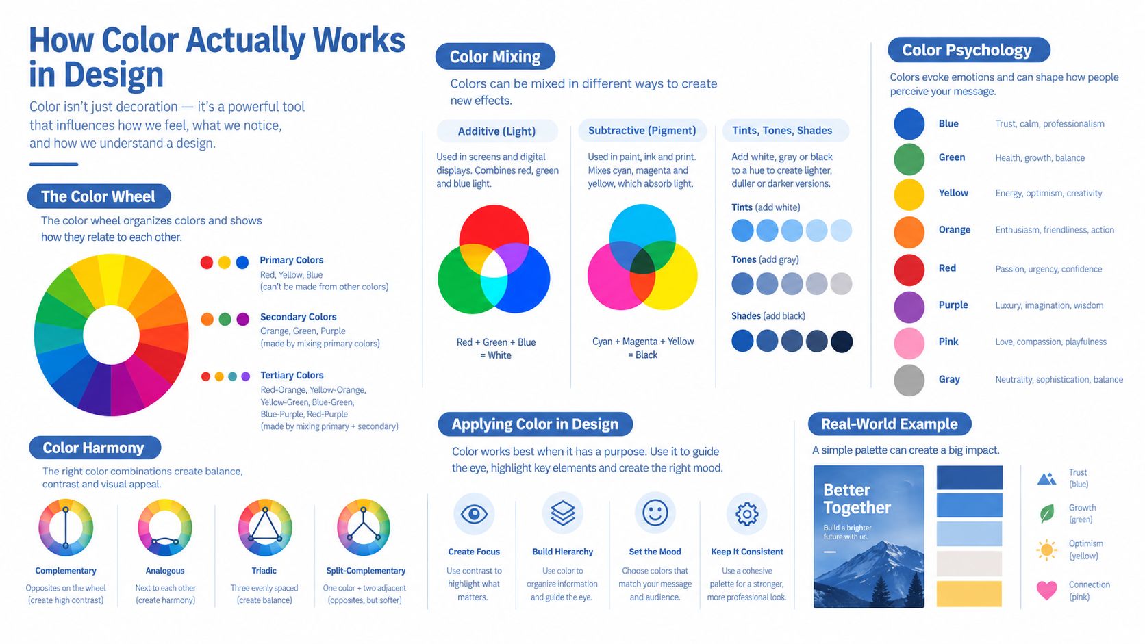
When you're developing a broader visual system, resources such as mattress brand visual identity design can help you see how color, typography, and product positioning work together. The lesson transfers well to apparel: the hue matters, but the surrounding system determines whether the product feels coherent.
What Buyers See in the First Two Seconds
A POD thumbnail creates a snap judgment through several visual properties working together. Warmth can make a product feel active or immediate, while cooler hues can support trust and aesthetic appeal. Research focused on e-commerce contexts found that warm hues such as red and orange can increase urgency and click intention, while cool hues such as blue and green tend to promote trust and aesthetic appeal. The findings are discussed in this empirical e-commerce color study.
That doesn't mean every red hoodie beats every navy tee. The result depends on the garment, the niche, the surrounding page, and the action you want the shopper to take.
Snap-Judgment Levers in POD Thumbnails
| Visual Property | Buyer Snap Reaction | Typical POD Use Case |
|---|---|---|
| Warmth | Feels energetic, urgent, or emotionally charged | Red hoodie for a limited seasonal drop |
| Saturation | Adds visual energy, but can become tiring when overused | Bright accent on a youth or humor design |
| Contrast | Separates the design from the garment and background | Light print on a dark tee in a category grid |
| Brightness | Changes readability, depth, and perceived visual clarity | Dark lettering on a pale garment mockup |
A red hoodie on a model may stop a scroll because the garment carries strong visual heat. The same red can overwhelm a detailed design if the print uses another aggressive color. A navy flat lay usually feels quieter, which can work well for premium basics, minimal typography, or trust-led product positioning.
Saturation deserves special care in ads. Increasing saturation can make a design look more energetic in the first glance, but it can also reduce comfort when the background, garment, and lettering all compete. The aim is usually one energetic visual signal, not maximum intensity everywhere.
Brightness affects what shoppers can decode. An image with a pale shirt, pale script, and bright platform interface may look clean in a large preview but lose its message in the feed. A darker garment can create a stronger silhouette, yet it may hide a dark print unless the seller adjusts the artwork or background.
Research on e-commerce interface color found that blue versus grey affected purchase decisions, with the effect partly mediated by users' aesthetic judgments rather than direct color preference alone. The study is available through the Wiley research on interface colour and purchase decisions. That's a useful reminder for mockup testing: buyers may respond to how polished and appropriate a color combination looks, not to the hue itself.
Why Universal Color Rules Break Down Fast
“Red means urgency” is a useful starting hypothesis. It's a poor final decision.
Color psychology in design gets flattened into cheat sheets because simple rules are easy to repeat. Blue becomes trust, red becomes action, green becomes calm, and yellow becomes optimism. Those associations can guide exploration, but they don't account for the product category, the visual environment, or the customer's immediate expectation.
Shopping-background research shows why context matters. Participants viewing blue or low-brightness backgrounds showed high patronage intentions regardless of whether prices were high or low, while red or high-brightness backgrounds produced more negative reactions to high prices. The findings are reported in this research on online shopping backgrounds and patronage intentions.
When Universal Color Rules Fail
| Common Rule | Where It Holds | Where It Breaks |
|---|---|---|
| Red creates urgency | A sale badge on a restrained product page | A storefront already dominated by red, where the badge disappears into the visual noise |
| Blue builds trust | A practical basics brand with a calm presentation | A playful Valentine's product that needs warmth and emotional energy |
| Bright colors attract clicks | A bold humor design with simple typography | A luxury tee where muted beige supports the price position more effectively |
| Green signals value or freshness | An outdoor, wellness, or sustainability-related concept | A fashion drop where green clashes with the garment and audience expectation |
Consider a red shirt in a Valentine's collection. Red doesn't function as a generic urgency trigger there. It reinforces the product's emotional category, which may make it feel expected rather than action-oriented.
A luxury tee creates a different problem. Bright blue may stand out, but muted beige, charcoal, or a restrained accent can communicate more control. The goal isn't to win the loudest thumbnail. It's to make the product look worth considering.
Black Friday creates the classic failure. A red badge placed on an already-red storefront may technically use an urgency color, but the shopper won't receive a distinct cue because the badge lacks separation.
Color has no conversion meaning outside its surrounding product, page, and customer state.
Use color charts to generate options. Then judge those options against the product category, price point, garment photo, platform background, and the buyer's reason for shopping.
Building an Apparel Palette That Sells
An apparel palette needs more discipline than a collection of attractive swatches. Every color should have a job, especially when the same design appears on a garment, a flat lay, a model mockup, and a paid ad.
Start with the garment
Lock the base garment color first. Off-white creates an open, approachable foundation. Charcoal gives a stronger streetwear or premium feel. A garment color can't be treated like an empty canvas because fabric texture, folds, lighting, and print placement all change the final appearance.
Next, choose the dominant print color. Charcoal lettering on off-white is dependable because it creates readable structure without competing with the design. If the garment is dark, the print may need a lighter value rather than a brighter hue.
Add one controlled accent
Use one accent to create a visual point of interest. Mustard can add warmth to an off-white and charcoal system without turning the entire product into a loud composition. In a darker streetwear variant, the same structure can shift toward a black or charcoal garment, off-white print, and a saturated accent used only for a small graphic detail.
Build the palette in HSB rather than HEX when you're tuning variations. HSB makes it easier to adjust brightness and saturation while preserving the basic hue direction, which helps you create seasonal or platform-specific versions without losing identity.
For broader palette inspiration, color schemes for custom furnishings offers a useful reminder that seasonal combinations rely on relationships between colors, not isolated swatches.
Reserve a CTA slot
Ads need a separate action layer. Reserve one palette slot for the CTA, sale badge, or shipping message rather than borrowing the print accent for every purpose. If mustard identifies the design, a separate high-contrast CTA can guide the click without confusing the product's visual identity.
Drop the palette into three formats:
- Flat-lay mockup: Check whether the garment edge separates from the background and whether the print reads without a model.
- Model mockup: Look for skin-tone, lighting, and fold interactions that weren't visible in the flat lay.
- Facebook ad thumbnail: Reduce the image to the size buyers will see and inspect the product before reading the copy.
The how to make graphic tees guide is a useful companion when you're deciding how the artwork, garment, and visual presentation should work as one product.
Use Coolors or Adobe Color to explore relationships, but don't lock a palette from a digital swatch alone. Check every option against a real garment photo. Fabric texture and lighting can make a clean screen color appear dull, pale, or unexpectedly intense in the final mockup.
Contrast and Accessibility as Conversion Tools
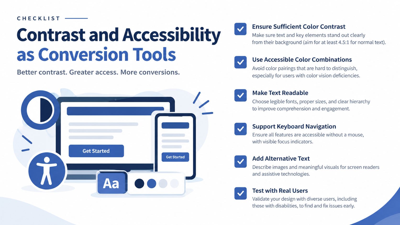
Accessibility improves the number of shoppers who can understand the product quickly. It isn't a restriction on creativity, and it isn't only a compliance task. If the slogan, badge, or product detail disappears for part of the audience, the thumbnail loses selling power.
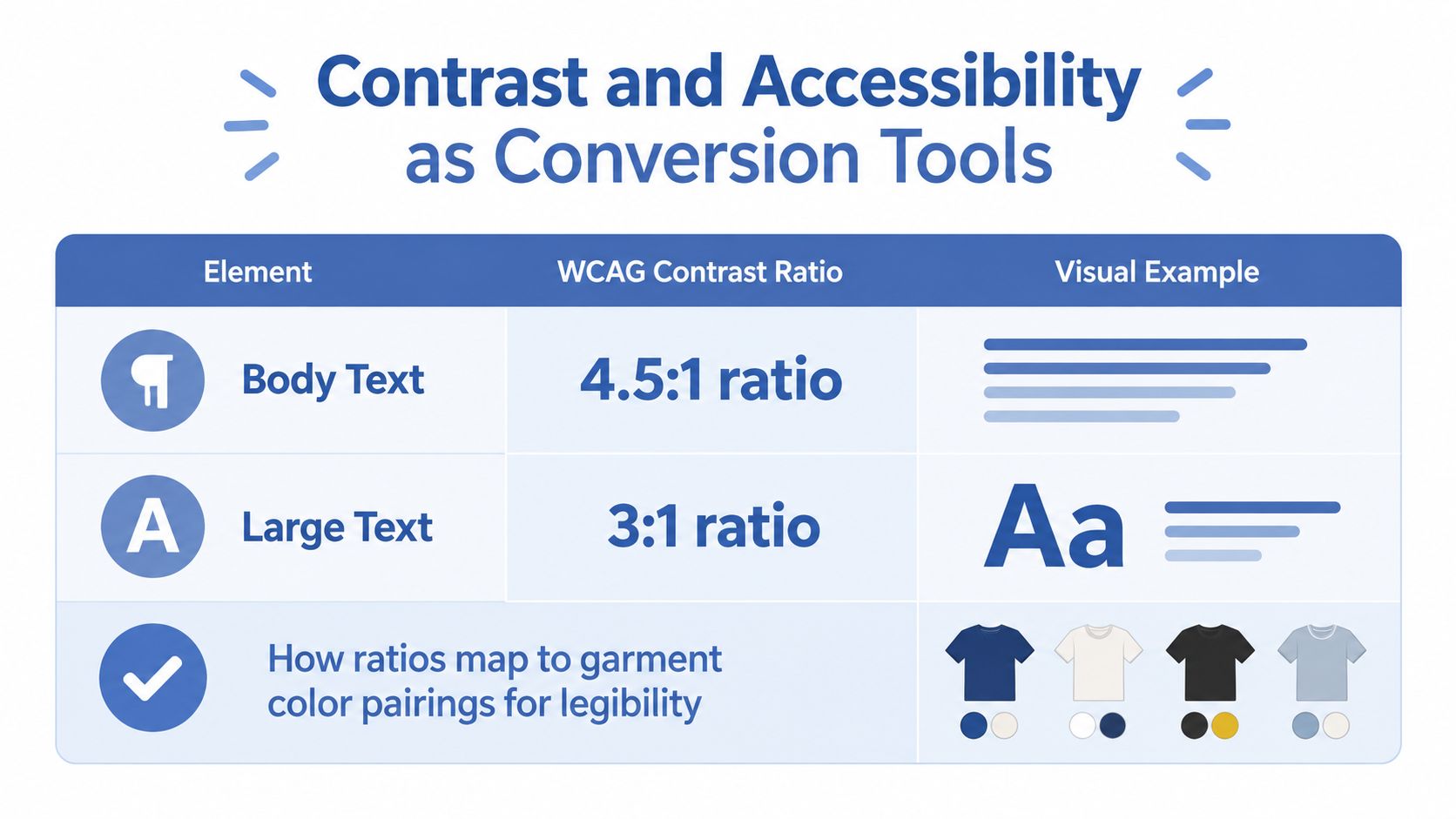
For text, the practical WCAG contrast targets are 4.5:1 for body text and 3:1 for large text, as shown in the contrast infographic above. In a POD workflow, those ratios apply to ad overlays, sale labels, size information, and any text placed on a garment image.
A common failure is white script on a pastel tee. It may look soft and attractive on a dark design workspace, then vanish against Instagram's light interface when the image is cropped and reduced. The buyer doesn't see a calm aesthetic. They see an unclear product.
Research on accessible web design found 87% positive readability ratings, 65% of participants reporting lower cognitive strain, and a 40% improvement in navigation efficiency compared with poor-accessibility prototypes, according to the accessibility research published by Atlantis Press. Those findings apply directly to the principle behind apparel thumbnails: clarity helps people process and make their way through the offer.
Run this check before upload
- Check contrast: Test text and important overlays against their immediate background.
- Preview in grayscale: If the design loses its hierarchy without hue, it may depend too heavily on color.
- Use a low-vision simulation: Look for lettering or icons that merge into the garment, model, or background.
- Inspect the small thumbnail: Reduce the image before approving it. Fine script and thin outlines often fail here.
- Test the platform background: Review the creative against the light and dark environments used by the marketplace or ad placement.
Don't use color as the only signal. A red sale badge should also include text, shape, or an icon so shoppers don't need to identify the hue to understand the offer. This matters for the 8% of male buyers with red-green color blindness, a figure cited in the provided accessibility guidance, because red-on-green combinations can erase the distinction you intended.
The accessibility conversation is broader than color vision deficiency. High contrast, structured hierarchy, and sensory-friendly palettes can also support shoppers with low vision and neurodivergent conditions. Clear design gives more people a fair chance to notice, understand, and choose your apparel.
Picking CTA Colors That Earn the Click
A CTA color should make the next action obvious, not win a popularity contest. Red isn't automatically the right answer. The surrounding mockup, button text, whitespace, and platform interface often matter more than the hue itself.
CTA Color Decision Aid by POD Scenario
| Scenario | Recommended Color Family | Why It Works | Watch Out For |
|---|---|---|---|
| Sale badge | High-contrast warm accent | Separates the offer from a neutral product presentation | Red on an already-red storefront |
| Add-to-cart button | Branded accent with strong contrast | Connects the action to the store while preserving hierarchy | A shade too close to the page background |
| Urgency banner | Warm hue such as red or orange | Communicates immediate attention and action | Filling the entire ad with urgency color |
| Free-shipping strip | Neutral or cool branded color | Feels informative without competing with the main CTA | Low-contrast text over pale blue or grey |
| Size-variant selector | Neutral base with a clear selected state | Keeps product choices organized and understandable | Using color alone to show the active size |
Warm hues can support urgency and click intention in e-commerce contexts, while cool hues can support trust and aesthetic appeal, as discussed earlier. The decision rule is simple: high-stakes action usually needs a high-contrast warm cue, while a low-stakes prompt can use a neutral or branded accent.
Platform conventions also shape expectations. Etsy, Shopify, TikTok Shop, and Amazon each present their own interface patterns and button treatments. A seller who fights those conventions with a visually ambiguous CTA makes the shopper work harder to identify the next step. Match the platform's hierarchy where possible, then use your brand accent to distinguish the product rather than trying to redesign the entire shopping environment.
A strong CTA also needs readable text, sufficient weight, and breathing room. A perfect color can still fail when the label is tiny, the button is crowded, or the background contains competing garment details. Use the principles in these landing page best practices when the ad click leads to a product page that must continue the same visual logic.
Test, Ship, Repeat Your Way to Better Designs
Color decisions improve through controlled repetition. The sustainable POD operator doesn't try to discover one magical palette. They build a library of evidence across products, audiences, mockup styles, and traffic sources.
Start with one variable. Test the background color, CTA color, or model mockup against a clear alternative, but don't change the artwork, headline, garment, and color at the same time. If several elements move together, you won't know which change influenced the result.
A practical test setup looks like this:
- Choose one comparison: For example, a warm cream background versus a cool grey background.
- Keep traffic conditions fixed: Use the same audience and comparable placement.
- Run the test for a defined window: A 7 to 14 day window can be used as a working test period when traffic is held steady.
- Track the buying path: Compare click-through rate and add-to-cart rate rather than judging the thumbnail by clicks alone.
- Wait for statistical confidence: Don't declare a winner because one version has a promising early result.
Etsy sellers can use listing experiments through Promoted Listings, Shopify merchants can compare theme or variant presentations, and Facebook ads support straightforward split tests using cropped thumbnails. The exact platform setup matters less than preserving the test variable.
The step-by-step guide to testing print-on-demand designs can help you create a repeatable process. The goal isn't to perfect one mockup forever. It's to compound knowledge across hundreds of designs, so every new upload begins with better assumptions.
Upload with a hypothesis, measure the shopper's response, and keep the lesson even when the design doesn't win.
A simple ritual works well: before publishing, check the thumbnail in color, grayscale, and at small size, then write down the single color decision you're testing. That habit turns color psychology in design from vague inspiration into a practical growth system.
Skup helps POD sellers build and refine apparel businesses through practical education, coaching, and tools such as AvatarIQ for AI-assisted apparel design and professional mockups. Visit Skup to explore the Apparel Cloning System and create a faster workflow for turning better color decisions into more product tests.