10 Tie Dye Color Combinations for POD Apparel
Tie dye has roots that reach back far earlier than most apparel sellers realize. The oldest known form, Bandhani, dates to about 4000 B.C. in the Indus Valley, with surviving examples from Peru from roughly 500 to 810 A.D. and Sui dynasty China in the 5th century A.D. Wikipedia's tie-dye history makes one thing clear. Color choice has always been tied to what dyers could produce, and modern saturated palettes only became widely practical after synthetic aniline dye arrived in 1856.
That's why tie dye color combinations matter so much in POD. They don't just decorate a shirt. They tell a shopper whether the piece feels nostalgic, premium, calming, loud, mystical, or easy to wear before the customer reads a single line of your listing copy.
The strongest tie-dye products usually start with a focused palette, then build everything else around it. Garment color, spiral or crumple execution, mockup styling, niche message, and thumbnail visibility all get easier once the palette is doing the emotional heavy lifting. A rainbow spiral sells a different feeling than a slate-and-charcoal wash, even if both sit on the same blank.
That's also where AvatarIQ helps. Skup built it for exactly this kind of workflow. You can generate design variations, test placement ideas, and create apparel mockups without slowing your launch down. For POD sellers, that turns one good color direction into multiple viable listings fast.
If you want more general color coordination ideas beyond tie dye, More Sewing fabric matching tips is a useful companion read.
Table of Contents
- 1. Classic Rainbow Gradient
- 2. Pastel Dream Swirl
- 3. Deep Jewel Tone Luxury
- 4. Sunset Gradient
- 5. Ocean Wave Blend
- 6. Forest Woodland Earth Tones
- 7. Electric Neon Burst
- 8. Monochrome Gradient
- 9. Cosmic Galaxy Purple and Pink
- 10. Retro 70s Burnt Orange and Avocado
- Top 10 Tie-Dye Color Combinations Comparison
- Turn One Color Combination Into a Collection
1. Classic Rainbow Gradient
Rainbow is still the easiest starting point if you want broad appeal. It reads instantly on apparel, works across age ranges, and doesn't need much explanation in the listing. If a shopper can understand the design in one glance, your thumbnail is doing its job.
This palette also lines up with the core mechanics of tie dye. Primary colors in tie dye are red, yellow, and blue, and mixing two primaries creates secondary colors like green, orange, and purple, which is why rainbow transitions feel natural when they're handled cleanly Printify's tie-dye color guide. In practice, that means rainbow works best when the sequence blends with intention instead of jumping randomly between unrelated sections.
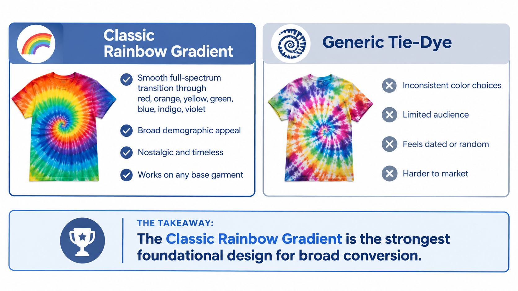
Where It Fits Best
Festival apparel, vintage-inspired drops, pride-adjacent merch, and streetwear capsules all have room for rainbow. It also works well as a “foundational SKU” because you can branch into niche versions later with text overlays, sleeve wraps, or a more muted base.
A centered spiral is the obvious move, but it isn't the only one that sells. Off-center spirals and chest-biased swirls often feel more wearable because they look less costume-like in mockups.
Practical rule: Rainbow wins when the order is clean and the mockup feels intentional. It loses when every color fights for equal attention.
- Best garment choice: White tees keep the palette bright, while black garments create a stronger, nightlife-style contrast.
- Best listing angle: Lead with mood words like retro, expressive, bold, or celebratory instead of just saying “multicolor.”
- Best design add-on: Vintage typography or a small minimalist chest graphic can separate your version from generic tie-dye listings.
For variation testing, use Skup's color psychology breakdown alongside AvatarIQ to compare how the same rainbow placement feels on different blanks.
2. Pastel Dream Swirl
Pastel tie-dye earns its keep by feeling easy to wear. Buyers pick it for comfort, quiet optimism, and a cleaner aesthetic than high-contrast festival colorways. In POD terms, that shifts the decision from "How bright can this get?" to "How soft can this stay once it hits a mockup, a garment color, and a product page?"
That restraint is the whole job. Knowing Fabric's tie-dye color theory guide recommends limiting the palette to a small set and letting one shade lead. Pastels need that discipline more than saturated palettes do, because too many soft hues can flatten together and read blurry from thumbnail size.
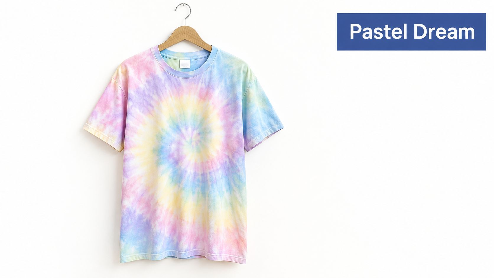
For customer emotion, this palette sits in the calm, comforting lane. That makes it a good fit for wellness merch, journaling brands, dorm-style shops, affirmation apparel, and giftable spring collections. It usually underperforms for edgy streetwear unless the artwork or copy adds a sharper point of view.
Garment choice decides whether pastel looks intentional or faded. White and cream blanks keep lavender, mint, baby blue, and blush pink clean. Heathered or dark garments often dull the effect, which can lower perceived print quality in listing images even if the design itself is solid.
Pattern execution should stay loose. Cloud wash, soft swirl, and watercolor-style diffusion usually sell better than a hard, centered spiral here. The reason is simple. Pastel buyers tend to want "styled" rather than "costume," so the pattern has to feel light on-body.
A good listing strategy is to merchandise pastel as a coordinated story instead of a single hero SKU.
- Best niche fit: Self-care, campus lifestyle, gentle mental health themes, bridal weekend merch, baby shower or mom-focused gifting
- Best contrast setup: Low-contrast dyes on white or cream blanks for a soft premium look
- Best mockup decision: Use bright, natural-light lifestyle scenes with clean backgrounds, because flat studio mockups can make the colors look weaker than they are
- Best collection move: Pair the shirt with a matching hoodie, tote, or sleepwear-adjacent item to raise average order value
Pastel also has strong listing potential because it crosses seasons well. With the right mockups, the same color family can read spring, back-to-school, or year-round loungewear. That flexibility makes it a smart collection builder, especially for shops that want repeatable color stories without reworking the entire design system.
3. Deep Jewel Tone Luxury
Deep jewel tones do the opposite of a novelty tie-dye shirt. They push the product toward boutique apparel, giftable premium pieces, and cleaner streetwear. Emerald, sapphire, amethyst, burgundy, and a small amount of antique gold or deep teal usually perform better than a crowded five-color mix.
The main decision here is restraint. Tie-dye already adds visual movement, so the palette should carry depth instead of noise. Knowing Fabric's blending article explains how complementary color relationships create contrast, but for this style, high contrast needs control. One anchor color should dominate. The second and third colors should add richness without fighting for attention.
That choice affects who buys it.
Shoppers drawn to this palette usually want confidence, mood, and polish rather than playful energy. That makes it a stronger fit for boutique streetwear, astrology or spiritual merch with a darker edge, premium wellness branding, museum-shop style graphics, and holiday gifting where the shirt needs to feel substantial in the listing.
Garment choice matters more here than with brighter palettes. Deep dyes look better on heavyweight cotton, pigment-rich fleece, and blanks with a structured silhouette. On lightweight tees, the same palette can read muddy or inexpensive in mockups, especially under soft lighting. Black, washed black, deep navy, and mineral-dyed charcoal can work well if the dye retains separation. White blanks can work too, but they shift the mood from luxury to art-driven statement wear.
Pattern execution should also change. Skip the perfectly centered spiral if the goal is higher perceived value. Controlled marble, off-center folds, diagonal saturation, and smoke-like diffusion usually photograph better and feel more intentional on-body. They also leave cleaner space for a small chest print, neck label mockup, or minimal typography if the design needs branding.
For merchandising, this palette sells best when the listing looks edited. Use fewer props, tighter crops, and a mockup set that shows texture and dye depth clearly. Flat lay images often miss the point. Front-on torso shots, detail crops, and a secondary image with the fabric close-up usually do a better job of justifying a premium price.
A practical POD move is to build this color story around fewer, stronger SKUs instead of a broad variant spread.
- Best emotional read: Confident, moody, exclusive
- Best niche fit: Boutique streetwear, darker spiritual themes, premium gifting, upscale wellness, art-forward apparel
- Best contrast setup: One dominant jewel tone with one or two supporting shades on structured blanks
- Best mockup decision: Use clean studio or editorial-style images that show shadow, texture, and dye separation
- Best collection move: Pair the tee with a heavyweight hoodie or washed sweatshirt in the same palette to strengthen average order value
AvatarIQ is useful here because small changes in saturation, blank color, and lighting can shift the listing from premium to muddy fast.
4. Sunset Gradient
Sunset tie-dye sells on mood faster than almost any other warm palette. Customers read it in a second. Freedom, late summer, road trips, festival weekends, beach towns, and optimistic gift buying all sit inside the same color story, which gives this option unusually broad listing potential.
For POD, that range matters. A rainbow shirt often asks the buyer to like tie-dye first. A sunset gradient can pull in buyers who normally shop by vibe, destination, or message.
The strongest version usually keeps the palette tight. Orange, coral, warm pink, and gold do the heavy lifting. Purple works best as a small cooling accent, not a co-star, because too much violet pushes the shirt away from sunset and closer to galaxy or festival merch.
Pattern execution decides whether this reads polished or generic. Horizontal fades suggest a horizon and work well for travel and location-based designs. Diagonal color movement is better for fashion-forward tees because it slims the torso visually in mockups and gives chest graphics a cleaner landing area. Loose radial bursts can work too, but only if the center point stays soft.
Use the blank color to control contrast. White blanks make the colors brighter and more tourist-friendly. Sand and cream blanks feel more wearable and usually photograph with less glare. Pale pink can look great in concept, but it narrows your audience and can make orange dye lose separation if the mockup lighting is weak.
This palette is also one of the easier choices for text-driven POD designs. Short phrases like travel slogans, affirmations, retreat names, and destination graphics usually feel integrated instead of forced. If you want a full-coverage look on polyester-heavy items, Skup's guide to sublimation fabric printing is useful for checking how this gradient behaves before you build out multiple mockups.
A practical merchandising setup:
- Best emotional read: Uplifting, nostalgic, adventurous
- Best niche fit: Travel apparel, summer events, yoga retreats, beach shops, positive-message gifts
- Best contrast setup: Warm midtones on white, cream, or sand blanks with one darker accent shade
- Best pattern move: Horizon fade or diagonal wash for cleaner on-body presentation
- Best listing strategy: Lead with an outdoor or golden-light mockup, then show one clean studio image so buyers can judge the actual dye balance
If the listing looks too busy, this palette loses value fast. Keep the artwork simple, keep the crop tight, and let the color transition do the selling.
5. Ocean Wave Blend
Blue sells calm fast. In a tie-dye listing, that matters because buyers read ocean palettes in a split second. They see beach, surf, lake trips, coastal shops, aquarium gifts, and vacation wear without needing extra explanation.
Blue, teal, seafoam, and white also give you a cleaner production path than riskier color mixes. Analogous shades tend to hold separation better during dye blending, while direct complements can turn dull if the pattern gets overworked, as explained in Practical and Pretty's tie-dye color advice. For POD, that translates to more reliable mockups and fewer listings that look great in one image but muddy in the next.
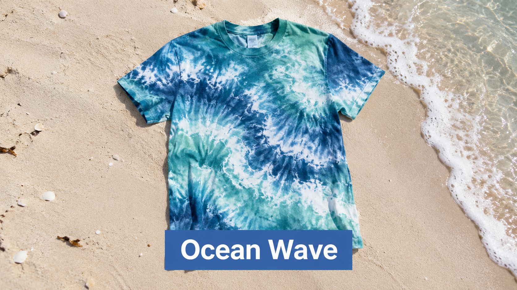
The emotional lane is clear. This palette reads cool, quiet, and refreshing, which makes it useful for customers who want tie dye without the louder festival look.
Pattern choice decides whether it feels premium or generic. A loose ripple, side-to-side wash, or top-down fade usually fits the ocean theme better than a centered spiral. Spirals still work, but they shift the product toward novelty and away from coastal lifestyle. If the niche is surf camp, seaside rental merch, whale watching, or marine conservation, fluid movement does more selling work than a perfectly symmetrical tie-dye pattern.
Garment color changes the whole listing. White blanks feel bright and tourist-friendly. Heather ice blue and pale gray soften the contrast and make the shirt look more wearable in everyday photos. Deep navy blanks can look strong in person, but they often swallow the seafoam tones in thumbnails, so use them only if the design has enough light dye to stay visible.
A good merchandising setup for ocean tie dye looks like this:
- Lead mockup: beach or boardwalk scene for instant niche recognition
- Second mockup: flat or studio image so buyers can judge the actual dye balance
- Best graphic pairing: small chest wave, coordinates, marina name, sea turtle, shell line art
- Strongest customer emotions: calm, escape, freshness, coastal nostalgia
- Best shop fits: beach towns, surf apparel, lake vacation merch, marine life gifts, resort collections
This palette has solid listing potential because it can split into several micro-collections without changing your core color story. Use one ocean blend for minimal coastal text shirts, another for kids' marine animal graphics, and another for destination merch. The collection stays visually connected, but each product serves a different buyer intent.
6. Forest Woodland Earth Tones
Forest palettes sell to buyers who want tie dye texture without the usual loudness. That makes them useful for POD shops serving outdoor, cabin, camping, national park, botanical, and slow-fashion niches where the shirt needs to read as wearable first and tie dye second.
The strongest versions stay disciplined. Use two or three close earthy shades, such as moss with clay, olive with sand, or bark brown with muted gold. Add too many colors and the dye job starts drifting back toward novelty, which weakens the grounded mood this palette is supposed to create.
Analysts at Accio's seasonal tie-dye trend report highlighted forest green, charcoal, sand, stone, olive, and slate blue as versatile color directions. That lines up with what works in listings. Buyers who skip bright rainbow tie dye will still consider a muted woodland piece if the product photos show it as part of an outdoor or everyday wardrobe.
Execution matters more here than with brighter palettes.
A spiral can look too souvenir-driven for this color story. Crumple, low-contrast scrunch, mineral wash, and uneven stripe treatments usually perform better because they mimic natural variation, not a perfect graphic target. That also helps if you plan to add simple chest prints, trail coordinates, campsite names, tree line art, or conservation messaging. The shirt keeps visual texture without competing with the graphic.
Mockup choices carry a lot of the selling work. Earth tones often look understated in thumbnails, so use environments that clarify the niche fast. Cabin wood, trail settings, canvas tents, stone backdrops, and neutral studio shots all help. For garment blanks, cream and sand make the palette feel softer and giftable. Faded black and olive push it toward workwear or outdoorswear. White usually makes the dye look less premium.
I would merchandise this palette as a small lifestyle capsule, not a one-off color experiment. Pair tees with hoodies, keep the same dye family across products, and let the customer see an outfit story. That raises listing potential because the palette supports matching sets, group trip merch, park-themed drops, and quiet branded apparel without changing the core emotion: grounded, calm, and outdoorsy.
7. Electric Neon Burst
Neon tie dye wins fast or fails fast. On a category page, shoppers decide in seconds whether it feels exciting or cheap, and this palette leaves very little room in between.
That makes it a strong POD choice for customers buying on emotion first. Festival buyers, gaming audiences, nightlife shoppers, and younger streetwear customers usually want color that reads instantly in a thumbnail. Neon delivers that better than almost any other tie-dye palette, especially on hoodies, oversized tees, and boxy cuts.
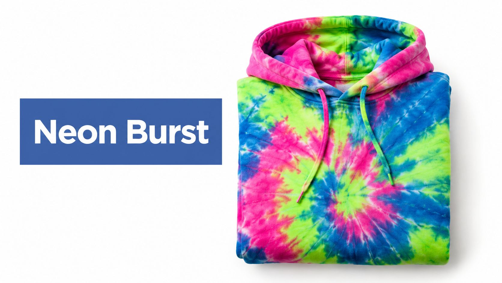
The trade-off is control. Neon has high click potential, but poor execution makes it look noisy in mockups and even worse in print. Limit the palette to two dominant brights and one support color. Electric pink with acid green on black has a very different customer than neon blue with violet on white. Choose the emotion first, then build the dye mix around it.
Garment color does a lot of the selling here. Black gives neon the sharpest contrast and hides uneven transitions better, which is useful if your production partner varies slightly from batch to batch. White feels more classic rave or summer-camp. Charcoal softens the hit and can make the piece easier to wear, but it also reduces some thumbnail impact.
Pattern choice should stay bold and readable. Tight spirals, center-burst layouts, and stripe explosions usually outperform washed-out scrunch treatments because the customer is buying energy, not subtle texture. If you plan to add graphics, keep them small and high-contrast. A large front print often fights the dye instead of helping the design.
For merchandising, present neon as a statement product, not a safe basic. Use bright, clean mockups with strong exposure and enough negative space around the garment so the color stays crisp on mobile. This palette also gives you good listing potential for themed micro-collections: festival drops, arcade-inspired capsules, club merch, and limited seasonal releases that need immediate visual punch.
8. Monochrome Gradient
Monochrome gradient tie dye sells calm, control, and polish. For the right customer, one color family often has more POD value than a louder mix because it reads cleaner in thumbnails, wears easier in daily outfits, and supports a higher-end product story.
It also gives you a clearer merchandising lane. Tonal blue feels cool and modern. Charcoal reads streetwear or minimalist. Burgundy pushes the piece toward premium casualwear. Olive works well for outdoors, workwear-adjacent stores, and muted vintage shops. The palette choice is not just aesthetic. It signals who the product is for before the shopper reads a word.
The trade-off is subtlety. Monochrome usually gets fewer impulse clicks than rainbow or neon, so it needs stronger execution on the garment itself. Flat dye placement looks dull fast. A good version uses visible light-to-dark movement, enough white space or low-saturation breaks to show the pattern, and a blank color that keeps the tones distinct.
Pattern choice matters more here than in louder palettes. A spiral can work, but it often pulls monochrome back toward a standard tie-dye look. Crumple, angled stripe, and loose center-fade layouts usually fit the tonal concept better because they let the gradient do the selling. This is also one of the safer palettes for adding a chest graphic or small back print. If you need help balancing dye texture with print placement, review these shirt design tips for cleaner POD layouts.
For niche fit, monochrome performs well with minimalist fashion buyers, creative-industry audiences, boutique streetwear customers, and matching-set shoppers who want dye texture without full visual noise. It is especially useful if your store already sells neutral caps, tonal totes, or simple typography designs. The collection feels more intentional.
A practical product stack looks like this:
- Best garment match: heavyweight tees, pigment-dyed sweatshirts, relaxed hoodies, lounge sets
- Strong color families: slate blue, smoke charcoal, faded burgundy, tonal olive, dusty mauve
- Best customer emotion: calm, understated, design-aware, wearable
- Best listing angle: tonal tie dye, minimalist statement piece, premium casual essential
For mockups, use soft lighting and avoid busy backgrounds. Monochrome wins on texture, so the shopper needs to see folds, dye variation, and contrast between tones. Front, angled, and close-up detail shots usually do more work here than lifestyle scenes alone. If the gradient is subtle, lead with the most readable garment color first in the listing, then group nearby tones into a small capsule instead of scattering them across unrelated products.
9. Cosmic Galaxy Purple and Pink
Galaxy purple and pink sells best when the buyer wants the shirt to signal identity first and color second. The emotional pull is clear. Mystical, romantic, expressive, slightly dramatic. That makes this palette a practical fit for astrology shops, tarot merch, festival apparel, affirmation brands, and alternative boutiques that already sell moon, star, or spiritual themes.
Execution decides whether it reads cosmic or childish. Use purple as the anchor, push pink into highlight areas, and keep some navy, black, or deep plum visible so the pattern has depth. If every section is bright and evenly blended, the garment starts to look sugary instead of atmospheric.
The dye balance matters more here than it does in a basic rainbow. Small shifts in saturation can change the whole mood. Chandye's tie-dye mixing guide explains how minor ratio changes affect color outcome and also outlines stronger versus more vibrant dye concentration ranges, which is useful if you are testing custom galaxy variations instead of relying on stock color names Chandye's tie-dye mixing guide.
For POD, this palette works best as a themed mini-collection rather than a one-off listing. Build around one customer emotion and keep it tight. Zodiac signs for identity-based gifting. Moon-phase graphics for wellness and ritual audiences. Tarot-inspired text for shoppers who want the shirt to feel more personal than decorative.
Mockups need contrast. Black and deep navy blanks usually photograph better than white because they hold the cosmic effect without washing out the pink. Lead with one front-facing mockup that shows the full dye movement, then add a close crop so shoppers can see the darker pockets and soft transitions that make the piece feel layered.
A good merchandising setup looks different from your calmer or more minimal palettes:
- Best niche fit: astrology, tarot, spiritual merch, festival fashion, alternative streetwear
- Best garment contrast: black, deep navy, washed plum
- Best pattern execution: spiral with dark gaps, crumple with bloom areas, off-center burst
- Best listing potential: giftable zodiac drop, moon-phase capsule, statement festival tee
Use this palette when the product needs a clear point of view. It attracts a narrower buyer than a classic rainbow, but the listing usually feels more specific, giftable, and easier to style into a focused POD collection.
10. Retro 70s Burnt Orange and Avocado
Retro earth tones usually convert better than brighter tie-dye palettes when the buyer wants nostalgia instead of attention. Burnt orange, avocado, harvest gold, and cream give the listing a clear emotional signal. Comfortable, familiar, a little worn-in.
This palette sells best when the product looks era-specific, not just brownish and muted. The 1969 festival era pushed tie-dye into mainstream youth style, and shoppers still read these colors through that cultural memory. You do not need to force the history lesson in the listing copy. The color story already does the work.
The main product decision is restraint. Keep the pattern loose, slightly uneven, and lower contrast than a rainbow or neon design. If the dye lines get too crisp, the shirt starts to look like a modern graphic exercise instead of a retro piece.
Use the blank to finish the job. Cream, natural, sand, or faded tan garments usually outperform bright white because they soften the orange and keep the avocado from turning harsh in mockups. Washed black can work too, but only if the dye stays dusty rather than saturated.
For merchandising, this palette fits sellers who want a stronger niche identity without going costume-like:
- Customer emotion: nostalgia, comfort, thrift-store discovery, laid-back self-expression
- Best niche fit: vintage apparel, record-shop merch, indie bands, national park souvenirs, retro state-pride drops
- Best garment contrast: natural cream, sand, faded tan, washed black
- Best pattern execution: off-center spiral, soft bullseye, sun-faded crumple, loose stripe
- Best listing potential: throwback capsule, vintage gift tee, retro travel shirt, heritage-inspired seasonal drop
Mockups should look lived-in, not sterile. Flat studio lighting often makes these shades feel dull, so lead with a lifestyle image or a mockup with a warmer cast. Add one close crop that shows the faded transitions. That detail helps the buyer see intention instead of assuming the print came out weak.
This is a strong POD choice for shops that already sell vintage-coded designs. It will not reach as many buyers as a classic rainbow. It often gets better product-market fit, though, because the shopper knows exactly why they want it.
Top 10 Tie-Dye Color Combinations Comparison
| Style | 🔄 Implementation Complexity | ⚡ Resource Requirements | 📊 Expected Outcomes | 💡 Ideal Use Cases | ⭐ Key Advantages |
|---|---|---|---|---|---|
| Classic Rainbow Gradient | Moderate, symmetry & saturation control | Medium, standard dyes, versatile bases | High reach & recognition, broad conversions | Festivals, streetwear, pride, mass-market | Nostalgic, highly versatile, scalable |
| Pastel Dream Swirl | High, precise desaturation & balance | High, premium printing, light bases | Premium pricing, niche loyal buyers | Wellness, lifestyle, TikTok/Instagram trends | Refined premium aesthetic, less competition |
| Deep Jewel Tone Luxury | High, saturated layering + metallics | High, premium blanks & printing | High margin, lower volume (exclusive) | Luxury drops, influencer collabs, premium brands | Designer-tier perception, strong photogenic appeal |
| Sunset Gradient | Moderate, warm blending requires care | Medium, warm-toned dyes, adaptable bases | Consistent positive engagement year-round | Travel, outdoor, motivational apparel | Universal emotional resonance, timeless |
| Ocean Wave Blend | Moderate, flowing/wave pattern control | Medium, blue-green palettes, forgiving print | Strong niche engagement, loyal buyers | Coastal brands, surf, conservation campaigns | Calming, niche-defining aesthetic |
| Forest Woodland Earth Tones | Moderate, layered natural pigments | Medium, sustainable blanks preferred | Strong alignment with eco-conscious buyers | Sustainable fashion, outdoor, boho markets | Signals sustainability and authenticity |
| Electric Neon Burst | High, maintain extreme vibrancy | High, top-tier inks, dark bases ideal | High social visibility, youth-focused sales | Gaming, festivals, Gen Z social campaigns | Maximum visual impact and differentiation |
| Monochrome Gradient | Moderate, precise tonal progression | Medium, quality printing, single-family dyes | Premium perception, subtle wardrobe versatility | Minimalist/luxury brands, creative pros | Sophisticated, versatile, premium positioning |
| Cosmic Galaxy Purple & Pink | Moderate, layered cosmic tones | Medium, good saturation control | Strong niche demand in spiritual communities | Spiritual brands, astrology, alternative fashion | High social engagement, community loyalty |
| Retro 70s Burnt Orange & Avocado | Moderate, era-accurate color matching | Medium, research & vintage-style blanks | High appeal to vintage/thrift audiences | Retro/nostalgia brands, vintage collectors | Authentic retro differentiation and storytelling |
Turn One Color Combination Into a Collection
The smartest move isn't launching all 10 palettes at once. It's picking one that matches your audience, your brand mood, and the kind of garment you want to sell. If your niche leans expressive and broad, classic rainbow or neon can work. If your buyers want something more wearable, ocean, forest, monochrome, or pastel usually give you a cleaner path.
Start with the feeling, not the dye pattern. Ask what the customer should feel when they see the thumbnail. Calm, loud, nostalgic, premium, grounded, spiritual, energetic. Once that answer is clear, the palette gets easier, and so do the merchandising decisions around it.
The next step is variation. Create several AvatarIQ versions of the same core concept instead of jumping to a totally different style. Test spiral versus crumple. Try the palette on white, cream, faded black, or sand depending on the mood you want. Small presentation changes can completely change whether a listing feels boutique, festival-ready, outdoorsy, or refined.
Then review the mockups like a shopper would. Don't zoom in first. Look at them at thumbnail size. If the pattern turns muddy, if the contrast disappears, or if the shirt just reads as “random color,” refine it before you publish. Tie dye has to stay legible from far away or it won't earn the click.
After that, tighten the listing angle. A product title that only says “tie dye tee” wastes the emotional work the palette already did. Build the title and description around the niche signal. Ocean palettes should sound coastal or surf-inspired. Forest tones should sound grounded and outdoors-ready. Galaxy purples should feel mystical or celestial. The color combination should shape the language, not sit separately from it.
This is also where coordinated products start making sense. A strong palette can expand into hoodies, oversized tees, lounge pieces, and matching set concepts without forcing a new identity every time. That's one of the most exciting parts of POD. One winning color direction can become a real collection if you stay consistent with garment contrast, pattern execution, and message.
You also don't need the most complicated palette to build a strong store. In many cases, the more focused design wins because it's easier to style, easier to understand, and easier to present cleanly in mockups. A well-executed monochrome wash can outperform a busy rainbow if it speaks more clearly to the customer you're targeting.
Tie dye gives POD sellers room to test ideas that feel artistic without becoming random. You can launch something expressive, refine the visual story quickly, and turn the best-performing concept into a sharper brand direction. That's a real opportunity, especially if you approach color like a product decision instead of just a decoration choice.
If you're just getting started, that should feel encouraging. You don't need to master every tie-dye look. You need one palette that fits your niche, reads clearly on the right garment, and shows up well in a mockup. Build from there. That's how a single design idea turns into a store with personality.
Skup gives POD sellers a practical edge with training built around what's working now, and AvatarIQ makes it much easier to test tie dye color combinations, create design variations, and produce strong apparel mockups fast. If you're ready to turn one palette into a real collection, visit Skup and start building with tools made for eCommerce apparel.