How to Make a Mockup in Illustrator: A Step-by-Step Guide
You finished the shirt graphic, dropped it on a product photo, and listed it the same afternoon. The preview looks sharp. Then the sample shows up with a duller red, a logo that sits too low, and a corner of the art lost in the hem. That gap is fixable, and learning how to make a mockup in Illustrator the production-safe way is one of the quickest skills that turns a nice picture into a listing you can stand behind.
A production-safe mockup checks the preview against what your decorator can print. Placement, colour, and file type are reviewed at every step, so the shirt you sell is the shirt that ships. The routine is calm once the file is ready, and each clean listing moves a store closer to orders that arrive while you are doing something else.
Table of Contents
- What to Prepare Before Building Your First Mockup
- How to Keep Artwork Inside the Print Area
- How to Map Vector Artwork onto a Garment Mockup
- Export and Color Settings That Protect Print Quality
- Mockup Mistakes and the Three-Gate Check
What to Prepare Before Building Your First Mockup
Say you export a finished chest graphic, paste it onto a hoodie photo, and publish three colourways before dinner. The mockup sells the idea. The printed hoodie tells a different story because the file was never prepared for fabric. Most of that risk is gone before Illustrator opens, and a prepared file is the shortest path to a listing that matches the product.
Illustrator has carried this kind of artwork since Adobe released the first public version on March 19, 1987, initially for Apple Macintosh computers, as Britannica's history of Adobe Illustrator records. The software describes artwork through mathematical paths, points, and curves rather than fixed pixels, so one design can be enlarged for a poster or reduced for a left-chest logo without pixelation. Layers and artboards later made that same scalable file easier to split across a tee, a hoodie, and a hat.
While you are thinking about how a garment drawing should read before any print is applied, Display Guru's guide to fashion illustration is a clear companion for judging shape and proportion.
Settings that stop the usual listing problems
| Item | Recommended setting | Why it matters |
|---|---|---|
| Artwork format | Vector (AI, EPS or SVG) | Scales to chest, back and poster sizes without pixelation |
| Print file color mode | CMYK | Adobe recommends CMYK for process-ink printing |
| Listing graphic color mode | RGB | Suits website, social and marketplace images |
| Mockup base image | Front-facing garment photo with even lighting | Keeps the print area easy to read |
| Master file | Saved copy made before mapping | Lets you reset placement without rebuilding |
Adobe's color guide recommends CMYK when you prepare documents for process-ink printing, and notes that some RGB and HSB colours, including neon-like colours, have no equivalent in CMYK. Keep the bright screen file for the listing, and keep the print file in the mode your decorator inks.
A file is ready when the artwork sits on named layers, you use one artboard per product, colours have been checked for printability, and a master copy is saved before anything is mapped. I would start with that saved master every time. Each box you tick is one less surprise on the first order, and it puts the listing one calm step closer to going live.
How to Keep Artwork Inside the Print Area
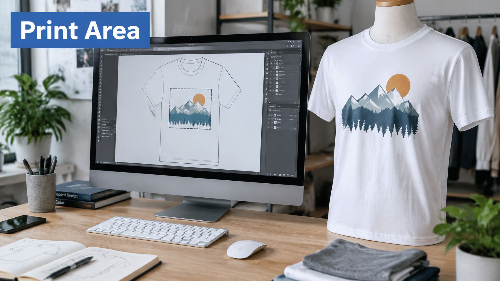
A shirt-shaped or print-area vector keeps the design inside the zone a decorator can print, and nothing outside that shape is deleted. Adobe's clipping mask notes specify that only vector objects can serve as clipping paths. When a shape becomes the mask, Illustrator removes its fill and stroke automatically, while the art underneath stays editable.
Before you draw the shape, ask your decorator for the maximum print width, the maximum print height, and the decoration method, then build the shape to those measurements. If you want a quick sense of the dimensions shops commonly use, the notes on common print sizes help you line the mask up with a real printable zone.
Stack the shape, then mask
Adobe's lesson on cropping with masks is clear about order. The mask shape has to sit above the artwork in the Layers panel.
- Draw the print zone. Draw or paste a vector shape that matches the printable width and height.
- Put that shape on top. If it sits below the art, the mask hides nothing and the design still spills past the hem.
- Select the shape and the objects you want constrained.
- Choose Object > Clipping Mask > Make. Everything outside the vector boundary drops from view.
- Reposition the art inside the mask. Hidden parts remain in the file.
- Release the mask with Object > Clipping Mask > Release when the print zone changes. The path stays, with no fill or stroke until you apply one.
Say the design is a full-bleed graphic on a hoodie front. It has to stop above the hem and clear the sleeve seams, or the printer crops it somewhere you did not choose. The mask handles that without a redraw.
A masked file stays editable, so a print-area change is a quick adjustment rather than a new illustration.
How to Map Vector Artwork onto a Garment Mockup
Mapping is the moment the flat art meets the garment. Do it on clean vectors, with the master already saved, so a bad placement never becomes the only copy you have.
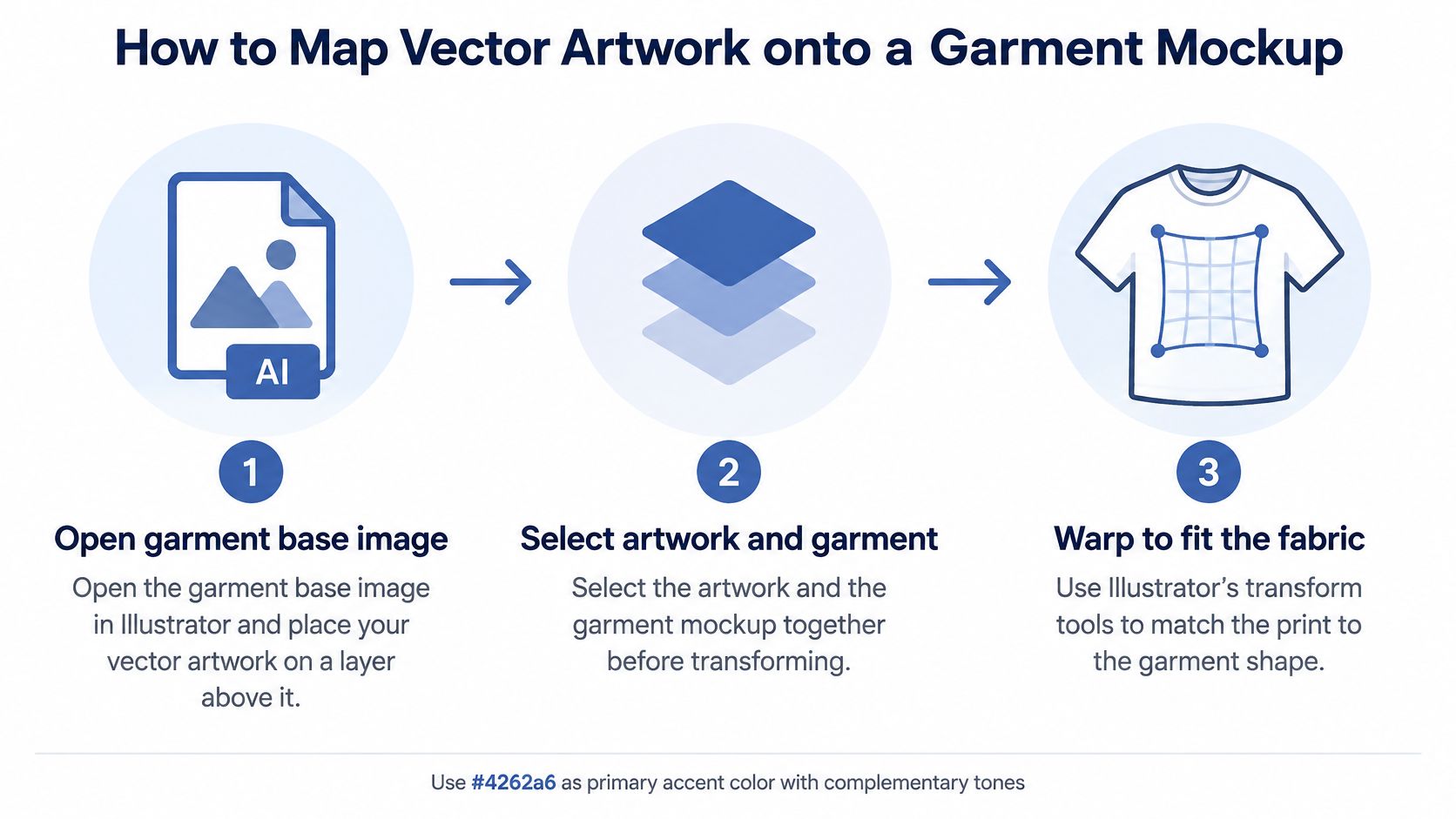
- Open the garment base in Illustrator and place the vector artwork on a layer above it. A front-facing photo with even light keeps the chest easy to judge. A wrinkled, side-lit photo hides whether the logo is centred.
- Select the artwork and the garment image together. Illustrator needs both objects to build the mapping. The usual slip is selecting only the art, then wondering why the command will not build a mockup of the shirt.
- Go to Window > Mockup. Adobe's mockup workflow is vector-first: you select the apparel image and the vector artwork together, then create the mockup.
- Choose Create Mockup. Illustrator maps the artwork onto the garment and converts the vector art into a symbol, so you can edit the image, the mockup group, or the content later without starting over. Map only after stray points and extra boxes are gone, or those leftovers show up in the preview.
- Zoom to 100% and read the chest for stretched letters, cut edges, and a logo that drifted toward a seam.
- Use Edit Content to correct scale, position, or distortion. Rebuilding the mockup is the slow fix. Editing the content is the one that keeps your afternoon.
What a healthy mapped file looks like
The design sits on the fabric instead of floating like a sticker. Edges stay crisp at 100% zoom. The file is still editable, so the next colourway is a swatch change rather than a new composite. That is the result you want before you export anything.
The mapped image communicates positioning and realism. It does not validate ink coverage, how the garment colour interacts with the art, or the printer's separation requirements. Adobe advises matching output settings to the printer or service provider, because resolution and monitor calibration affect the printed appearance. Treat this step as the placement check, and save the print proof for the export pass.
A base photo with honest light makes that placement check fair. The pointers in product photography tips help you pick a garment image that will not fight the artwork.
Export and Color Settings That Protect Print Quality
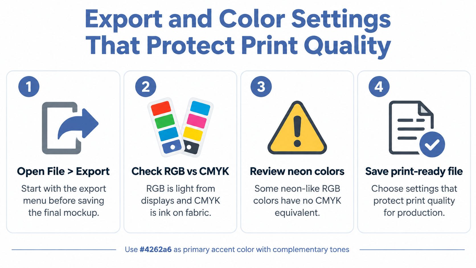
Colour is a production decision, not a screen decision. RGB is light from a display. CMYK is ink on fabric. A mockup can look electric on your monitor and then print darker once the art leaves the colours ink can hold. Setting this before you export is how a first-time seller avoids a reprint and still ships something buyers are happy to wear.
Adobe's print color management steps are the controls that keep the conversion honest.
- Open File > Print > Color Management. You are telling Illustrator how this file should be converted, instead of hoping the desktop printer guesses.
- Select Let Illustrator Determine Colors. One application should own the conversion. Two owners is how a red that looked right on screen shifts on the shirt.
- Choose the profile that matches the output device and material, plus an appropriate rendering intent. A profile built for the wrong material will push the art toward colours that fabric will not hold.
- Turn colour management off in the printer driver. Leaving it on converts the file a second time, and that second pass is what dulls a design you already approved.
- Before you export, check the document colour mode, embedded raster images, overprinting, transparency, and any spot-colour specifications from the decorator. A linked photo in the wrong mode can undo a careful vector file.
- Export the transparent PNG for the mockup as its own file, separate from the production asset. Then export the listing mockup as an sRGB JPG or PNG sized to what your marketplace asks for, so the screen version never replaces the file the decorator prints.
Direct-to-garment, screen printing, sublimation, and embroidery each carry different limits on colour, detail, and resolution. The decorator's profile and specifications should control the final file, not a generic RGB preview used for every method. Adobe notes that monitor calibration, printer resolution, and the selected profile affect the final result, so do not promise an exact match from an uncalibrated screen.
The same care you give a print file applies when you choose formats for 3D design assets: the delivery format has to match the job, or the pretty version becomes the wrong version. If you want a plain walk-through of getting digital art ready for a press, printing digital artwork pairs well with this export pass.
A clean colour workflow lets you ask a decorator precise questions, and those questions are what keep a beginner's first run on the profitable side of a reprint.
Mockup Mistakes and the Three-Gate Check
A polished composite can still mislead you. The attractive preview and the manufacturing file are different objects, and Adobe's Illustrator release notes land in a moment when Firefly-connected image creation, editable vector generation, and new scene tools make photorealistic mockups easier to build. Folds, shadows, garment colour, or generated anatomy can imply a print result the decorator cannot reproduce. An honest flat lay beats a dramatic composite when the drama is not on the product.
Read the symptom before you redraw
| Symptom | Likely cause | Fix |
|---|---|---|
| Artwork looks soft on the mockup | Raster image placed instead of vector | Re-place the vector master and map it again |
| Print looks darker than the screen | Neon RGB colours outside the printable range | Swap to printable swatches and check the color settings |
| Lettering looks stretched | Distortion from scaling the mapped content | Reset scale with Edit Content |
| Design runs past the hem or seams | Artwork extends beyond the print area | Apply a clipping mask to the print zone |
| Shadows suggest a fold the product lacks | Composite lighting added beyond the real product | Use a flat-lay preview for that listing |
Soft art means the vector master never made it into the map. Stretched type means the mapped content was scaled instead of edited. Ink past the hem means the print-area mask was skipped. A darker print means screen-only colour stayed in the production file. Fake folds mean the listing should use a blank-product or flat-lay preview so buyers see the garment they will receive.
Run three gates on one design
Screen proof. Compare the mockup with the intended design at 100% zoom. You are looking for cut edges, wrong proportions, and a transparent background that is a white box.
Exported-file inspection. Place the exact production export into the mockup, zoom for artifacts, and check seams, folds, and both dark and light garment variants. This gate catches the file you intended to send versus the file you exported.
Physical sample or printer proof. Order it before you scale advertising. A sample is a small, exciting confirmation that the listing and the shirt agree, and it is the moment a colourway earns the right to be promoted.
Run all three on one design, then repeat them for each colourway. Each gate catches a different miss, so skipping one leaves a hole the next step cannot see.
When mockup and design steps are the bottleneck, AvatarIQ is built for that pace. It was created specifically for print-on-demand apparel and jewelry businesses, and that is where we recommend you start. It does not require technical skill: if you can copy and paste and click a button, you can use it. Content you make with it can go on Etsy, out through social posts, or to friends and family, and running paid ads is not required. Accurate previews set honest expectations from the first view, and that trust is what brings buyers back for the next drop.
Skup teaches print-on-demand sellers how to pair production-safe Illustrator files with listings that match the shirt in the box, including the Apparel Cloning method for turning proven products into your own designs. AvatarIQ sits in that same workflow when you want mockups and designs without a long setup. Visit Skup and put the next colourway live with a preview you can trust.