Tote Bag with Picture How to Design Print and Sell
You're probably looking at a photo right now and thinking one of two things.
Either it would make a great gift on a tote bag, or it could become a product people would buy if the print came out clean.
That instinct is good. A tote bag with picture works because it sits in two strong buying lanes at once. It can feel personal enough for gifting and simple enough for everyday use. But picture totes only work when the image survives canvas. That's where most beginners get tripped up. Uploading a photo is easy. Getting that photo to look sharp, readable, and flattering on textured fabric is the job.
Table of Contents
- Why a Tote Bag With Picture Is Such a Winning POD Product
- Preparing Your Picture File So It Actually Looks Great on Canvas
- Choosing the Right Print Method for Your Picture Tote
- Designing Placement and Creating Mockups With AvatarIQ
- Listing and Selling Your Picture Tote for Maximum Conversions
- Your Next Picture Tote Launch Made Simple and Exciting
Why a Tote Bag With Picture Is Such a Winning POD Product
A shopper buys a tote with a pet portrait for a birthday. Another wants a family photo bag for a holiday gift. Someone else wants a minimalist fashion tote with a bold image, not a sentimental one. Same product shape, very different buying intent. That flexibility is exactly why picture totes are worth paying attention to.
The tote itself already has a long commercial history. One of the best-known milestones is 1944, when L.L.Bean introduced the reinforced canvas “Ice Carrier,” a design often cited as an early ancestor of the modern tote bag in mainstream consumer use, as noted in this tote bag history overview. Utility came first. Personal expression came later. Now those two uses sit together in one product.
Why sellers keep coming back to totes
The demand side is still there. One market report places the global tote bag market at $5.84 billion in 2025 and projects $6.19 billion in 2026, implying 6.0% annual growth, while another forecast cited in the same market coverage projects a separate market path with continued expansion and notes the printed segment at 7.2% CAGR in projected growth, according to The Business Research Company's tote bag market report.
That matters for POD sellers because picture totes fit right inside the visual customization trend.
The broader POD side is moving fast too. The print-on-demand market was estimated at USD 10.78 billion in 2025 and projected to reach USD 13.06 billion in 2026, with 23.6% CAGR through 2033, and accessories such as tote bags were described as a significant part of that growth in this print-on-demand market overview.
Big advantage: a picture tote doesn't need to be complicated to sell. One strong photo and a clear use case can be enough.
Why beginners can launch this faster than they think
A tote is easier to understand than a lot of products. Buyers already know what it is. Your job is to make the image feel worth carrying.
That's why this category is such a solid starting point if you're exploring best print-on-demand products. You don't need a huge catalog. You need a printable image, a good method match, and a listing that tells the buyer whether this is a gift, a daily carry, or a style piece.
Preparing Your Picture File So It Actually Looks Great on Canvas
A customer uploads a favorite photo, the mockup looks clean, and the finished tote still comes out disappointing. I see that pattern all the time. The problem usually starts with the file, then gets worse when the image is forced onto textured canvas without enough adjustment.
Canvas changes a photo. The weave softens edges, reduces micro-detail, and can make dark areas merge together. A phone image that feels sharp on a backlit screen can print flat or muddy once ink hits cotton.
Start with the highest-quality original you can get. Full-resolution camera files, direct exports, or the original phone photo give you more room to crop and correct. Screenshots, social-media saves, and forwarded images break down fast on totes because compression damage shows up quickly on fabric texture.
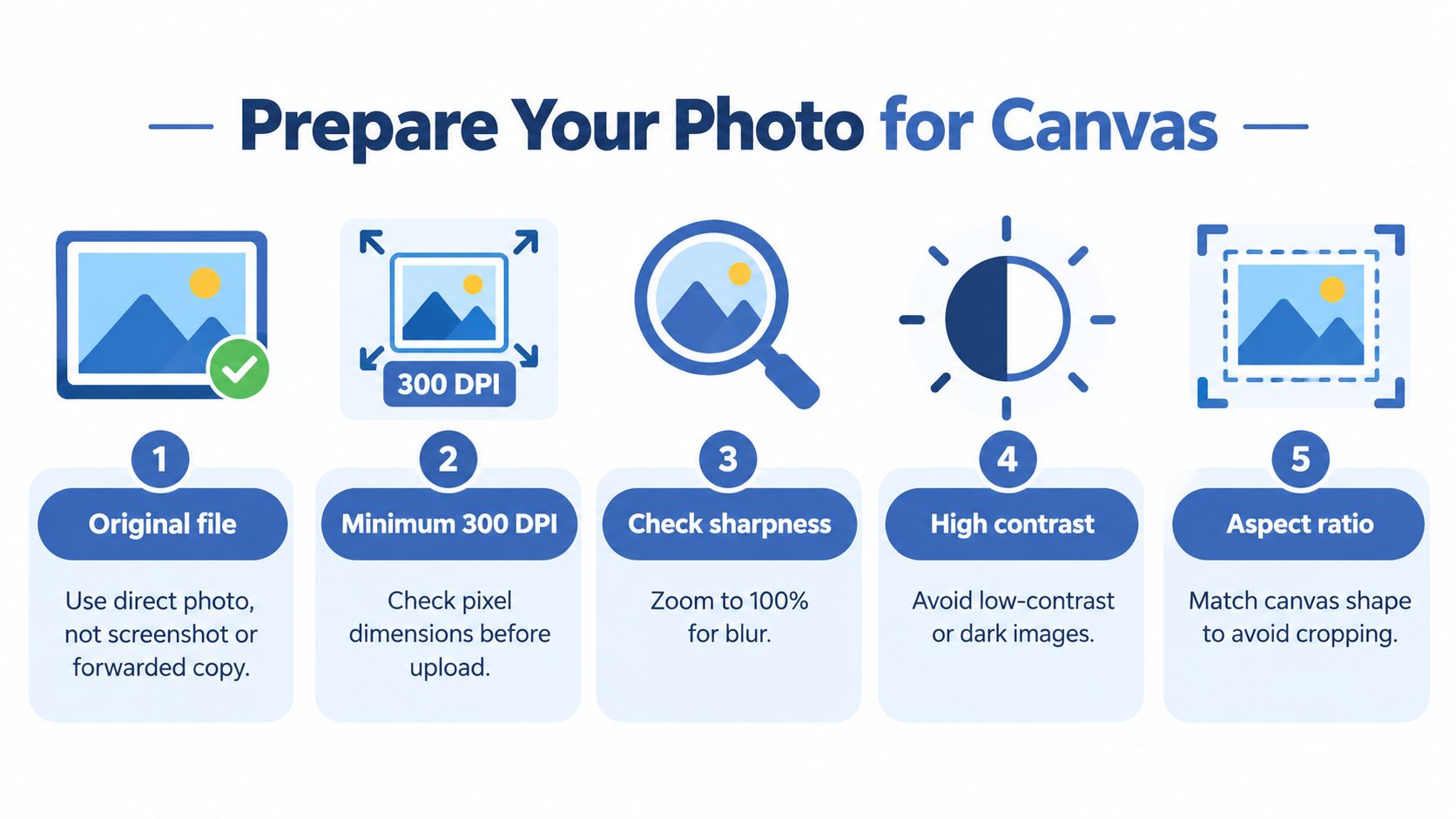
I also check the photo at something close to print size before I approve it. If eyelashes, pet fur, or small lettering already look soft at that stage, canvas will not rescue them. The guide by That Blanket Co is a useful reference here because it reinforces the same discipline. Judge the image before upload, not after a sample disappoints you.
What to check before you print
Use this preflight routine before approving any tote bag with picture design:
- Inspect the focal point at actual size: Faces, eyes, and product text need to stay readable without zooming in.
- Open the shadows slightly: Deep blacks often fill in on canvas, especially on natural cotton.
- Crop for a vertical panel: Tote bags are usually taller than the original photo. Wide scenes often need a tighter crop or a framed layout with margins.
- Keep text large and heavy: Thin script and tiny date lines are common failure points.
- Leave breathing room near seams and handles: A photo placed too high can warp visually once the bag is filled and carried.
- Match image detail to fabric texture: Smooth images with one clear subject usually print better than busy scenes with lots of tiny elements.
Placement matters more than new sellers expect.
A centered photo can still look off if the tote body wrinkles through the middle of a face or if the main subject sits too close to the bottom fold. On canvas bags, I usually keep the important part of the image in the upper-middle print area, where distortion is lower during normal use.
A strong screen preview does not guarantee a strong tote print. Fabric texture, bag construction, and folding all change how the picture reads in real life.
If you already sell art-based products, the same file judgment used for preparing digital artwork for print still applies. Tote bags add one more filter. The image has to survive texture, movement, and daily handling.
The easiest photos to print well
These image types usually hold up best on canvas:
- Portraits with clean backgrounds
- Pet photos with strong contrast
- Black-and-white images with clear shapes
- Lifestyle shots with one obvious focal point
Crowded group photos are harder. They can still work, but only if the key faces stay large after cropping. If a buyer wants every person from a vacation shot on one tote, I recommend a tighter crop or a collage layout instead of shrinking the whole image until nobody reads clearly.
Choosing the Right Print Method for Your Picture Tote
Once the file is solid, method choice gets much easier.
Most sellers overcomplicate this. For a tote bag with picture, the biggest decision is whether the artwork behaves like a photo or behaves like a simple graphic. Then you match that to volume and fabric.
The simplest way to choose
One independent production guide gives a very practical rule set: screen printing fits 1 to 3 solid colors and becomes the cost and durability winner above about 500 units, while DTF heat transfer is the better option for photographic, gradient, or full-color artwork below about 1,000 units. The same guide recommends classifying the art first, matching it to fabric second, and sampling one pre-production print before scaling because textured tote fabric can reduce fine detail readability, according to this tote bag printing methods guide.
That's the framework I'd use every time.
Picture Tote Print Method Decision Matrix
| Artwork Type | Best Method | Order Size Sweet Spot | Watch Out For |
|---|---|---|---|
| Full-color photo | DTF heat transfer | Smaller runs | Fine detail can still soften on rough canvas |
| Gradient artwork | DTF heat transfer | Smaller runs | Poor curing can hurt adhesion |
| Simple 1 to 3 color graphic | Screen printing | Larger runs | Not ideal for photographic tonal detail |
| Bold text plus flat icon art | Screen printing | Larger runs | Setup makes less sense for low quantities |
A walkthrough of the custom tote bag printing process from Dirt Cheap Product, Inc. is helpful if you want to see how production thinking changes once you move from one-off art to repeatable tote runs.
Fabric changes what's possible
Method selection isn't only about artwork. It's also about material.
DTG works best on 100% cotton or high-cotton blends, and it struggles on polyester, nylon, and non-woven polypropylene because water-based inks don't bond properly to those synthetic fibers, as explained in this custom tote bag material guide. That doesn't mean synthetics are unusable. It means you need to stop assuming every tote blank behaves the same way.
Practical rule: choose the blank after you choose the artwork style, not before.
If you're comparing decoration methods more broadly, this overview of direct-to-garment printing helps clarify why some image-heavy products look great on one fabric and weak on another.
What actually causes bad outcomes
These are the mistakes that show up over and over:
- Using screen print for a true photograph: tonal transitions can break down on textured canvas.
- Pushing DTF into a very large run: the image may look good, but the unit economics usually get less attractive as volume climbs.
- Skipping the sample: totes can surprise you because weave texture changes line sharpness and edge definition.
One pre-production sample solves a lot of problems cheaply.
Designing Placement and Creating Mockups With AvatarIQ
A customer uploads a favorite photo, the flat preview looks sharp, and the delivered tote still feels off. I see that problem more with picture totes than almost any other POD accessory.
The failure usually starts with placement, not the image itself. Canvas moves, the panel bows once the bag is packed, and the side seams pull the print area in ways a centered mockup does not show. Photos are less forgiving than simple graphics. A face that sits too low can stretch slightly in use, and that slight stretch is enough to make the product feel cheap.
Place the subject where the fabric stays more stable
For portrait-led designs, keep faces and any meaningful text in the upper third of the printable area. That guidance lines up with common portrait-composition practice from Adobe's photo composition guide, and it translates well to tote printing because the lower panel takes more distortion during real use.
That does not mean every design needs to sit high. It means the fragile parts of the picture should. Eyes, smiles, pet faces, and short names belong higher on the panel. Background texture, loose scenery, and other non-critical detail can drop lower without hurting the design.
A square crop also needs extra care. On many tote blanks, a square image centered vertically looks balanced in software but prints too low once the handles and top hem enter the visual frame. I usually nudge photo art slightly upward before approving it.
A placement workflow that reduces bad samples
Use this check before generating final mockups:
Mark the image element that cannot warp
Usually that is the face, the pet, or the line of text the buyer cares about most.Keep that element away from the lower third
The bottom area is where canvas bulge and fold pressure show up fastest on a filled bag.Leave breathing room near seams and the hem
Photos printed too close to the edges can look cramped, and stitching can make alignment feel off even when production was technically correct.Preview the design on a human-held tote, not only a flat lay
A hanging bag reveals whether the image still reads clearly once gravity and folds change the panel shape.

Build AvatarIQ mockups around real buyer objections
AvatarIQ works best when you use it to answer the questions buyers already have. How big is the photo on the bag. Does the image still look clear from normal viewing distance. Will the print area wrinkle in a way that hurts the subject.
Create more than one mockup angle for each design:
- Front-facing clean shot: shows the picture clearly and helps the buyer judge crop and scale
- In-hand lifestyle shot: shows where folds appear across the image during actual carry
- Slight side angle: reveals whether the subject sits too close to the seam or disappears into the bag's curve
- Closer crop on the print area: helps buyers see canvas texture and understand that the photo prints on fabric, not glossy paper
Gift buyers usually want clarity first. Fashion buyers often care more about how the tote reads as a whole outfit piece. Everyday-carry buyers look for realism. Show each group what they need to see.
Include at least one mockup with natural folds across the lower panel. It sets the right expectation and filters out buyers who expect a rigid, paper-flat photo print.
What strong mockups do, and weak ones hide
Weak mockups hide the exact problems that create returns. They smooth the canvas too much, keep the bag perfectly flat, and crop so tightly that scale is impossible to judge.
Strong mockups show the product while still making it attractive. They keep the hero image high enough to survive distortion, show enough of the tote body to communicate print size, and respect the fact that canvas has grain, bend, and shadow. That is what helps a picture tote convert without disappointing the buyer when it arrives.
Listing and Selling Your Picture Tote for Maximum Conversions
A strong product can still stall if the listing doesn't tell buyers what the tote is for.
The biggest mistake I see is trying to make one picture tote appeal to everyone. It's better to position it clearly. Is it a sentimental gift? A fashion tote with image-based art? A custom everyday bag for errands, books, or events? The answer should shape your title, first image, and description.
Match the listing to the use case
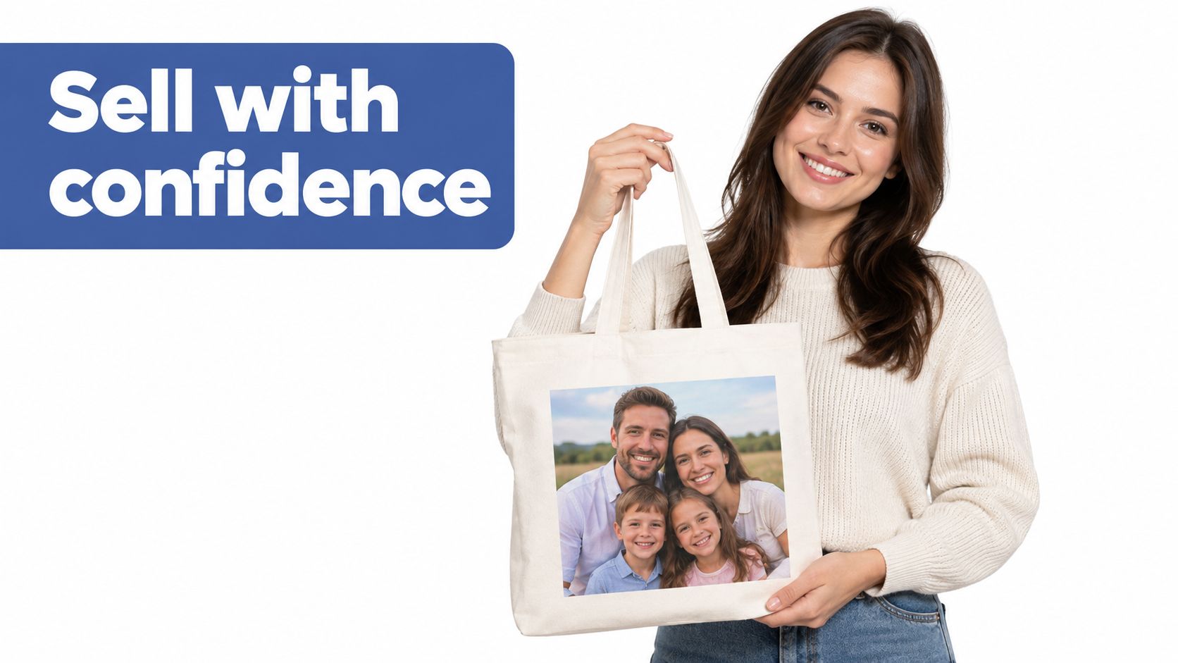
If you're selling to gift buyers, lead with the emotional angle. Use a main image where the photo is large and obvious. If you're selling a fashion-forward tote bag with picture styling, lead with the overall look first and let the image detail come second.
A useful reference point is how curated visual brands present keepsake products. This luxury portrait studio shop from Liz by Design Photography is a good example of how image-based products can feel personal without looking cluttered.
Build the listing around buyer intent
Use this checklist when writing the page:
- Title with clear purpose: Include the product type and the reason someone buys it. “Custom family photo tote bag” tells a different story than “art print canvas tote.”
- Image order that removes doubt: Start with the hero image, then show a close-up of the print, then a lifestyle shot, then a detail that helps with scale or carry.
- Description that frames real use: Mention whether it's suited for gifting, everyday carrying, or expressive personal style.
- Upload guidance that protects quality: Tell buyers to send original photos when possible and avoid tiny text or dark, low-quality images.
- Privacy language that builds trust: If people upload photos of children, families, or events, remind them to use images they have permission to print.
Consent matters more than most sellers think
Mainstream tote listings often skip this, but they shouldn't. A picture tote can include children, private family moments, school photos, event images, or branded visuals. That means sellers should think about consent and rights before fulfillment.
The broader tote market discussion has also highlighted a growing overlap between personalization, gifting, and expressive imagery, while noting that privacy and consent are often overlooked in mainstream tote content, as discussed in this tote bag market trend coverage.
Buyers don't just want to know “Can I upload a photo?” They want to know whether that photo is a good idea to carry in public.
That's a smart angle to address in your listing copy. It makes the product feel considered, not generic.
Your Next Picture Tote Launch Made Simple and Exciting
A picture tote usually looks promising on screen and average in real life for one simple reason. Canvas is not a flat poster surface. It has weave, flex, seams, fold lines, and a carry position that can pull a face lower or bend text around the side of the bag.
The sellers who get repeat orders account for that before they launch. They choose images with a clear subject, leave enough margin around the photo, place the print high enough to stay visible when the tote is filled, and test on a fabric that suits the image style. A soft family photo can fail on a rough natural canvas. A bold pet portrait or high-contrast black-and-white image often holds up much better.
The category still has room for careful sellers, as noted earlier. That matters, but market growth alone does not make a tote sell. Print discipline does.
Start smaller than you think.
One clean launch is enough to learn a lot if the concept is specific. Run a pet memorial tote, a travel photo tote, or a simple custom portrait tote. Pick one print method, one blank, and one placement strategy. Then order the sample and look for the problems, muddy midtones, faces landing too low, strap interference, or edge distortion near the side seams.
That sample tells you more than another week of planning. After a few launches, the pattern gets obvious. Images with strong contrast convert better on canvas. Center placements usually need to sit slightly higher than new sellers expect. Busy full-bleed ideas look exciting in mockups and disappoint fast on actual totes.
If you want help turning ideas like this into real products faster, Skup gives POD sellers practical training, proven launch frameworks, and tools built for the actual design-to-listing workflow. Their Apparel Cloning training and AvatarIQ software fit this category especially well if you want to create stronger picture totes, better mockups, and launch with more confidence.