Let’s start by playing a quick game of What Comes to Mind First?!
Let’s play around with some word association; I’ll list a few phrases, then scroll down to see if our answers match up!
A beverage
An informational hub
A computer
A burger

Coca-Cola
Apple
Mcdonalds
If you are amazed and think I can read minds, you’re wrong.
Google is even recognized as a flippin VERB in the English Dictionary! A company went from a dorm room project at Stanford to being a prominent verb that flies out of the mouths of billions of people worldwide!
Although each of these companies has hundreds of competitors, they are the leaders in their industry because they have brilliant branding tactics.
Branding is so easily overlooked when starting a business, although it is integral to its success.
A common assumption is that you, a business owner, need to rush to put together your store and get it out into the market so you can quickly generate sales – you can work on the frills of brand personality later.

This is a rather large misunderstanding; your branding should be the core of your business, you should have your brand strategy set up to create your store correctly.
A brand is not only the cosmetic features; it is the core foundation of your business, its very own personality.
Just like the way you and I carry ourselves – through our selection of clothing, our taste in music, our interpersonal relationships and who we choose to surround ourselves with – it’s our form of branding ourselves- you can apply the same to your business.
You should brand your business the same way, by its visual aesthetics all the way through to the tone it encompasses in product descriptions.
You had an idea, an image of what you wanted to create and the people you wanted to sell to. Take all of these attributes and make it something tangible and real.
I’m going to take you through the fundamentals of building a brand, from the identity and tone all the way to the unboxing experience – the branding adventure!

Utilize the brand personality spectrum below to assess your business’s core identity:
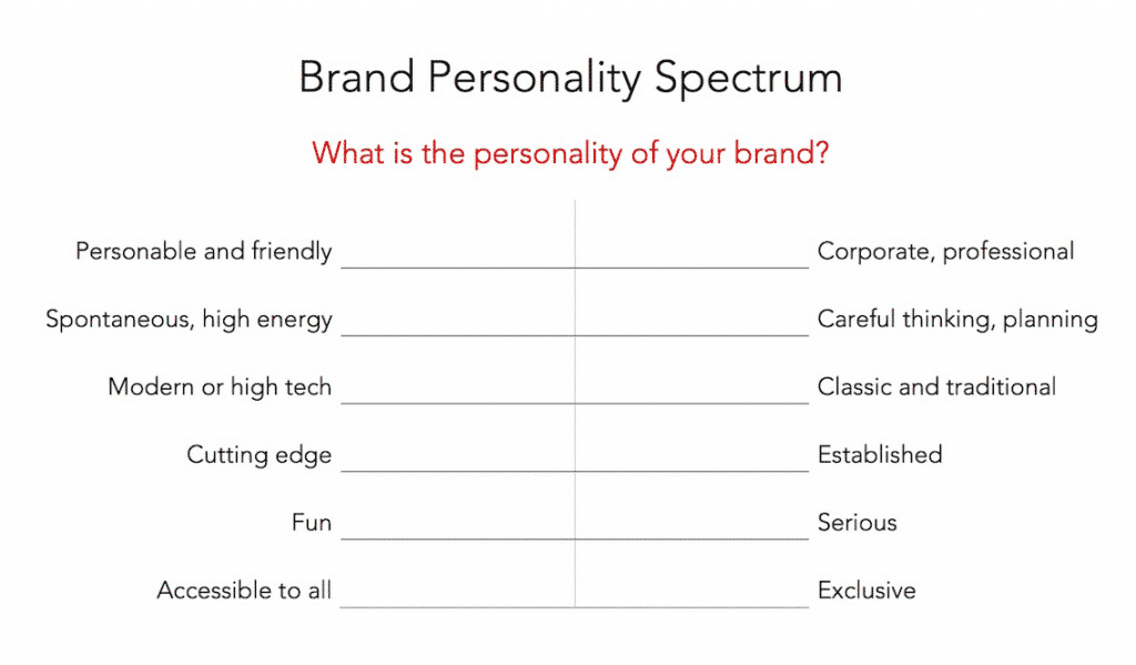
Once you have taken the time to accurately assess where your business lies, come up with a list of 3-5 adjectives that describe what you want your brand to encompass.
If you are drawing a blank because I just put you on the spot, do not fret! You can head over to this site and take advantage of their list of adjectives!
Now that we have established the building blocks of your brand, we must consider an essential factor for your business as a whole:
Your customers are the sole reason your business exists. Yes, you may be passionate about establishing a thriving business, but without that customer base, that business will not survive.
With that being said, we need to formulate your customer personas.

After all, you are selling to them, so don’t you want to know how to EFFECTIVELY?
If you are brand spankin new and don’t have a customer base yet, construct a general idea of what your quintessential customers would be.
If you have had a few sales by now, use your data and analytics to establish your persona’s.
While crafting these customer persona’s, you need to focus on factors such as their:
I recommend making three customer prototypes to keep in mind while creating your brand strategy.
Seek out your competitors – assess their layout and designs and gauge their tone and inspect their images.
INSTEAD OF MIMICKING, put your hours of extensive research to good use and make yourself STAND OUT and fill in the gaps your competitors are missing out on.
You need to take the time to figure out what you can do better than everyone else in the market.
Every single company has a competitor; however, each company has their own distinct branding.
For example:
Everything from their color schemes to their mission statements is vastly different even though they are targeting the same audience. Each brand has its own unique identity – which is the reason they are competitors, not followers.
The reason I am telling you to rework it is due to the weight it carries. Your brands’ identity is how your customers will perceive your business and differentiate it from the competitors, plus – since you’ve done your research, you now know the gaps you can fill!
Now is the time to set yourself apart!
Utilize Kapferers brand identity prism:
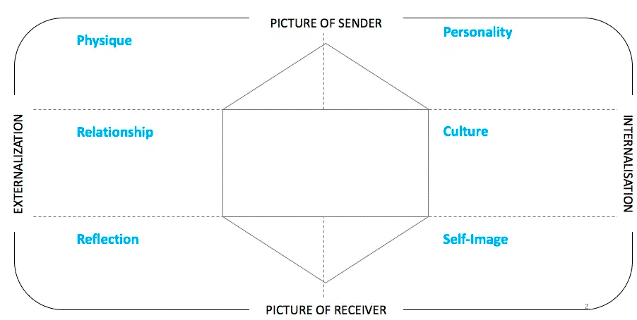
This model was created to build strong brand identities with apparent core values.
Every company out there applies Kapferers prism in the construction of their brand identity, and it would be wise for you to do the same.
The unique selling proposition is a statement that that explains the factors that distinguish your services and offers from your competitors.
If you need some inspiration, check out M&M’s unique selling proposition:
“The milk chocolate melts in your mouth, not in your hand.”
The little chocolate sphere’s use the benefits of their hard candy shell as their unique selling proposition, unlike other chocolates that leave a mess while eating them, these candies were able to set themselves apart from the rest.
Alright friends, we have finally been able to establish your brands’ core identity. Write it down and keep it nearby, we will be referencing back to it quite a bit!
If you already have it squared away, then go ahead and proceed to the next section.
Alright, one thing to keep in mind when formulating your business’s name – DITCH ANYTHING GENERIC.
The name of your business is going to be the first impression your customers have of you.
Jan’s Gardening Store Direct sounds about as thrilling of a shopping experience as going to the DMV.

It’s not creative, and it’s uninspiring.
Reflect back on that core identity and start writing. Write anything that comes to mind, silly or eloquent, who cares – this is a creative process, and great things happen from inhibition.
There are companies out there that have sprouted from made up words like Xerox and Pepsi.
You can incorporate numbers just like SMAR7 Apps and 7-Eleven.
You can even combine words just like Netflix and Pinterest have.
The general rule is to be genuinely original.
One tip to keep in mind: stay mindful of the domain availability when choosing your store’s name – narrow down your searches with this in mind.
Studies have shown that color selection can increase brand recognition up to 80%, so you want your color associations to lie within your core values!
Although you may think its a hock of bologna, I really do recommend referring to the color psychology graphic below.
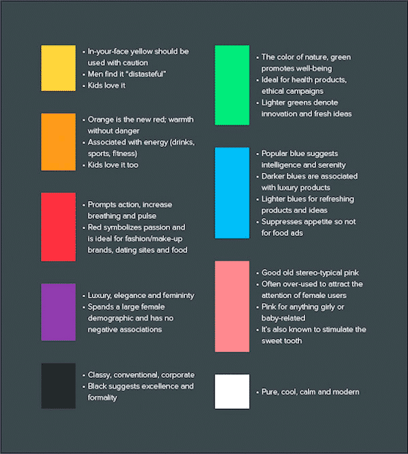
If you want a more in-depth look into the power of color psychology, check out the following article our friends over at The Los Angeles Film School organized: The Psychology of Color
I recommend selecting one primary color for your brand and then choosing a palette of complementary and analogous colors to infuse into your virtual store.
If you are anything like me and can’t even pair a matching outfit, or create a robust color scheme for that matter, then refer to the tools I have compiled below to make the process easier for you.
This app allows you to upload a photo to populate a color scheme, or you can browse hundreds of pre-generated color schemes.
You can create color schemes using the color wheel or choose a pre-existing color scheme established by the Kuler community.
This site is exceptionally user-friendly and tad bit addicting – scroll your mouse over the screen to generate colors accompanied by their specific HEX #’s.
You can find a designer through UpWork or Fiverr and have a beautifully crafted logo created for a fraction of the cost elsewhere.
Keep it simple!
Busy logos can confuse and appall your visitors, anything over the top is bougie and tasteless.
As mentioned a couple of times already, refer back to your core ID and convey it to your designer, do not let them take a shot in the dark or else you will be wasting time on both ends.
Your logo should be scalable, meaning it should look as amazing blown up as it does scaled down into a little favicon.
Be sure to let your designer know that your logo must have a transparent background – you want it to appear naturally placed on your site instead of a big ol’ massive eyesore.
Below I have included examples of charming yet straightforward logo’s for you to reference.



I know that sounds about as thrilling as selecting toothpaste, but the impression it leaves your customers with is colossal.
The look of the letters written on a page can impact the way your customers perceive you, so you want the typography to, once again, reflect your core ID and values.
You should select two fonts to exploit on your store, one for the headers, and the other for the body text.
You can get a lil crazy with the header text because it will be larger than the body, so added curves and swoops might add a nice touch to your brand personality.
For the body text, keep it refined and uncomplicated. It must be legible at any size, you will have mobile visitors, and you want them to be able to read the descriptions you worked so hard on clearly!
There are thousands of fonts to choose from, and although it is not consciously apparent, the pairing of cohesive fonts is imperative. Utilize font pairing guides, such as the ones provided below, to combine refined and aesthetically pleasing combinations.
They call themselves the typographic dating game, and there is really no better way to describe it.
You select a font from their list and they provide a complementary one.
Provides you a collection of great font pairings around the internet.
Figuring out the tone to use should be the most straightforward task to tackle, you not only need to reference back on your core ID, but you should also look back on your customer personas – that is who your brand will be speaking to.
Your brands’ tone should be present everywhere from the headlines to the product titles and especially in the product descriptions!
I know it sounds like a lot of work, but I did mention this should be the easiest assignment because we have created a Copywriting Bible to help you craft the perfect descriptions to use on your store.
You need to speak to the audience you are selling to, and we know it can be hard to place yourself in other’s shoes, so we have compiled a ten minute read for you to write like a pro.
Make your customers feel like they need your products NOW by downloading our free Copywriting Bible here.

The importance of appealing product images is monumental. You are an online retailer, and one disadvantage you have is that your customers can not inspect and get a good feel for the product you are selling.
That disadvantage can turn into a profitable opportunity with visually appealing product images!
The look of your product images should match your brands’ tone and identity.

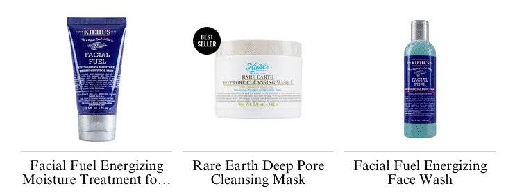

As you can see, the best images are the ones with no distractions, white backgrounds and congruent in size and positioning.
Your products images should be so clear and visually stimulating that your customers should basically be envisioning themselves with it!
If you are not at a stage where taking your own product images are attainable, use Photoshop or GIMP to edit the pictures you do have access to and make them seem like your brands original work!
Alright friends, we are nearing the finish line!
One final aspect to keep in mind is not going to be located within the web address of your domain.

Buying online is equivalent to receiving a present in the mail- it’s not the same as instantaneous gratification as purchasing something from a brick and mortar.
Your customers are continually checking tracking information and eagerly awaiting their packages, why not add a special unique touch and wow your customers with your own crafted unboxing experience.
Companies that absolutely slay at the unboxing experiences are:
Chegg
Textbooks aren’t necessarily the most thrilling things to purchase and receive, Chegg adds a special touch by accompanying them with RedBull, Tide Pods and other necessities college students may find useful.
Birchbox
Although they don’t add anything alongside the awesome luxury product samples, the way they address their subscribers makes the box a pleasant arrival. Greetings include “To the Fabulous ____” and “___ the Magnificent”.
Daily Harvest
This superfood subscription box includes magnets with their deliveries to decorate your freezer with.
Alright friends, I have provided you with the fundamentals of branding your business. You now know how to establish your brands identity, create your customer persona’s, and even have access to some creative inspiration! Make sure to download your free Copywriting Bible, take advantage of it and leave your comments below!
Great information. Thank you..
Always happy to help 🙂 Thanks for the feedback!
Great information thanks! Lot to take in- totally different than my day job so really apprecite the links for extra information and ideas.
No!Thank you! for your time.
Making dreams come alive
Nooo… Thank you!!
We strive to make your dreams come true so make sure to stay in the loop – if you’ve subscribed you will get more of this awesome content straight to your inbox 🙂
Thanks for another great blog Patricia. You are a true guru!
Thanks for taking the time to read it, Alexander!
Thank you Devin for this wonderful information. Its very helpful, specifically to me that I am just new in this business.
We’re glad you enjoy it!
Really helpful information! I stumbled across this article at just the right time! Thank you for the tips!
Thank you for the feedback, Kassie! We’re glad you enjoyed it 🙂
In the product images section what tool do you use to edit the pictures? It was never named and there was no link to it in the post. Please help!
Good eye! 10 pts for Parker 🙂 So the tools are either Photoshop or GIMP, which is essentially a free version of Photoshop
This is awesome you guys!! Thank you!!!
YOU’RE awesome Holly!
I’ve learned a great deal from this article. Please continue to share.
We definitely will!
Wow! Very powerful. Thanks so much for sharing
Of course! We’re here to help
Fantastic article
We’re glad you enjoyed! 🙂
I really enjoyed this article. Its packed with so much useful information. Thank you. I’m saving it to refere back to . I will also keep in mind about how to enhance the customers unbox ing experience. (Puppy is sooooo cute!!! too.)
Well appreciated.
Antoinette.
Make sure to share with your friends 😀