It’s no secret that small to medium-sized e-commerce stores have a harder time breaking into the online retail space.
Finding a unique product to market, developing a brand strategy, and keeping up with an ever-evolving social media presence can be too hard for one person to manage.
But every business starts at square one and endures the long, hard uphill hike to success.
We’re going to dive deep into a Shopify store and see how they battled their way to the foreground of e-commerce. I’m honing in on their products, store design, and brand identity so you can see what it takes to get to that point of success.
I present you, Baboon!
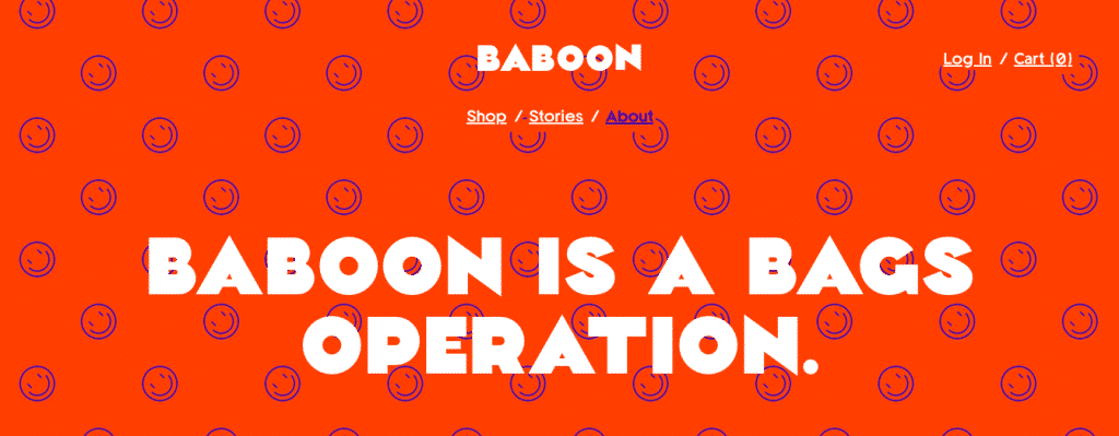
Baboon is a ‘bags operation’ that loves to illuminate the fun and weird sides to any adventure.
The art inspired tactical bag company launched in July of 2018 and has quickly gained traction due to their vibrant and mysterious social media presence as well as their quip-like ads.
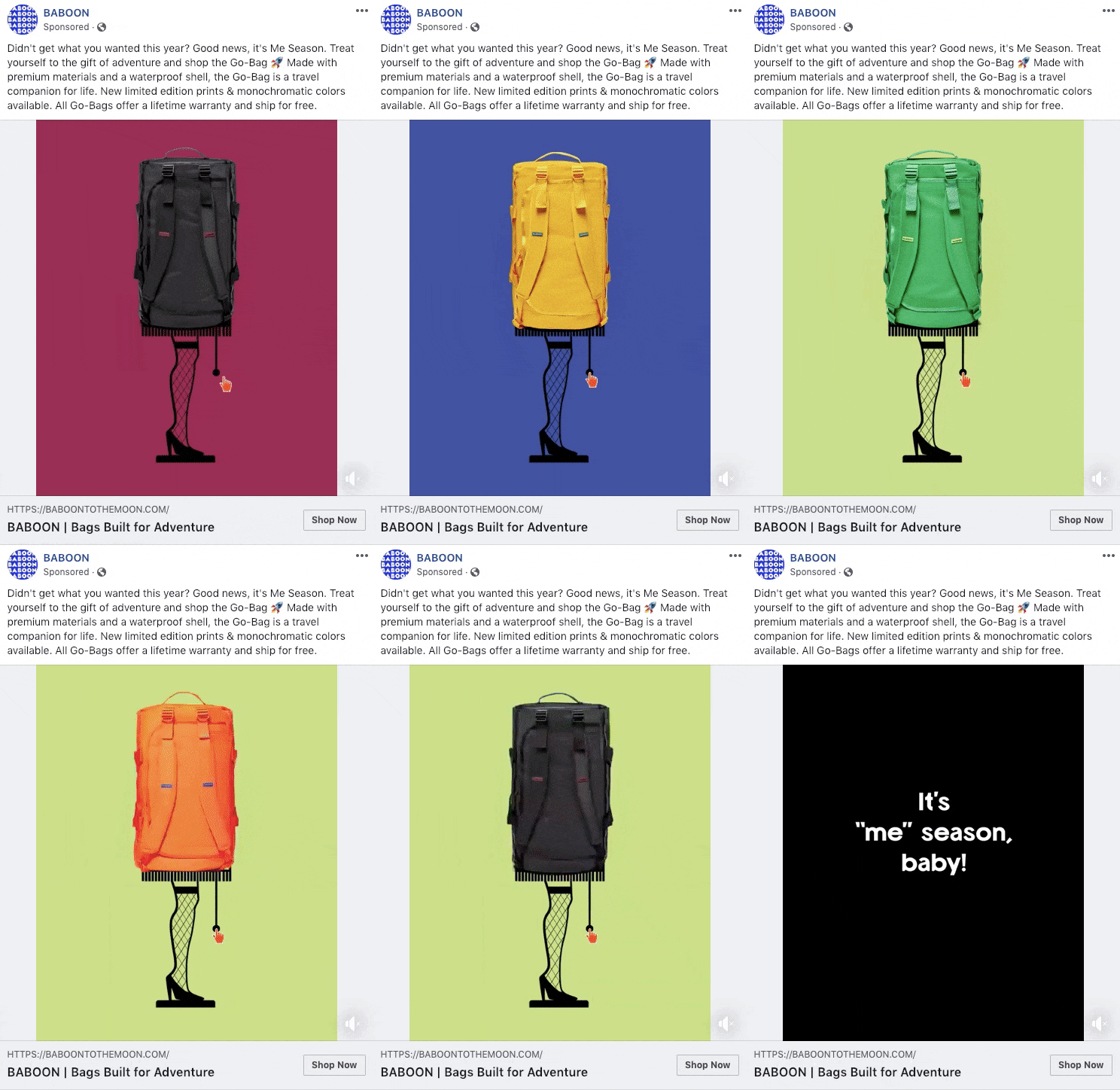
Baboon takes the seemingly boring luggage niche and turns it into a memorable and fun shopping experience – which ultimately separates them from other luggage companies such as Away and Herschel.
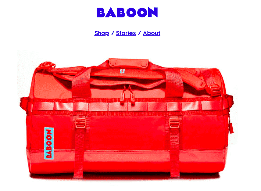
Baboon focuses on selling one thing, and one thing only – their Go Bag.
The bags are available in different external colors and interior prints for variety, as well as two sizes.
The main focus and selling point is on this one product.
The focused product line allows them to center all of their attention on that item’s unique selling points without any extra distractions impeding them.
Instead of spreading their marketing thin on a mixture of different products, they focus on selling one product really well.
Homepage
The shipping bar is visible in the header, and it advertises two incentives – free shipping as well as a lifetime warranty on their bags. It’s always best to be upfront with any incentives of the like because it will make visitors more inclined to buy when they know:

The navigation menu is laid out horizontally in the header, so it’s visible for the customers. By only offering three menu items to select from, the navigation menu is straightforward and doesn’t distract the visitor from anything other than the “Shop” option.
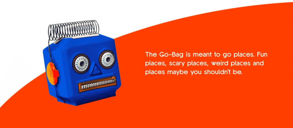
The color scheme of any store should be made up of complementary or analogous colors- and Baboon nails theirs with the complementary color scheme of blue and orange. It’s visually pleasing for the visitors, and allows certain elements, such as the call to actions, stand out from the rest of the features on the page.
The background of the site is white, excluding the about us page, which enhances the visibility of the main focus points – the product images and the add to cart button.
The product images have consistent angles and backdrops, making the site appear uniform and professional. The white backdrops make the items seamlessly fit onto the page, and allow for easy edits of the photo’s themselves, so the attention is solely on the product.

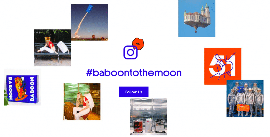
Baboon shows off its social proof loud and proud. On the homepage, Baboon has integrated its Instagram accompanied by a custom hashtag, their blog/stories which features artists that use the products, and press that has featured Baboon in their editorials, such as GQ.
Product Page
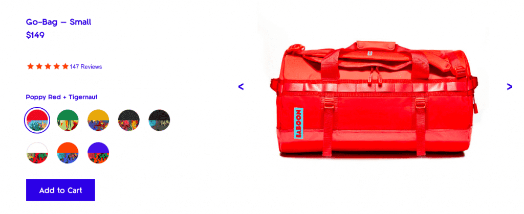
The product titles are short, concise and related to the product and the brand. Go-Bag – Small or Go-Bag – Large is straightforward and to the point. There are no additional fluff words such as awesome or durable – you can include the fluff in the product descriptions.
The variants on the product page are linked to the product images. Connecting the product images to the variants allows customers to quickly see the variety of products instead of having to click through all of the images one by one manually.
The add to cart button is bold and easily visible because it’s optimally placed above the fold, meaning they don’t have to scroll to see it. Your customers should never have to scroll to see the add to cart button.
Below the add to cart button, there are organized product descriptions in tabs, so customers can easily find the information they want to see.
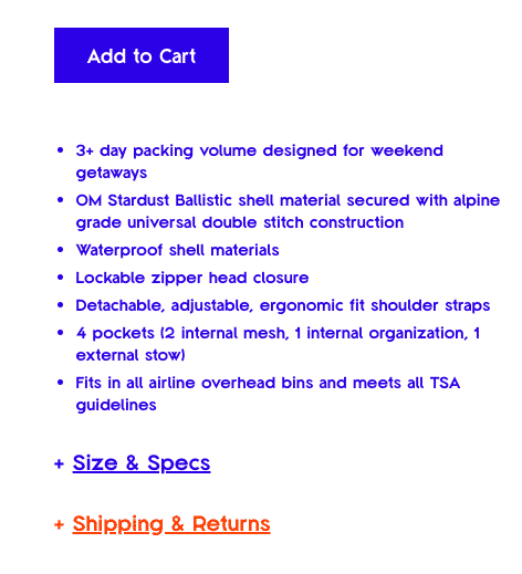
The sticky cart allows the customers to easily add the item to the cart while they are reading product descriptions and reviews. It has the same color and format as the stagnant add to cart button on the top of the page – congruency and consistency with buttons are crucial.
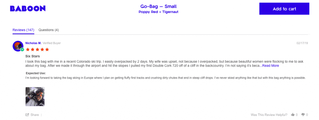
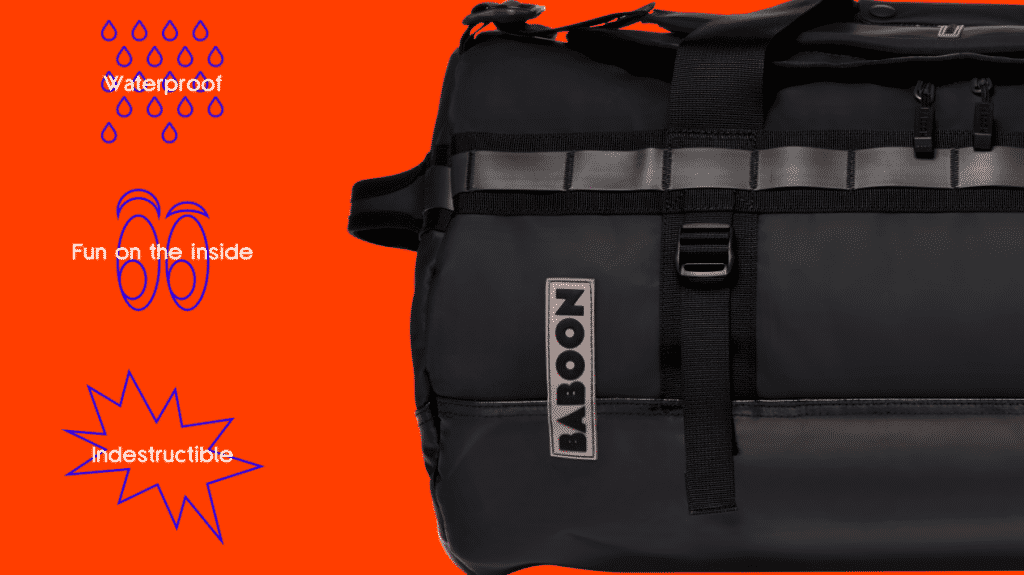
Baboon includes sections that accentuate the UVP on the product page:
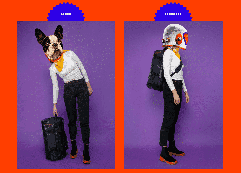
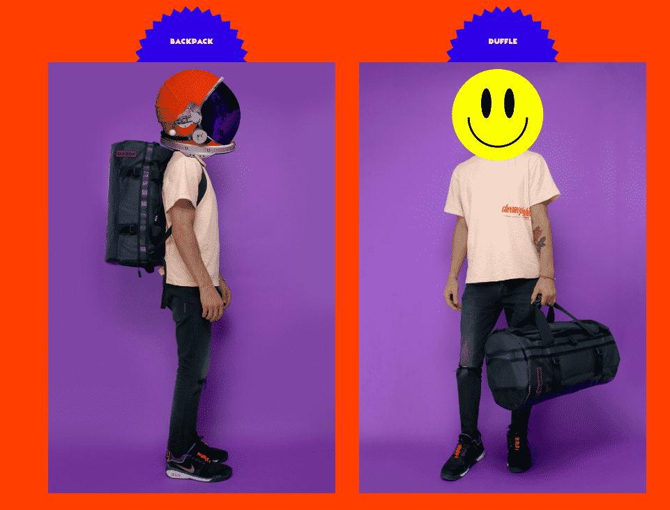
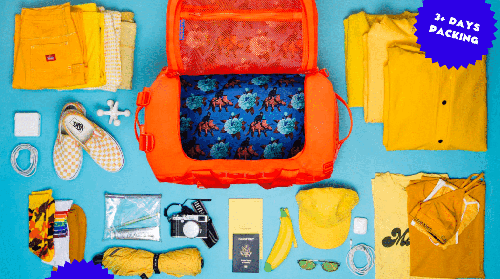
In addition to emphasizing the UVP, these sections also allow the customers to envision themselves with the product tempting them to make the purchase.
The typography they use on their site is simple and easy to read. The color of the font is dark enough to distinguish the words from the rest of the elements on the page.
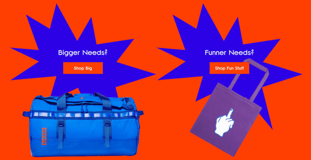
The recommended products section at the bottom of the page is an easy way for Baboon to cross-sell its other products, increasing the average order value.
Checkout Page
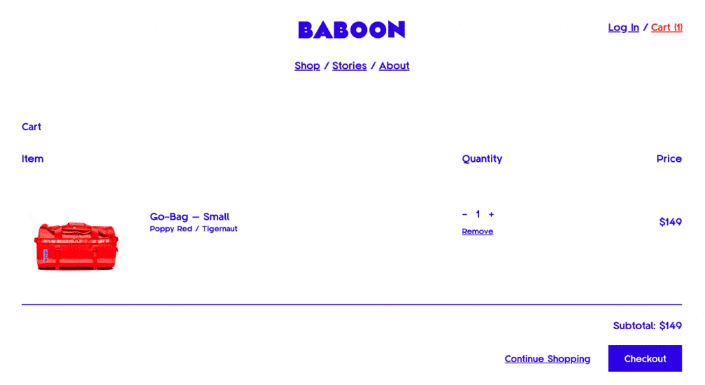
There is little white space, making all of the essential elements, such as the checkout button, fall above the fold.
The product image in the cart is perfectly sized. It doesn’t take up unnecessary space. The customer can view detailed pictures of the product on the product page, the purpose of the image on the cart is to make sure that the customer is ordering the correct product, so it doesn’t have to be very large.
The checkout button has the same format as the add to cart button (solidifying my point on the congruency and consistency) and sticks out from the only other button on the page – the continue shopping button
On the shipping and payment pages, the customer’s information is pre-filled, and it also allows the customer to proceed through the checkout as a guest – which is the preferred option for most people.
The most significant focus for any branding efforts is consistency. Consistency across a store, in the ads, in email campaigns, and any other outlet that your customers will interact with is essential.
Baboon has mastered the art of brand consistency.
Their tone and voice are playful and mysterious – which not only carries throughout the copy they use to interact with their customers but also in the design and color elements they chose to represent their brand.
Baboon decided upon their name because of the silly nature of the animals, which encapsulates everything the brand stands for. The outlandish designs and use of humor make it easy for the target audience to resonate and align with the brand, as you can see by the witty customer reviews.

In addition to communication, they have strict guidelines upon the way certain elements appear on the store. For example, all of the product images are shot at the same angles and have the same brightness and contrast – which emphasizes the bright, playful colors of the products.
Forming a brand identity and personality is crucial for a successful, memorable business.
We can attribute Baboon’s ability to go from a concept to a successful e-commerce business within six months to their awesome marketing focused on its core product, simple store design, and vibrant, entertaining branding!
I hope Baboon has inspired you as much as it has me, now you can take these easy concepts to create a framework for your store!
Leave a comment below letting me know which brands inspired you to start your business – we all have one!
12derk70@gmail.comi love the the education the why’s and the construction the meaning the conclusion s I need some products to run with thanks derk
Luckily for you, we’re going to be doing a Shopify store breakdown each month so hopefully, they will give you the inspiration for your products!
Amazing Breakdown, it makes sense how they were able to put it together so well and efficiently. It stands out. I don’t have a store in mind but this gives me a way to assess how other ecommerce stores are laid out. Thanks for doing that.
I’m glad you found it so valuable, Patricia! Hope it gave you some inspiration!
It seems to me that even though they are new in the market, the people behind it are not new to marketing and to the industry. Do you think it’s advisable for a beginner to hire a marketing expert to work out the presentation of the product? Or maybe just to take some time to study visual programming ourselves?
I don’t believe it’s necessary to hire a marketing expert. There are so many online resources and books that will give you the same insight, and it will be worthwhile learning it yourself. You can start with The 22 Immutable Laws of Branding by Al and Laura Ries
Although I enjoyed this breakdown, it seems so far out of my reach that it feels like a fantasy to me. I don’t have the funds to have a custom built theme with all the moving parts and special options shown on this site. Nor do I have one product that I have developed that I can choose to sell. I’m feeling a little bit lost with the breakdown and how it’s relevant to a small independent, underfunded business like mine. I can take a few pointers from this and apply them to my store, but I doubt it will have the impact that these extremely creative people have had on their market.
That’s not the mindset we aim for here at SMART Apps, Barbara! You need to get on board and find that passion 🙂
I chose them for the breakdown because of their simplistic approach to store design – they have a cohesive color scheme, buttons correctly placed, great descriptions and copy.
It doesn’t matter if you have a custom product or if you are dropshipping one, as long as you have an awesome product then you will be able to sell the heck out of it.
The purpose of this article is not to copy and paste, it’s to see what is currently trending for store design and branding now so that way you can implement similar practices on your store. I mention the product only because they are focusing on selling one awesome product instead of spreading themselves too thin on a huge catalog.
I hope this comment helps clarify the objectives!
Thank you for this breakdown.
I love every single thing that you pointed out. These guys are real genius marketers. I sure hope that I can incorporate their system into what I want to do.
Thanks, Sanja
They definitely lay out a good foundation for some inspiration!
nice write up…also I’m considering purchasing from baboon..
You writing style has compelling gestures….some sales..nice
I’d be lying to you if I told you my bank account didn’t take a beating during the writing of this article.
Thank you for this great post, truly appreciated.
I’m glad you’ve found it valuable, Rukon!
This was a great visual aid that really echoes a lot of Patricia feedback on the facebook live videos. I’m only on my 3rd day of week one but I will definitely be using this as I move forward into week 2. Great stuff!
Now you have something tangible to reference 🙂
I was JUST on their store admiring their set up and then I get this email. Amazing breakdown. Definitely inspired to do more with my store set up.
Sounds very serendipitous to me! They definitely nailed what they aimed for.