Home » Blog » Conversion Rate Optimization Shopify: POD Playbook to Boost Sales
You've driven a ton of traffic to your new print-on-demand store—congrats! But then… crickets. Visitors are clicking around, looking at your awesome apparel, and then leaving without buying a single thing. Sound familiar?
This is your playbook for fixing that. We're going to dive deep into conversion rate optimization for Shopify, specifically for entrepreneurs like you. The goal is to turn your store from a digital window display into a sales machine that actually makes you money. It's an incredible opportunity, and you're in the perfect position to seize it.
Your Blueprint for Turning Visitors into Buyers
Getting traffic is only half the battle. Seriously. The real magic—and the profit—happens when those visitors pull out their credit cards. This whole process is called conversion rate optimization (CRO), and it's the single most powerful lever you can pull to grow your POD business without just throwing more money at ads.
It’s how you build a sustainable, high-margin business and turn unpredictable traffic into a revenue stream you can count on. The world of eCommerce is booming, and there has never been a better time to build your dream brand.
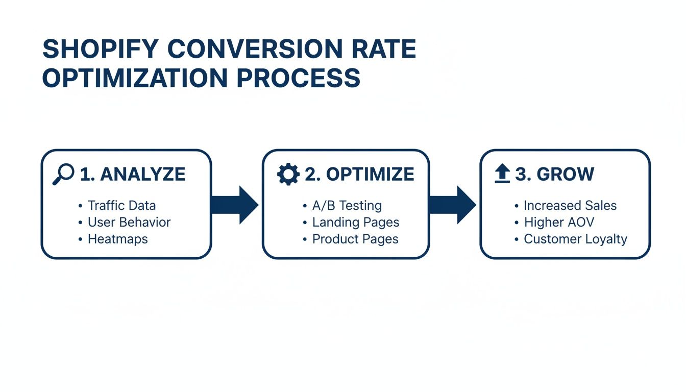
Think of CRO as a continuous cycle. You analyze the data, make smart changes, and measure the growth. It’s not a one-and-done fix; it's an ongoing, exciting process of improvement.
The Massive Opportunity Hidden in Small Tweaks
I've seen so many store owners get stuck when traffic is high but sales are low. The gut reaction is always, "I need more traffic!" But honestly, the real opportunity is usually hidden right there in your existing store experience.
Tiny friction points—a confusing layout, a slow-loading page, or a checkout process that feels a bit sketchy—are silent sales killers. Fixing these little things is where you'll find massive growth.
The average Shopify conversion rate hovers around a solid 1.4%. That means for every 100 visitors, 98 of them are walking away empty-handed. For POD sellers, that number should be a call to action.
Why? Because the top-performing stores are hitting 4.7% or higher. That's not just a small bump; that's potentially tripling your sales from the exact same traffic you already have. Imagine what that could do for your business!
Shopify Conversion Rate Benchmarks to Aim For
Not sure where you stand? Use this quick overview of Shopify conversion rates to benchmark your store's performance and set clear goals for growth.
Performance Level
Average Conversion Rate
What This Means for You
Needs Improvement
Below 1.0%
Something is actively turning people away. Focus on fixing major friction points first. This is a huge opportunity!
Average
1.0% – 2.0%
You're in the majority, which means there's a huge opportunity to stand out from the pack.
Good
2.0% – 4.0%
You're doing things right. Now it's time to refine and optimize for even bigger gains.
Excellent
Above 4.0%
You're in the top tier. Keep testing and innovating to stay ahead of the curve.
These numbers give you a clear target. If you're sitting at 1.2%, your first goal should be to break that 2% barrier. Every tenth of a percent matters.
CRO isn't about tricking people into buying. It’s about creating an experience that's so smooth, intuitive, and trustworthy that hitting "buy now" feels like the most natural next step. It’s about building genuine confidence in your brand.
Shift Your Mindset From Guessing to Knowing
To really succeed, you have to stop guessing. No more randomly changing button colors and hoping for the best. It's time to adopt a data-driven approach where you identify the "leaks" in your sales funnel and prioritize changes that actually deliver results.
This guide will give you the exact strategies to make that happen. But before we get into the nitty-gritty Shopify tactics, it helps to understand the bigger picture. These proven CRO tips for improving website conversion rates will give you a solid foundation to build on.
This playbook is designed to give you an actionable framework, focusing on what works for POD apparel stores. You’ll learn how to:
Diagnose Bottlenecks: Pinpoint exactly where you're losing customers.
Prioritize High-Impact Tests: Put your energy into changes that truly move the needle.
Implement Winning Strategies: Apply proven tactics for product pages, offers, and checkout.
This is where things get really exciting. By focusing on CRO, you're taking direct control of your store's profitability and building a business that can thrive for years. Let's unlock that potential together.
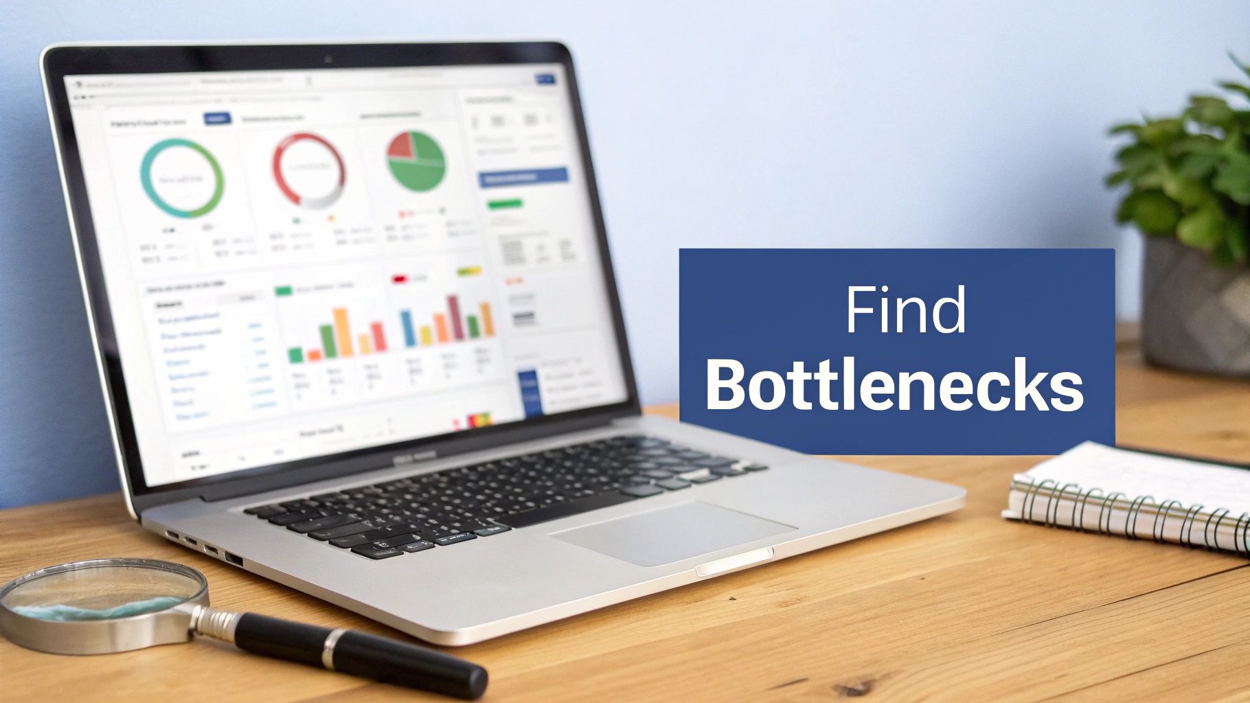
Finding and Fixing Your Conversion Bottlenecks
Before you start tweaking button colors or A/B testing headlines, you need to play detective. The whole game of conversion rate optimization for Shopify boils down to one simple question: Where are my potential customers getting stuck? A great answer to this question puts you on the fast track to success.
Your store’s data tells a story, and hidden in that story are the exact spots where your sales funnel is leaking cash. Think of this as a quick-and-dirty conversion audit. You're hunting for the high-traffic pages where a surprising number of visitors just vanish into thin air.
Start with Your Store’s Data
You don't need a bunch of expensive tools to get started. The analytics you already have are more than powerful enough to spot the major leaks. Shopify Analytics and Google Analytics are your best friends here.
Your mission is to pinpoint your store's biggest "drop-off" points—the specific stages where would-be buyers lose interest and bounce. This isn't about becoming a data scientist overnight; it's about spotting obvious patterns.
Here's where to focus your investigation:
High Traffic, Low Conversion Pages: Find product pages getting tons of eyeballs but barely any "Add to Cart" clicks. That’s a massive red flag. Something on that page—the images, the description, the price—isn't connecting.
High "Add to Cart," Low "Reached Checkout": Are people loading up their carts but never even starting the checkout process? The problem is likely your cart page or a confusing next step. Maybe the "Checkout" button is hard to find.
High "Reached Checkout," Low "Purchase": This is the classic cart abandonment scenario. If you're losing people at the final hurdle, the culprit is almost always unexpected shipping costs, a clunky form, or a lack of trust signals like security badges.
Focus on the biggest leaks first. It's simple math. Fixing a page where you lose 50% of your traffic is way more valuable than optimizing a page where you only lose 5%. Go for the biggest impact.
Dig Deeper into User Behavior
Once you've flagged the problem pages, the real work begins: understanding the why. Analytics tell you what is happening, but watching actual user behavior tells you why it's happening. This is where you find the insights that truly move the needle. For a deeper dive, check out our guide on how to increase ecommerce conversion rate for more strategies.
To see exactly how visitors are interacting with your Shopify store and where they're hitting a wall, using session replay software can be a total game-changer. These tools let you watch recorded sessions of real users on your site, showing you exactly where they get confused, frustrated, or stuck. It's like looking over their shoulder.
Common Bottlenecks in POD Stores
When it comes to print-on-demand apparel stores, the same opportunities for improvement pop up again and again. They might seem like small details, but their impact on conversions is huge.
A few real-world examples I've run into:
A Confusing Size Chart: A client couldn't figure out why their most popular hoodie had such a high bounce rate. The reason? The size chart was a tiny, pixelated image that was impossible to read on mobile. We swapped it for a clean, mobile-friendly chart, and sales for that one item jumped 30%.
Slow-Loading Product Images: High-quality mockups are non-negotiable, but massive, unoptimized image files will absolutely murder your page speed. One store owner I worked with discovered their product pages took over eight seconds to load on mobile. Most visitors were leaving before the images even appeared.
Hidden Shipping Costs: A major reason for cart abandonment. A customer sees a $25 t-shirt, adds it to their cart, and gets hit with a surprise $10 shipping fee at the very last step. That sticker shock sends them running for the hills.
By combining the "what" from your analytics with the "why" from user behavior, you can build a clear, data-backed hit list. This isn't just a random to-do list; it's a prioritized roadmap of your biggest growth opportunities. This is the foundation of any successful CRO strategy on Shopify.
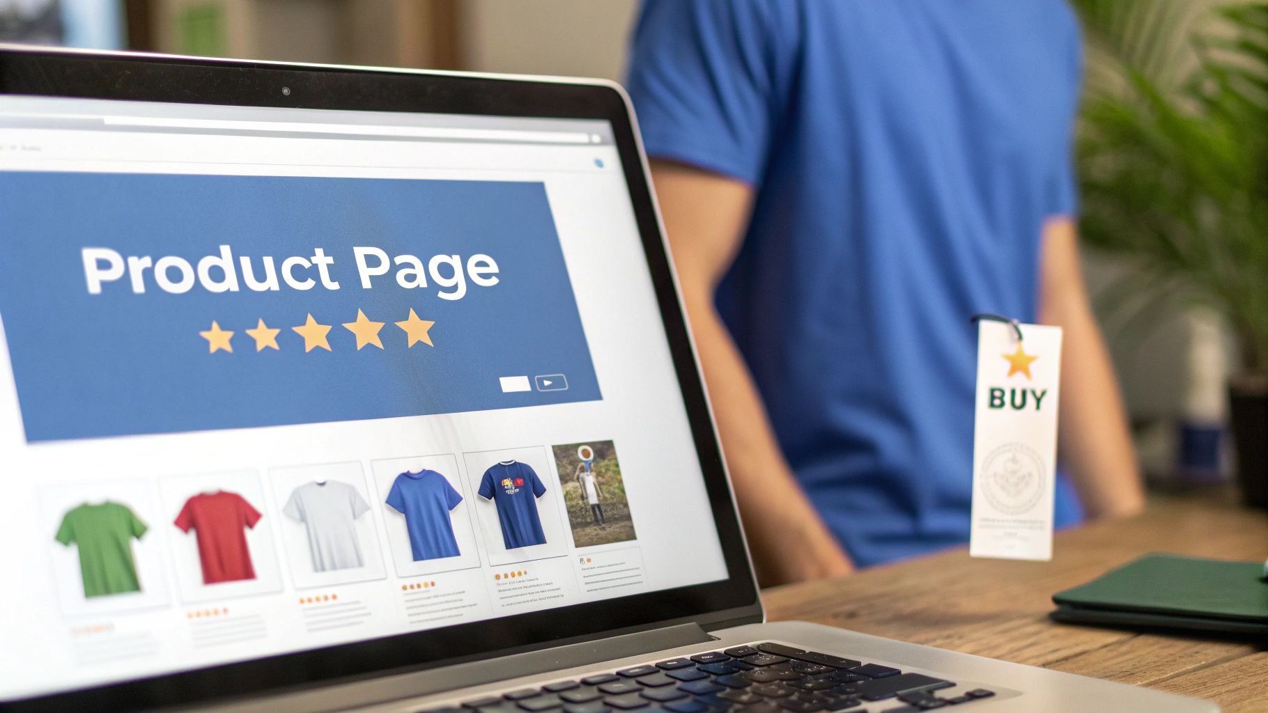
Mastering the High-Impact Product Page
Your product page is the final hurdle before that glorious "Add to Cart" click. Think of it as your digital showroom. For a print-on-demand brand, this is where a casual visitor’s interest has to transform into a burning desire to own what you're selling.
A truly effective product page does more than just display a t-shirt. It tells a story, builds rock-solid trust, and makes your design feel like an absolute must-have. This is where your conversion rate optimization for Shopify really pays off, often with the most exciting returns.
Elevate Your Visuals with Professional Mockups
Before a customer reads a single word, they see your photos. In the POD world, your mockups are your product photography. Low-quality, flat images of a t-shirt floating on a white background just don't cut it anymore. They don't do your designs justice and can miss a huge opportunity to connect with customers.
Customers need to imagine your product as part of their life. This is where high-quality, realistic mockups become your most powerful conversion tool. They subconsciously answer critical questions for the shopper:
How will this actually fit on a real person?
What’s the fabric and print quality really like up close?
Does this design vibe with my personal style?
The goal isn't just to show a product; it's to sell a feeling. A great mockup helps a customer see themselves looking and feeling amazing in your gear. That’s the key to forging an emotional connection that drives them to buy.
This is the exact problem we built AvatarIQ to solve. We watched countless POD entrepreneurs struggle to create those professional, studio-quality mockups without the time or budget required. AvatarIQ automates the entire process, letting you generate stunning, lifelike photoshoots in minutes. It instantly elevates your brand's perceived value and makes your products look seriously premium.
Write Product Descriptions That Sell a Story
Once your visuals grab their attention, the product description is there to seal the deal. Ditch the boring spec list at the top. Nobody gets excited about "100% cotton." Instead, lead with a story.
Connect the design to an identity, a shared passion, or a specific sense of humor. Who is this shirt for? The proud dog mom? The sarcastic software developer? The vintage sci-fi movie buff? Your description needs to speak directly to that person.
Here’s a simple structure that works:
The Hook: Kick things off with a relatable sentence or a question that taps right into your target audience's world.
The Story: Briefly touch on the inspiration behind the design. Make it personal.
The Benefits: Shift into why they'll love wearing it—the comfort, the perfect fit, the compliments they'll get.
The Details: Now you can drop the practical stuff. End with the material, sizing info, and care instructions.
This narrative approach turns a simple piece of clothing into a statement piece, making the purchase feel more meaningful and way more exciting.
Build Trust with Powerful Social Proof
Nothing sells a product better than a happy customer raving about it. Social proof, especially in the form of reviews and customer photos, is absolutely vital for building the trust needed to convert a skeptical visitor. In fact, just adding customer reviews to a page can deliver a conversion lift of 3.5%.
Make it ridiculously easy for customers to leave reviews, and don't be shy about asking for them. A simple follow-up email offering a small discount on a future purchase in exchange for a review with a photo works wonders.
Great ways to show off your social proof:
Star Ratings: Place these prominently right under the product title.
Customer Photo Gallery: Dedicate a section to showing off real people looking great in your designs.
Featured Reviews: Hand-pick the most compelling testimonials and make them stand out.
This user-generated content acts as a powerful, authentic endorsement. It creates a bandwagon effect that convinces new shoppers it's safe—and cool—to buy from you. And for all these visual elements, make sure you’re using the right Shopify image sizes for your product pages to keep your customer photos and mockups looking sharp.
Optimize Your Call-to-Action and Create Urgency
Your "Add to Cart" button should be impossible to miss. Seriously. Use a contrasting color that pops off the page and stick with clear, action-oriented text.
But you can go a step further by gently nudging people to buy now. This isn't about using fake, spammy timers; it's about leveraging genuine scarcity or highlighting real demand.
Low Stock Alerts: "Only 3 left in size Medium!"
Popularity Nudges: "25 people have this in their cart right now."
Limited Edition Labels: Clearly mark designs that won't be coming back.
When you master these four elements—stunning visuals, compelling stories, trustworthy social proof, and a clear call-to-action—your product page becomes the hardest-working part of your entire store. It's how you stop window shoppers dead in their tracks and turn them into your next happy customers.
Optimizing Offers and the Checkout Experience
Getting a visitor to add something to their cart is a huge win. But let’s be honest, the job isn’t even close to being done.
This is the exact moment where so many store owners take their foot off the gas, and it's where cart abandonment silently starts chewing through your profits. Nailing your offers and streamlining the checkout process is a non-negotiable part of conversion rate optimization for Shopify.
Think of this as the "last mile" of your customer's journey. You've already done the heavy lifting to get them this far. Now you just need to make buying from you an absolute no-brainer. This means creating irresistible offers that bump up your Average Order Value (AOV) and designing a checkout flow so smooth it feels automatic.
Crafting Irresistible Offers That Increase AOV
Right before a customer clicks that checkout button, you have a golden opportunity to increase the value of their order. The whole point is to present offers that feel like a genuine win for them, nudging them to add just one more thing to their cart.
It’s all about creating real value. Instead of just trying to jam another item into their order, you're genuinely improving their purchase with a great deal. This simple change in mindset is what separates a pushy, annoying upsell from a helpful suggestion that a customer actually appreciates.
Here are a few strategies that just plain work:
Product Bundling: Group complementary items together and knock a little off the total price. If you run a print-on-demand store, this could be a "Complete Look" bundle with a matching t-shirt, hat, and tote bag. It's a fantastic way to get customers hooked on more of your designs.
Tiered Discounts: Reward shoppers for spending more. An offer like, "Save 10% on orders over $50, 15% on orders over $75" gives them a clear incentive to increase their cart size.
Strategic Free Shipping Thresholds: This is easily one of the most powerful psychological tools in ecommerce. If your average order is $42, setting a free shipping threshold at $50 gives customers a compelling, tangible reason to find one more small item.
We've seen it time and time again: unexpected shipping costs can be a major hurdle at checkout. By using a free shipping threshold, you flip a potential friction point (a surprise fee) into a powerful positive (a goal to unlock a reward).
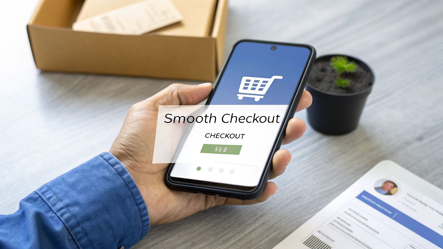
Designing a Frictionless Checkout Flow
Once that cart is full, your only job is to get out of the customer's way. Every extra click, every unnecessary form field, and every second of confusion is another chance for them to rethink their purchase and bounce. A clean, simple, and trustworthy checkout isn't a "nice-to-have"—it's everything.
The checkout page needs to scream confidence, not create anxiety. Customers are literally about to give you their credit card details, so the entire experience needs to feel secure and professional from start to finish.
Simplifying the Path to Purchase
You would be amazed at how big of an impact you can have by simply cutting the checkout process down to the absolute bare essentials. The less a customer has to think or type, the more likely they are to finish their order.
Here’s how you can make it happen:
Kill the Clutter: Do you really need their phone number? Is that second address line mandatory? Get ruthless and eliminate every single form field that isn’t absolutely critical for processing the order.
Always Offer Guest Checkout: Forcing people to create an account is a classic conversion killer. Make sure the guest checkout option is obvious and easy to find.
Enable Accelerated Payments: One-click options like Shop Pay, Apple Pay, and Google Pay are the gold standard. They let returning customers fly through checkout by pre-filling all their info. This is the definition of a frictionless experience.
Show Off Your Trust Badges: Make sure your security badges (SSL certificates, secure payment icons like Visa/Mastercard) are front and center. It’s a small visual cue that goes a long way in calming any last-minute jitters.
Plenty of tools can help you put these strategies into action. To get started, you can check out some of the best Shopify apps to increase sales and see what makes sense for your store.
When you combine smart, value-packed offers with a checkout that’s stripped of all friction, you turn your store into a well-oiled machine. You'll not only see cart abandonment rates drop, but you'll also watch your average order value climb—driving up your bottom line without spending another dime on traffic.
Running A/B Tests That Actually Drive Growth
Guesswork is the fastest way to build a business that goes nowhere. The top-tier e-commerce operators, the ones who consistently grow month after month, don't guess—they test. This is where A/B testing, also known as split testing, separates the amateurs from the pros in conversion rate optimization for Shopify.
A/B testing demystifies growth by letting your customers tell you exactly what they prefer. Instead of running on gut feelings, you’re using cold, hard data to make decisions. The concept is simple: you show two different versions of a page (or an element on a page) to your visitors to see which one performs better.
This process pulls emotion and ego out of the equation. You might love your slick new product page design, but if it converts at a lower rate than the old one, the numbers don't lie. This is how you build a store that's engineered for sales, not just one that looks good to you.
Forming a Powerful Hypothesis
Every great A/B test kicks off with a solid hypothesis. This isn't just a random guess; it's an educated prediction about what change will produce a specific, measurable result. A good hypothesis follows a simple but powerful structure: "If I change [X], then [Y] will happen, because [Z]."
That "[Z]" part—the "because"—is the most important piece. It forces you to actually think about the customer psychology behind the change you're proposing.
Here are a few practical examples for a print-on-demand store:
For Product Images: "If we replace our standard flat-lay mockup with a vibrant, AI-generated lifestyle mockup from AvatarIQ, then our 'Add to Cart' rate will increase because shoppers will be able to better visualize themselves wearing the shirt in a real-world setting."
For Headlines: "If we change the product headline from 'Graphic Tee – City Nights' to 'Own the Night: A Tribute to Our City's Skyline,' then conversions will increase because the new headline creates an emotional connection and tells a story."
For a Call-to-Action: "If we change the button text from 'Purchase' to 'Get My Tee,' then checkout initiations will go up because the copy is more personal and less transactional."
Your hypothesis becomes your north star for the test. It defines exactly what you're changing, what you expect to happen, and the logic behind it all.
A/B testing is a conversation with your customers at scale. Each test is a question you ask them—'Do you like this more, or that?'—and their behavior provides the answer. Listen closely to what they tell you.
Choosing Your Tools and Running the Test
You don’t need a complex or expensive tech stack to start A/B testing on Shopify. There are tons of apps in the Shopify App Store designed specifically for this, making the setup process straightforward even if you've never done it before. Look for tools that integrate directly with your store and let you easily create variants of your pages.
Once you have a tool, the process is pretty simple:
Select Your Page: Choose the page you want to test based on your conversion audit. Start with a high-traffic product page to get the quickest results.
Create Your Variant: Make the one specific change you outlined in your hypothesis. And I mean one change. If you change the headline, the image, and the button color all at once, you’ll have no clue which change actually made the difference.
Launch and Wait: Kick off the test and let it run. It's crucial to wait until you have enough data for the result to be "statistically significant"—meaning you can be confident the outcome isn't just random chance. Most testing tools will tell you when you've reached this point. A good rule of thumb is to aim for at least 100 conversions per variant and let the test run for at least a full week to account for daily traffic fluctuations.
Analyzing Results and Taking Action
Once your test wraps up and there's a clear winner, the final step is to make the change permanent. If your new lifestyle mockup from AvatarIQ boosted 'Add to Cart' clicks by 15%, it's time to roll that change out across all your relevant products.
This is where the magic of compounding improvements comes in. A 15% lift from one test, a 10% lift from another, and a 5% lift from a third all add up to a massive increase in your store's overall conversion rate. This disciplined process of testing, learning, and implementing is what transforms a struggling store into a profitable e-commerce powerhouse. It's an exciting journey of continuous improvement that puts you in complete control of your growth.
Your Questions on Shopify CRO Answered
When you're grinding to get your print-on-demand store off the ground, a million questions about conversion rate optimization for Shopify can pop up. You're building something awesome, and getting straight answers is what turns all that hard work into real results.
I've rounded up some of the most common questions we get from entrepreneurs in the trenches, just like you. Let's cut through the noise and get you some clear, profitable answers.
What Is a Good Conversion Rate for a New Shopify POD Store?
Honestly, for a brand-new store, hitting a conversion rate between 0.5% and 1% is a solid place to start. Don't sweat it if you're in that range—it just means you've built the foundation and the fun part (optimization) is about to begin.
The Shopify-wide average hovers around 1.4%, so if you're below that, it's not a red flag. It's a massive green light telling you where the opportunities are.
Your first real goal should be to climb toward the 2-3% mark. Once you're there and have some momentum, pushing for 4% and beyond is a great long-term target.
The top dogs in the POD world consistently pull in conversion rates over 4%. It's not luck. It's the direct result of relentless testing and a deep obsession with the customer experience. Every little tweak adds up.
For the fastest wins, focus on your product page mockups and your mobile experience. Nail those two, and you'll almost always see the biggest initial lift.
How Long Should I Run an A/B Test on Shopify?
The right answer has nothing to do with a calendar and everything to do with traffic. You need enough data to trust the results—to know it's a real win, not just a random Tuesday spike.
A good rule of thumb is to let a test run for at least one or two full weeks. This helps iron out the weird daily fluctuations in traffic (weekend shoppers vs. weekday browsers) and gives you a much cleaner read.
But here's the real key: you're aiming for a specific number of conversions. A solid industry benchmark is to wait until you have at least 100 conversions per variant. So, if you're testing a product page, that might be 100 "Add to Cart" clicks for the original and 100 for the new version.
If your store traffic is on the lower side, hitting that number will take longer. That's perfectly fine. The single biggest mistake you can make is calling a test early because one version is ahead after 48 hours. Patience is what separates gut feelings from data-driven decisions.
What Are the Biggest Conversion Killers for POD Stores?
In print-on-demand, a handful of classic mistakes are usually responsible for the lion's share of lost sales. If you focus on fixing these, you'll see a serious impact on your revenue.
Here are the top culprits I see time and time again:
Poor Quality Mockups: This is non-negotiable. If a customer can't vividly picture themselves looking incredible in your gear, they're gone. It's exactly why a tool like AvatarIQ is such a game-changer—it helps you create those premium, gotta-have-it mockups that scream quality.
Unclear Sizing Info: A confusing size chart is an instant sale-killer. It creates doubt, and doubt leads to abandoned carts. Provide dead-simple measurements and, if you can, show photos of models with their height, weight, and the size they're wearing.
Slow Page Load Speed: This is a monster, especially on mobile. Every single second your page takes to load, you're losing potential customers. Optimize your images and use a theme built for speed.
Unexpected Shipping Costs: Surprise fees at checkout are a major reason for cart abandonment across all of e-commerce. Be painfully transparent about shipping costs from the get-go. Better yet, build a free shipping threshold into your pricing to turn a negative into a powerful sales driver.
Lack of Social Proof: A store with zero reviews feels risky. New visitors need to see that real people have bought your products and loved them. Proactively ask for reviews and show off your user-generated content to build that crucial trust.
Ready to stop guessing and start building a high-converting Shopify store with proven, step-by-step guidance? At Skup, we've helped thousands of entrepreneurs just like you build profitable print-on-demand businesses from the ground up. Our Apparel Cloning system, proprietary software like AvatarIQ, and hands-on coaching give you the complete ecosystem you need to succeed. Learn more about how we can help you build the business you've always dreamed of.
It is 10:30 p.m. Orders are still coming in, customer emails are stacking up, and tomorrow’s ad reports will be waiting in the morning. A manual business turns every sale into more tasks. An automated business turns each sale into a system event that triggers fulfillment, follow-up, reporting, and support with far less owner involvement.…
When you’re just starting out in ecommerce, “supply chain management” sounds like some complicated corporate term meant for massive companies. But let's ditch that idea. It's not just about moving boxes; it's the entire journey your product takes from a design idea to the moment a customer excitedly unboxes their order. It's one of the…
Does it feel like Etsy’s shipping costs are some kind of impossible puzzle designed to chew up your profits? Trust me, you’re not alone. So many sellers get stuck here, but mastering your etsy shipping costs is a game you can absolutely win. This guide is the complete playbook, built by founders who run 8-figure…