Hey friends! Patricia here again, this time to let you in on a commonly unpracticed conversion boosting tactic!
Are you aware of the significant feature on your store that has the power to generate noticeably more sales, yet is always overlooked and put on the back burner by the majority of store owners?
I do.
High-quality product images.
I get it – there are so many other things to focus on, like figuring out your analytics and creating the persuasive copy to place on your product pages.
Not to mention, the supplier already provides images for the products, and it is absurd to wait the long shipping times just to take photo’s that are readily available on Ali Express.
Well, that is where you are wrong.
Having high-quality product images can be the make or break point for your store.
By the end of this article, you will be able to take and use professional grade product images on your store just like the one below.
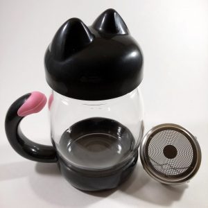

Ali Express clearly (and cheaply) overlays the heart garland onto a poorly blurred and pixelated backdrop.
I’m sure the example above speaks for itself, but let me dive deeper into a more practical explanation.
So, we humans are extremely visual creatures – we are designed to spot subtle irregularities that date way back to our innate self-defense instincts.
Although we aren’t hunting apex predators to survive anymore – we still use this visual dependance to form impressions that will either draw us toward something or turn us away.
So, the images you are using across your store cause your visitors to form immediate impressions, approximately within 50 milliseconds – this could mean the difference of someone landing on your sight and immediately fleeing, or deciding to stay and eventually purchase.
If you don’t believe me, fine, but survey results have shown that 93% of consumers say that product images and their quality impact their purchasing decision.
That’s not even 93% of the people that visit your store, that is the total sample population, meaning a higher percentage of the people who land on your site are more likely to base their purchasing decisions based on your images.
So what do I have against using the images provided by your supplier?
Well, there are a few things.
First, your supplier may not even own the rights to the images on his page – he may be using copyrighted images that he is licensed to use, but that doesn’t mean that you are.
Second, importing and screenshotting images from one site to another can lead to pixelation and lower resolution in your images which will cause a negative perceived value of your brand and products.
Your customers will ultimately form the impression that your brand is cheap and of low quality that is not worthy of their money or time.
Third, your competition is most likely using those same images and targeting to a large portion of your audience. In turn, this is causing saturation of the images, and your audience will mindlessly scroll past your ad because they have been exposed to the image before.
Creating your own product images sets you apart from the rest of the competition and noise.
Fourth, a disadvantage of selling online is that your customers are unable to hold and feel the product.
Your product images must be so detailed and contain unique selling positions that have the power to convert your visitors to buyers.
Your images must relay as much sensory stimulation as possible.
Sight and touch: vibrant colors and textures
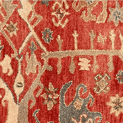
Pottery Barn makes it easy to visualize how soft and plush their oriental rugs will feel on your feet.
Smell and taste: delicious food and perfumes
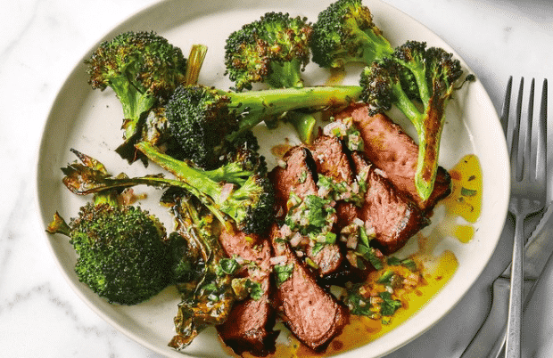
The sight of Bon Appetit’s vibrant and detailed imagery makes your mouth water like Pavlov’s dogs at the ringing of the bell.
Want to create a highly converting selling arsenal?
Pair your custom product images along with product copy targeted directly to your customer audience.
Don’t know how to write persuasive copy?
That’s ok; you can always download our free Copywriting Bible that will hold your hand and guide you along the way!
Along with being a key selling point, your custom product images adds a sense of personalization to your store which will allow your visitors to connect on a branded level – which will ultimately create repeat business for you.
Yes, I am aware of the difficulty due to the shipping times. However, you really should be ordering products while conducting your product research and phasing in new products.
You should take photographs of the products that make the cut and upload the images to your store.
All of your images need to have a consistent composition.
Each image should have the same composition technique (more on that soon), filters, lighting, size, and shape.
You should form guidelines that outline each of these details to create a visually pleasing, cohesive virtual product line.

Ray-Ban uses the same backdrop and camera angle for their product images.
As you are saving your product images after the editing process, you should save them as descriptive keyword filenames that you can use as the alt text of the image.
Don’t know what alt text is?
Alt text is merely a tag that describes the appearance and function of an image to give search engine crawlers some context to index properly.
You can find out more about alt text here.
The backdrop of all of your product images should be consistent as well.
White backdrops perform the best because they reflect more light onto the product – which ultimately leads it to stand out and appear more vibrant – as well as prevents any color spills and provides a chic and polished appearance for your store.

Pop & Suki use a femme pink color for the backdrop on all of their bags – and notice the consistancy of the camera angle 😉
As I mentioned earlier, you should have uniform composition techniques for your product images, however, if you have multiple product lines – for example – apparel, sunglasses, and watches – each line will have different compositions that will suit them best, so match arrangements within product lines.
This technique provides an up close and centered “hero shot” of your product that removes any distractions that may take attention away from the product.
Attention is drawn straight to the natural focal point which encompasses the product in its entirety.
Front and center is a great technique to use if you want more symmetrical images while providing a sense of space.
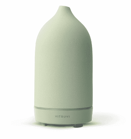
Vitruvi’s essential oil diffusers are shot up close and personal.
Camera angles provide close-ups on particular portions of the product to show off specific features and selling points.
If you want the angle towards the product, tilt the camera to the right to make the contents of the image appear more inviting and enticing to the viewer.
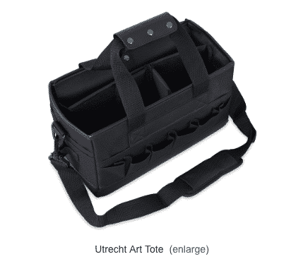
Blick art supply makes use of this angle for their tote to invite artists to use it for their supplies.
If you want the angle away from the product, tilt the camera to the left to give the viewer the desire to follow.
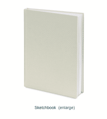
Blick also takes advantage of this angle to lure artists into using their sketchbooks.
This technique naturally draws the eyes to the products and enables viewers to visualize space and shapes more effectively.
Using negative space is great if you have a minimalist branding style because it gives the eyes room to breathe – there is no sensory overload.
It also provides a pleasing, balanced visual aesthetic.
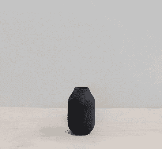
The Citizenry uses negative space to showcase their products.
This technique arises from a subconscious psychological reflex that occurs when looking at items grouped.
It is said that the human brain typically groups items in pairs, meaning that an even amount of elements are easier to digest than odd because there is no way to compartmentalize each item perfectly.
So, when producing an image with an odd number of elements, the brain will inspect each item individually instead of pairing them up together, blurring the elements.
Three is the most appealing amount of elements to use at any given time – any amount more will weaken the composition strength.
The rule of odds is a great technique to use for bundled products.

Although Anthropologie shot five items, they still successfully utilized the rule of odds.
So the general idea behind this technique starts by breaking up the frame into thirds, segmented by two lines equidistant horizontally and vertically, just like in the image shown below.
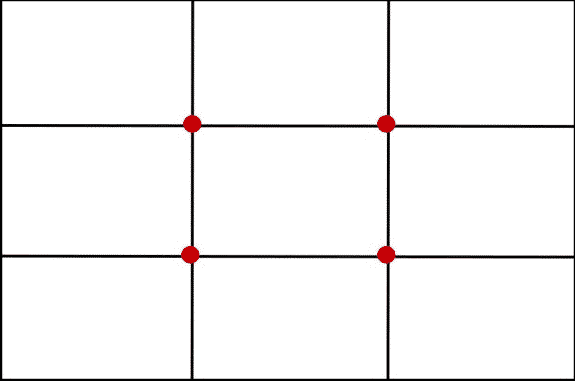
Thank you, Tom Howell, for this graphic.
The four intersections shown in the center are the areas in the photograph that appeal most to the viewer – why? The human eye naturally focuses on the top third of every image.
To make the most out of this visual appeal, you should focus the subjects in within these four key areas.
The product will be a properly balanced and natural image that is easy for the viewer to digest.
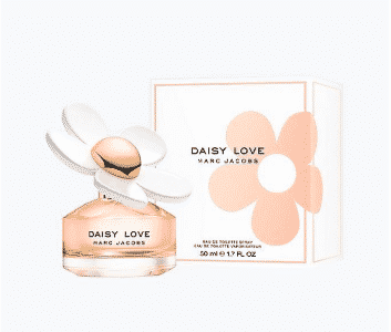
Marc Jacobs uses the rule of thirds while shooting the perfume collection.
This technique is used to create tension that leads the viewer’s eyes in a particular direction which will ultimately develop a sense of depth for the photo.
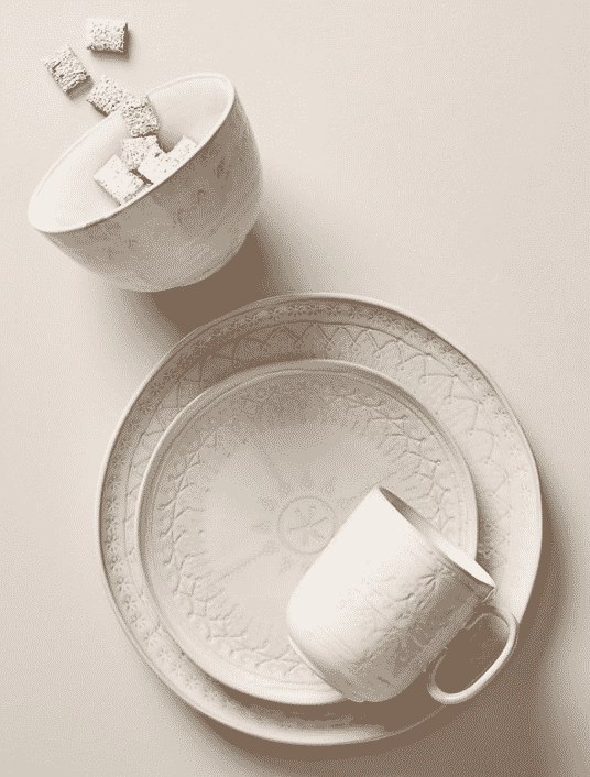
Anthropologies creative use of dynamic diagonals.
An overhead aerial shot does flatten the product. However, it enhances patterns, textures, and shapes.
You can fit more of the scene into the frame while focusing on a particular vantage point.
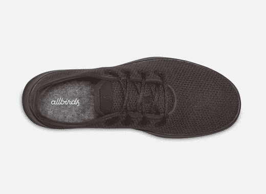
Aerial shot captured by Allbirds.
GIMP
GIMP is a free photo editing tool that is comparable to Adobe Photoshop.
The software allows image retouching, composition, and authoring.
Pixlr
Pixlr is a powerful image editing tool that is accessible on the web and even your mobile device.
Canva
Robust photo editing tool designed with non-design professionals in mind. It is extremely intuitive and generates beautifully edited images.
Snapspeed
Photo editing app for Android and Apple users that has the same range of editing tools as any web-based editor, at the tip of your fingers.
Polarr
Innovative photo editing tool that allows for layers and blending as well as a suite of filters to use. This tool is extremely dynamic and accessible from every device.
You can either invest in a lightbox or just follow the DIY lightbox tutorial we got from Savvy Seller to get the same results; the video is at the end of the post for your convenience :). Just a heads up – she says its about $10 for the whole set up – but if you are buying ALL of the materials – its going to run you about $20, which still beats the $110 lightbox you aren’t going to order off of Amazon!
18x18x24 box
1 1/2 yard interfacing fabric
One white poster board
Two clip-on lights
2 100 W fluorescent light bulbs
Scissors
Box cutter
Tape
Pen
1. Put the box together and secure it with tape, leaving one end open.
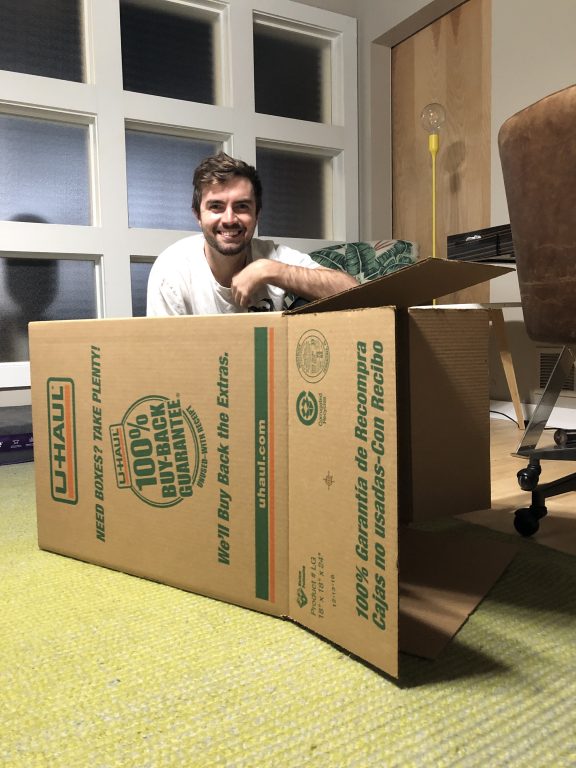
Hi Devin!
2. Place the interfacing fabric over the box and mark the measurements to know where to cut out the holes.
3. Cut the box along the marked lines with your box cutter.
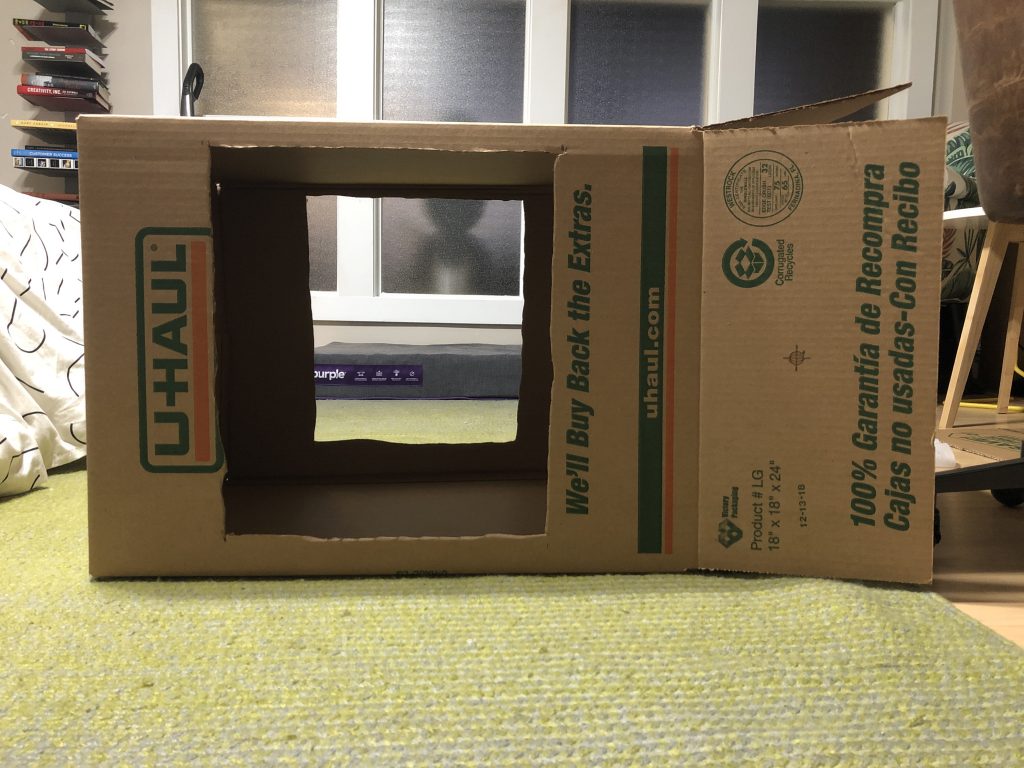
4. Cut down the posterboard, so it fits the dimensions of the box. Lay the poster board flat on top of the box, and cut anything that doesn’t fit the boxes dimensions.
5. Place tape at one end of the poster board and place it on the back wall of the box. Avoid making any creases on the poster board; it should be perfectly smooth.

6. Tape the interfacing fabric to the outside of the cutouts made in step 3.
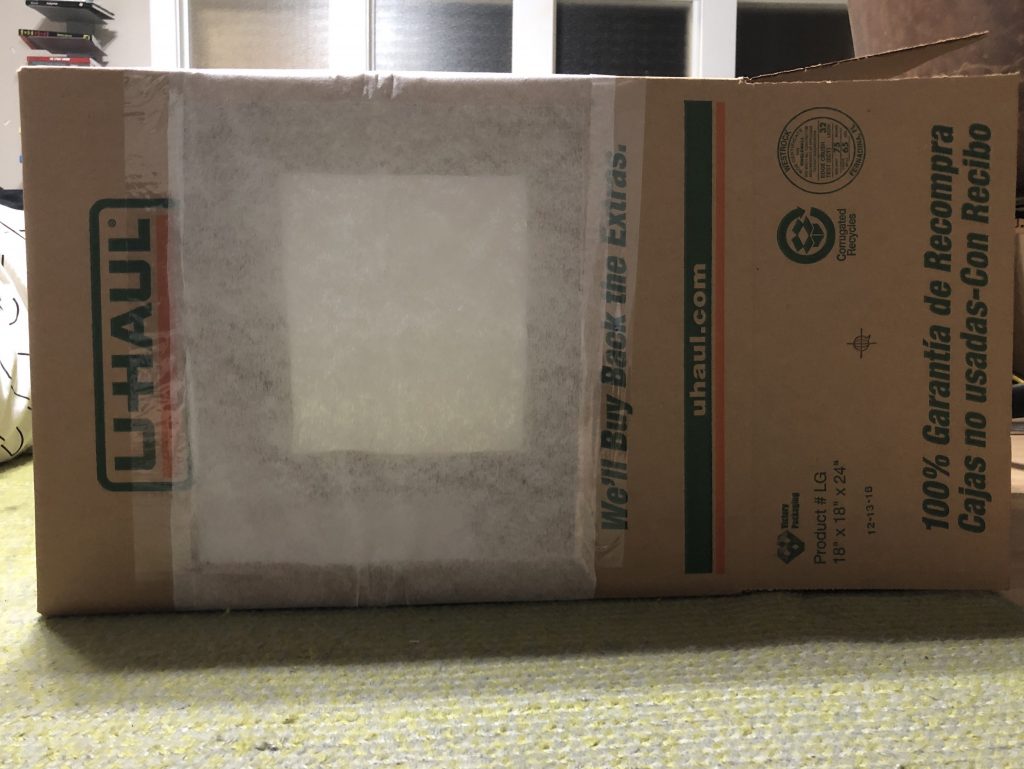
7. Place the lamps on either side of the box, facing the interfacing fabric, and make sure the lamps are equidistant from the box.
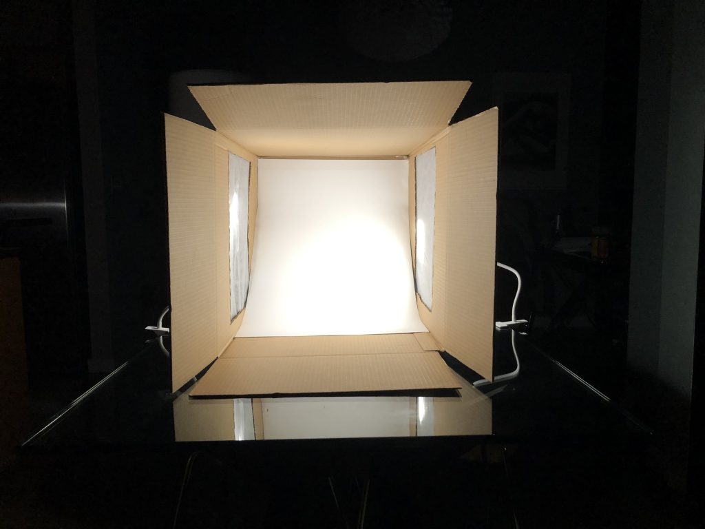
8. Start taking photos! P.S. – When taking the pictures, make sure the box flaps are open, so there is no light leaking into the frame from the lamps.
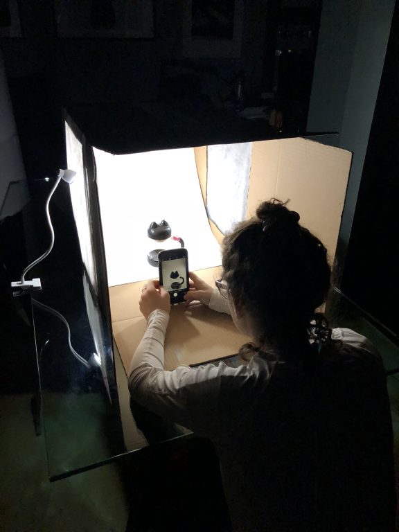
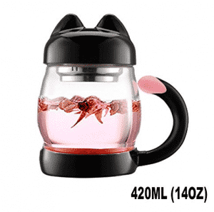

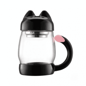
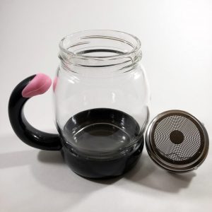
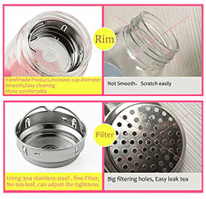
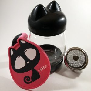
As you can see from our images on the right, by taking your own product images, you avoid any low-quality resolution and pixelation, cookie cutter images used on every other store, and nonsensical wording that causes confusion and apprehension.
…Go on and wow us with your own product images and don’t forget about those product descriptions! Download our free Copywriting Bible and slay the competition!
Great discussion! You provide really helpful tips properly and I have also a nice idea. Ecommerce business oweners somtime give all responsibility to photographer and then after production they send photos to other photo editing company at so chip rate and finally they assign a big budge for woeners; so I think they should take services from photographer only for production and then it needs to contact with photo editing service providers. By this system they can save up to 40% cost.
So happy you enjoyed it Eldonrap 🙂 It was definitely a fun project to work on!
Brilliant very interesting thanks
No problem, Carl! Make sure to come back and read our future brilliant posts 🙂
Awesome, Rey detailed and helpful! Thank you ????
We’re always happy to help 🙂
Thanks, very interesting
Glad you enjoyed it!