Home » Blog » How to Increase Ecommerce Conversion Rate A Practical Guide
Welcome to your guide for turning more visitors into loyal, repeat customers. Seriously. Boosting your store's conversion rate isn't about some secret formula; it’s about making a series of smart, targeted improvements that build trust and make shopping with you an absolute breeze and a genuinely exciting experience.
It all starts with figuring out where people are getting stuck and ends with turning your store into a place they're genuinely excited to buy from.
Your Playbook for Higher Ecommerce Conversions
Every person who lands on your site is an opportunity. Ecommerce is exploding, and your slice of that pie is just sitting there, waiting for you. But getting traffic is only half the job—the real magic happens when those visitors actually pull out their wallets. This is where conversion rate optimization (CRO) comes into play. It’s the art and science of turning casual browsers into committed buyers.
Think of this as your personal roadmap. We're skipping the fluffy theories and diving straight into actionable steps you can implement right away to see a real difference.
So many store owners get hung up on what a "good" conversion rate is. While the industry average hovers around 2-3%, the only benchmark that truly matters is your own. The goal is simple: continuous improvement. The opportunity to grow is always there, and that's what makes ecom so exciting!
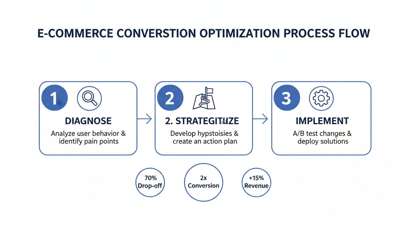
The Conversion Optimization Journey
This isn't a one-and-done fix. It's a cycle. You have to get inside your customers' heads, test your assumptions with real data, and make small, iterative changes that add up to a killer shopping experience. By the end of this playbook, you'll have a clear path forward, not just a list of random tactics.
To get us started, let's look at the core process. It really boils down to three fundamental stages: diagnosing the problems, building a smart strategy, and then actually implementing the fixes.
This simple flow—Diagnose, Strategize, Implement—is the engine that will power your store's growth.
What You Will Learn
This goes way beyond just changing a button color. True CRO is a holistic game that touches every single part of your customer's journey. We’re going to hit all the essential pillars that actually drive sales and create fans for life.
You're going to discover how to:
Diagnose Bottlenecks: Pinpoint the exact spots in your sales funnel where you're losing people.
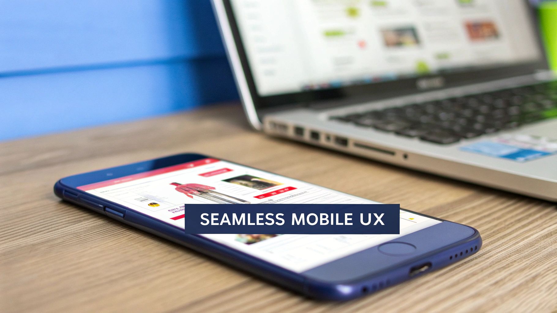
Enhance User Experience (UX): Craft a seamless, intuitive shopping experience that works beautifully on desktop and mobile.
Optimize Product Pages: Turn your product listings into high-octane sales drivers that scream "buy me."
Build Unbreakable Trust: Use powerful trust signals and a frictionless checkout to slash cart abandonment rates.
By focusing on these key areas, you're not just chasing a number. You're building a stronger, more resilient business that truly connects with customers and keeps them coming back for more.
The opportunity in ecommerce has never been bigger. Let's get into the specifics that will generate real, measurable results for your store.
Crafting a High-Converting User Experience
Your website's user experience (UX) is your most dedicated employee—it works around the clock, silently guiding every visitor. When it's good, it’s seamless, getting shoppers excited to browse and buy. When it's not, it can lead to frustrated clicks and abandoned carts. The path to a higher conversion rate starts by making this journey as smooth as humanly possible.
Think of your store's design less about aesthetics and more as a clear, intuitive map for your customers. Every single element, from your navigation bar to your search function, needs to serve one purpose: helping shoppers find what they're looking for with zero friction.
We're aiming to reduce what's known as cognitive load—basically, the mental effort it takes to use your site. The less a customer has to think about how to find something, the closer they are to actually buying it. This means a clean, distraction-free layout where your products are the stars. Ditch the excessive pop-ups, competing banners, and confusing menus. A streamlined experience builds trust and keeps the focus right where it should be: on your incredible products.
Bridge the Mobile to Desktop Conversion Gap
Let's be real: while mobile traffic is king, a massive conversion gap between devices still exists. We can't ignore the fact that desktop users often convert at a much higher rate. In fact, 2025 benchmarks show the average desktop conversion rate at 3.9%, which is nearly double the 1.8% we see on mobile.
This gap is there for a reason. Larger screens just make it easier to see products, compare options, and breeze through checkout forms. The trick to boosting your overall conversion rate is to replicate that same effortless feeling on a smaller screen.
Your mission is to make mobile shopping feel as intuitive and confidence-inspiring as browsing on a laptop. This means simplifying every step and designing for one-thumb navigation.
So, how do you actually do this? By truly adopting a mobile-first mindset. This isn’t just about making your site look okay on a phone; it’s about building the entire experience for the mobile user from the ground up.
Here's a quick rundown of some non-negotiables:
Sticky CTAs: Keep that "Add to Cart" button glued to the screen as users scroll. It eliminates the need to scroll back up, making the decision to buy instant and frictionless.
Simplified Forms: Long, complex forms can slow down mobile conversions. Cut down fields to the absolute essentials and turn on auto-fill options wherever you can.
Thumb-Friendly Design: Think about where a user's thumb naturally rests and place your most important buttons and navigation elements there. It’s a small detail that makes a world of difference in usability.
To help you prioritize, here’s a checklist comparing what matters most on mobile versus desktop.
Mobile vs Desktop Conversion Optimization Checklist
This table breaks down key optimization tactics, highlighting where you should focus your energy for the biggest impact on each platform.
Optimization Tactic
Mobile Priority
Desktop Priority
Impact on Conversion
Sticky "Add to Cart" Button
High
Medium
High
Simplified Checkout Forms
High
High
Very High
Thumb-Friendly Navigation
High
Low
High
One-Click Payment Options
High
High
Very High
Fast Page Load Speed
Very High
High
Very High
High-Quality Product Images
High
Very High
High
Detailed Product Descriptions
Medium
High
Medium
Advanced Search & Filtering
Medium
High
High
Visible Trust Badges
High
High
Medium
Focusing on these areas will help close that stubborn conversion gap and ensure a smooth experience for all your shoppers, no matter the device.
Create Intuitive Navigation and Search
Nothing sends a potential customer running for the digital exit faster than getting lost on a website. Your navigation is their main tool for discovery, and it absolutely needs to be crystal clear.
Put yourself in their shoes. A new visitor lands on your homepage. Can they immediately figure out what you sell and where to find it? Your main menu should be dead simple, with logical categories that mirror how your customers actually think about your products. If you're in the exciting print-on-demand world, for instance, categories like "T-Shirts," "Hoodies," and "New Arrivals" are instantly understood.
Beyond the main menu, a powerful search function is non-negotiable. Many shoppers land on your site with a specific item in mind. When they use that search bar, they're showing serious purchase intent. Your search needs to be fast, forgive typos, and deliver relevant, visual results. A great search bar doesn't just find products; it puts customers on a fast track to checkout.
By thoughtfully mapping out your store's flow, you’re not just improving the user experience—you’re building a solid foundation for more sales. For a deeper dive into this, check out our guide on creating an effective Shopify store design. Get these UX principles right, and you'll transform your site into a well-oiled machine that guides shoppers effortlessly from browsing to buying.
Turning Product Pages into Sales Drivers
This is it—the digital storefront where the final handshake happens. Your product page is the ultimate proving ground. After all the hard work of getting a visitor this far, this is where they either become a customer or just another bounce.
Let's transform these pages from simple listings into powerful, undeniable sales machines.
The opportunity here is massive. A truly optimized product page doesn't just show an item; it tells a story, solves a problem, and builds so much confidence that clicking "Add to Cart" feels like the most natural next step. We're shifting the focus from features to feelings, from specs to solutions.
This is your chance to show customers not just what your product is, but what it will do for them. When you nail this, you’re not just selling a t-shirt or a mug; you’re selling a new favorite piece of apparel or the perfect gift.
Write Copy That Sells a Story
Your product descriptions are your digital sales pitch. Generic, feature-heavy text puts people to sleep. You need copy that connects on an emotional level.
Think less about the "100% organic cotton" and more about the "unbelievably soft feel that makes it your go-to weekend shirt." The goal is to help customers visualize themselves using and loving your product. Use their language, speak to their pain points, and paint a picture of the outcome they're looking for.
This is especially true in the vibrant print-on-demand world, where your design is the star. Your description needs to amplify the story behind that design. What inspired it? Who is it for? Answering these questions turns a simple graphic into a statement piece. For a deeper dive, a well-structured Shopify copywriting guide is a great resource.
Showcase Your Products with Stunning Visuals
In ecommerce, your product photos are doing all the heavy lifting. Customers can't touch, feel, or try on your products, so your images have to bridge that sensory gap. Grainy, poorly lit, or single-angle photos can erode trust instantly.
High-quality visuals are non-negotiable. They need to be crisp, clear, and show your product from multiple angles. This is your chance to highlight unique details, textures, and the overall quality of what you're offering.
But here's where you can gain a massive edge, especially in the apparel space. Customers hesitate when they can't see how a shirt or hoodie will actually look on a person. This is where you can stop guessing and start showing.
Pro Tip: Using a tool like AvatarIQ is an absolute game-changer. It lets you create stunning, lifelike model photos without the expense or hassle of a professional photoshoot. You can showcase your designs on a diverse range of models, giving every customer a chance to see themselves in your product. This single step can dramatically boost confidence and skyrocket your add-to-cart rate.
Create Irresistible Offers and Urgency
A great product page does more than just describe; it persuades. This is where you introduce offers and psychological triggers that encourage immediate action. Urgency and scarcity, when used authentically, are incredibly powerful motivators.
Here are a few tactics that just plain work:
Limited-Time Offers: A countdown timer for a sale creates a compelling reason to buy now instead of later.
Low Stock Alerts: Showing messages like "Only 5 left in stock!" taps into the fear of missing out (FOMO) and can push a hesitant buyer over the edge.
Bundles and Cross-sells: Suggest complementary products directly on the page. Phrases like "Frequently bought with…" or "Complete the look" can easily increase your average order value.
Build Confidence with Social Proof
Before making a purchase, shoppers look for validation. They want to know that people just like them have bought this product and loved it. This is the power of social proof, and your product page is the perfect place to flex it.
Don't hide your customer reviews. Feature them prominently, right where decisions are being made.
Here’s how to make your social proof work harder for you:
Showcase Star Ratings: Display the average star rating clearly near the product title.
Feature Detailed Reviews: Highlight testimonials that speak to specific benefits, like quality, fit, or fast shipping.
Use User-Generated Content: Encourage customers to share photos of themselves using your products and feature these images on the page. Seeing real people enjoying your items is the most authentic endorsement you can get.
Nail the Checkout, Build Trust, and Close the Deal
You’ve guided a shopper through an amazing experience and wowed them with a killer product page. Awesome. But now comes the moment of truth where so many sales are won or lost: the checkout. Any friction, doubt, or confusion here can instantly unravel all your hard work.
Trust is the currency of ecommerce. To ask someone for their credit card information, you have to earn their complete confidence first. This is where you double down on reassurance and make the final step so seamless it feels like the natural end to a great shopping trip.
This final stage is your chance to solidify the customer relationship and slash those shockingly high cart abandonment rates. The key is to think like your customer: make it secure, make it simple, and make it fast.
Display Essential Trust Signals
Before a customer types in their payment details, their brain is subconsciously scanning for red flags. Your job is to shut down those security concerns with visual cues that scream, "you're safe here."
These signals are non-negotiable and need to be highly visible throughout your entire checkout flow.
Security Badges: Get those logos from trusted gateways like PayPal, Apple Pay, and the major credit card companies front and center. They’re universally recognized symbols of security.
SSL Certificate: Make sure your store URL starts with "httpss" and shows that little padlock icon. It’s a baseline requirement that savvy shoppers actively look for to know their data is encrypted.
Clear Return Policy: Link to a simple, easy-to-understand return policy. Knowing they have an out if the product isn't right removes a huge layer of purchase anxiety.
Accessible Support Info: Keep your contact info or a chat link visible. It shows you're a real business, ready to help if something goes wrong.
These elements work together to build a powerful sense of security, which is foundational for boosting conversions at this critical stage.
The checkout is where a customer’s lingering doubts come to the surface. By surrounding the "Pay Now" button with symbols of trust and clear policies, you're not just processing a transaction; you're confirming their decision to buy from you was a smart one.
Create a Frictionless Checkout Experience
The average online shopping cart abandonment rate hovers around a staggering 70%. A massive reason for this is an overly complicated or clunky checkout process. Every single unnecessary field you ask for is another chance for them to get distracted, frustrated, and bounce.
Your goal is to get them from cart to confirmation as quickly and painlessly as possible.
Less is always more when it comes to checkout forms. Look at every single field and ask yourself: "Is this absolutely essential to process the order?"
Offer Guest Checkout: Forcing account creation is a known conversion killer. Always, always provide a "Checkout as Guest" option to remove this barrier.
Use Express Payment Options: Integrating one-click payment options like Apple Pay, Google Pay, and PayPal lets customers bypass manual entry. This is a game-changer, especially on mobile.
Minimize Form Fields: Do you really need their phone number? Can the shipping address double as the billing address by default? Cut everything you possibly can.
Implement a Progress Indicator: A simple visual bar showing steps like "Shipping > Payment > Confirmation" manages expectations and makes the whole process feel shorter and more organized.
By streamlining these steps, you show respect for the customer's time and make the final purchase decision feel completely effortless. This is how you close the deal and turn a hesitant shopper into a happy customer who can't wait for their order to arrive.
Why Site Speed Is a Conversion Game-Changer
In ecommerce, speed isn’t just a nice-to-have feature; it’s a direct lever on your revenue. Every single second—or even millisecond—it takes for your store to load is a moment a potential customer might give up and leave forever.
Let’s be blunt: a slow website is one of the biggest conversion killers out there, and it’s a direct cause of cart abandonment.
Think of it like walking into a brick-and-mortar store. If the door is stuck or the aisles are cluttered and hard to navigate, you’re not going to stick around. Your site speed is that digital front door. A fast, snappy experience signals professionalism and reliability, telling customers you’re ready for their business.
This isn’t just a hunch; it's backed by mountains of data.
The Real Cost of a Slow Store
A slow site actively costs you money. When a customer clicks on your ad or a link to your product, their excitement and purchase intent are at their peak. A loading spinner drains that excitement with every rotation.
The link between page load times and conversion rates is undeniable. Data consistently shows that shaving seconds off your load time is a proven way to boost conversions and fight off high abandonment rates.
With global cart abandonment hovering around 70.19%, slow loading is a primary suspect. Every extra second of waiting risks a 7% drop-off in conversions. You can find more data-backed insights on how speed impacts sales in this report on conversion optimization statistics.
A one-second delay in page response can result in a significant reduction in conversions. For an ecommerce site making $100,000 per day, a 1-second page delay could potentially cost it $2.5 million in lost sales every year.
How to Actually Speed Up Your Site
Boosting your site speed is one of the highest-impact changes you can make. The great news is you don't need to be a coding wizard to see huge improvements. Here are some practical places to start.
Compress Your Images: Large, unoptimized images are the #1 cause of slow stores. Hands down. Using our Apparel Cloning course, we teach you how to create perfect, high-quality images that are also optimized for speed. This single step can drastically cut down your load times.
Do an App Audit: Every app, plugin, and custom script you add to your store adds weight. Regularly go through your Shopify apps and be ruthless. If you're not actively using it, get rid of it. Cleaner code means a faster site.
Leverage Browser Caching: Caching stores parts of your website (like images and code) on a visitor's browser. When they come back or visit another page, it loads almost instantly because their device doesn’t have to re-download everything from scratch.
Choose Your Hosting and CDN Wisely
The technical foundation of your store also plays a massive role. A reliable hosting provider is non-negotiable, as their server performance directly impacts how quickly your site responds to visitor requests.
And if you have a global audience, a Content Delivery Network (CDN) is an absolute must. A CDN stores copies of your site in data centers all around the world. When a customer from another country visits, your content is delivered from the server closest to them, which dramatically reduces load times.
Prioritizing speed isn't just a technical task; it's a core business strategy. It improves user experience, boosts your SEO rankings, and, most importantly, keeps excited customers on the path to checkout.
Using Data to Fuel Continuous Growth
Getting your conversion rate up isn't a one-and-done project. It's an endless cycle of tweaking, learning, and improving—all powered by data.
The most successful brands I've worked with treat optimization as part of their company culture. They're obsessed with what their customers are doing and are constantly adapting. This is where the real fun begins: turning raw numbers into real growth.
Think of yourself as a detective. Tools like Google Analytics are your magnifying glass, pointing you directly to where users are dropping off. Are they ditching their carts at the same exact step? Is one particular product page a ghost town compared to others? The data shows you the what and the where, which is your starting point for figuring out the why.
Launching Your First A/B Test
Once you have a hunch about what's going on, it's time to put it to the test. This is the absolute core of conversion optimization.
A/B testing, or split testing, is just a fancy way of saying you create two versions of a page—an 'A' version (the original) and a 'B' version (the new one)—to see which one gets you more sales. It's that simple.
You might come up with a hypothesis like, "I bet if we change the 'Buy Now' button to 'Get Your New Shirt,' more people will click it because it feels more personal." Then you run the experiment, showing half your traffic the old button and the other half the new one. No more guessing games.
This disciplined process—test, measure, iterate—is what will drive your store's success over the long haul. It's how you graduate from gut feelings to data-backed decisions that actually move the needle.
The real point of testing isn't just to find one "winner." It's to create a constant feedback loop. With every experiment you run, you get a little bit smarter about your customers and build a better experience for them.
To get even deeper, you can use specialized ecommerce survey software to ask customers why they're doing what they're doing. Pairing this kind of direct feedback with your analytics data is a killer combo for finding high-impact things to fix.
These small, data-driven tweaks are the building blocks of the most effective ecommerce growth strategies and are how tiny improvements add up to massive results over time.
Still Have a Few Questions?
Diving into conversion optimization always stirs up a few questions. It's totally normal. Here are some of the most common ones we get from store owners who are serious about turning more of their traffic into actual sales.
What’s a Good Ecommerce Conversion Rate, Really?
You’ll hear people throw around 2% to 3% as a "good" benchmark, but honestly, that number is almost useless without context. It’s not a one-size-fits-all game.
A print-on-demand store hitting a passionate niche might naturally see much higher rates than a shop selling high-ticket furniture. Everything from your industry and traffic source to whether someone is shopping on their phone or desktop can swing that number wildly.
The only benchmark that truly matters is your own. Forget the universal average and get obsessed with beating your last month's number. Consistent, incremental growth is a way more powerful—and exciting—goal.
How Long Until I Actually See More Conversions?
This one completely depends on the changes you’re making. Some tweaks can give you a boost almost immediately, while others are more of a slow burn.
Quick Wins: Think simple, high-impact fixes. Clarifying a fuzzy call-to-action button or plastering your checkout with trust badges can show a measurable lift within days of an A/B test concluding.
Bigger Lifts: A complete product page redesign or a major overhaul of the user experience is a different beast. These projects might take a few weeks or even a couple of months to gather enough solid data to know what's working.
The real key here is consistency. Just keep testing, keep refining, and the results will absolutely follow.
Is There One Magic Bullet Change I Can Make?
If I had to pick one, I'd say optimizing your checkout process almost always delivers the biggest bang for your buck. A clunky, confusing checkout is the number one killer of sales and the main driver of cart abandonment. Simplify it. Offer a guest checkout option. Slap those security badges everywhere. You're removing friction right at the finish line, and it pays off.
But another monster of an opportunity? Your product page visuals. People can't touch or feel your products, so their confidence hangs entirely on your images. This is especially true for apparel. Using a tool like AvatarIQ to generate incredibly lifelike model mockups directly tackles that uncertainty, making the decision to hit "Add to Cart" a no-brainer for your customers.
At Skup, our entire focus is on giving you the tools and the know-how to build a print-on-demand business that doesn't just survive, but thrives. We've walked thousands of entrepreneurs just like you through the process of turning an idea into a profitable brand. Ready to see what's possible? Check out our proven systems and AI tools.
Imagine launching a full-blown apparel brand without ever touching a single t-shirt or hoodie. That’s the magic of print on demand, and if you’ve been waiting for the right moment to jump in, this is it. This is your complete roadmap to getting your first sale and building a real, high-margin brand from the ground…
Quick Answer Matt Schmitt is the co-founder of Skup, a print-on-demand ecommerce training company. With over $30 million in personal ecommerce sales and a decade of experience building and scaling POD stores, Matt oversees Skup’s coaching program and teaches the systems that helped him exit multiple 7-figure businesses. His students have collectively generated tens of…
Ready to turn your creativity into cash? The fastest way to make money selling t-shirts is to find designs that are already crushing it, create even better versions with your own unique spin, and sell them to passionate audiences. The exciting world of print-on-demand allows you to start with virtually zero risk and build a…