The design of your Shopify store can encourage thousands of dollars in revenue each day, or it can send your visitors running for the hills.
Designing your store is a critical step during store set up, and it’s equally important to stay on top of its trends.
You don’t need any fancy graphics, or thousands of dollars to invest in designers.
The best performing stores have a simple, intuitive interface and organized layout.
There are 3 cardinal rules when it comes to designing your store, and they are:
In the following paragraphs, I’m going to cover the design elements you need to promote sales on each page of your Shopify store.
So, Let’s check them out!
Consider the homepage of your store to be the equivalent of the window display at the mall.
You want to showcase all of your best, lead items as well as any storewide promotions you’re currently running.
Let’s dive into the features that will boost your sales!
Even if you don’t offer free shipping or free shipping over a certain threshold, you should still include a shipping bar on your site.
You can use this space for advertising any promotions, coupon codes, or other conversion boosting copy.
Your shipping bar should be enabled on each page on your store to remind customers about your policies or promotions throughout their shopping experience.
You can also install a responsive shipping bar.
A responsive shipping bar is one that counts down the price your customers need to add to the cart to reach the free shipping threshold.
Enabling a responsive shipping bar is one of the easiest ways to raise your stores’ average order value.
Your logo and navigation menu should lie directly below the shipping bar.
Situate them on the same row, so your header isn’t taking up too much space – the header itself should only take up about 15% of the page above the fold.
What do I mean by “above the fold”?
Above the fold is the area on the screen that’s visible without having to scroll down the page.
All of your most essential elements will fall above the fold on the product and checkout pages – as you will soon see.
Your logo should be simple, attractive, and straightforward.
It should fit within the confines of the header, so make sure to have your designer create something that scales down well.
The navigation menu should sit horizontally in your header.
The sections of your navigation menu should include:
The last two sections, About Us and Tracking, are optional. We will cover them in more detail shortly.
For the rest; Home, Catalog, Contact Us – well, those are mandatory.
And you shouldn’t exceed 5 items in your navigation menu.
If you add any more, it becomes crowded, impractical, and distracts your customers from shopping through the catalog.
Speaking of the catalog, want it positioned near the front of the list.
People read from left to right, so you should have your pages arranged in a manner that displays the most important sections first.
Also, if you have an extensive product line of 10 products or more, your catalog needs to be organized into a collection list that drops down in the navigation menu.
A structured catalog provides your customers with the organization they need to shop for products that interest them.
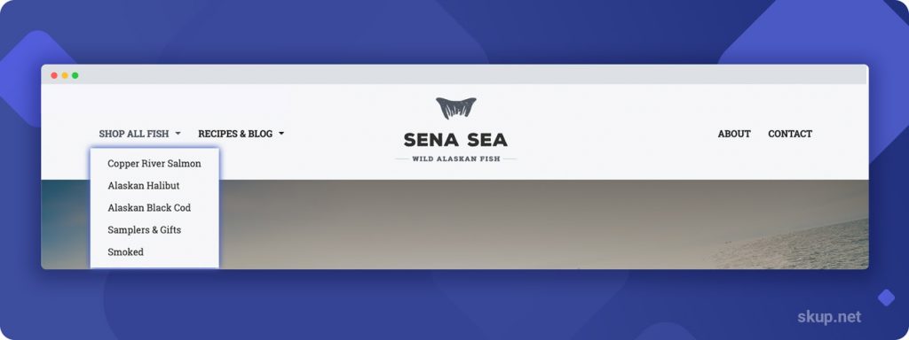
Check out Sena Sea’s logo and navigation, for instance.
Although the logo is detailed, it scales down well to fit within the header, on the same level as the navigation menu.
And since they have a wide variety of items on their store, they organize their catalog into a dropdown of specific collections.
The third mandatory section of the navigation menu is the Contact Us Page.
Easy access to your contact points is critical for making a sale.
Sometimes issues arise with shipping, product defects upon arrival, and order cancels. So if your customers can’t find a way to reach you, then they won’t want to risk purchasing from you.
Your contact page should include your support email, phone number, hours of operation, and a support form.
You can quickly create a support form on the back end of your Shopify store, in the pages section.
All you have to do is navigate to pages, then click add a page.
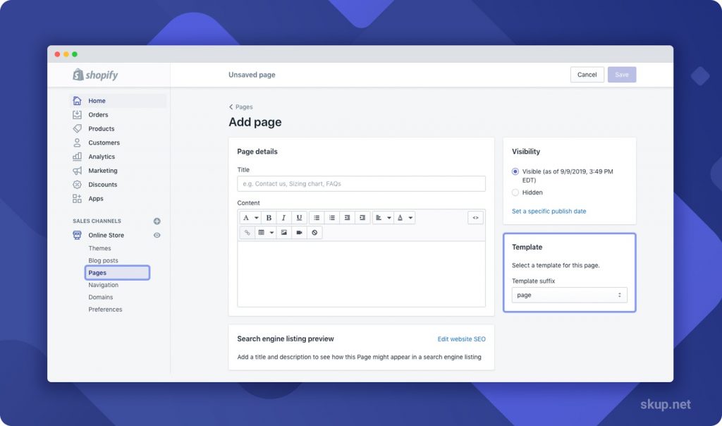
In the bottom right-hand corner, click the drop-down titled Template Suffix and select the page.contact option.
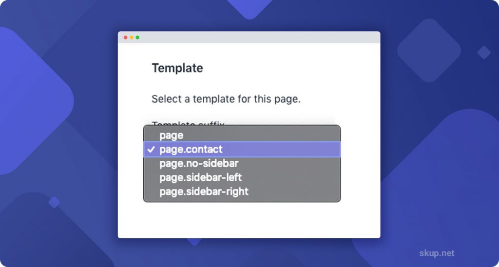
And there you have it, the support form!
Now, back to the About Us page & Tracking information.
The About Us page is entirely optional; however, we recommend creating one.
On average, this page is the 2nd most viewed page on a site.
Your visitors are interested in the story behind the brand, and it gives you a unique opportunity to form a relationship with them through your story.
Check out the About Us page on Black Chicken Remedies site:

And as I mentioned earlier, Tracking information is another optional section for the navigation menu.
It provides an extra layer of support for your customers who are trying to figure out when their packages arrive.
You eliminate the task of them jumping through hoops and searching their inboxes for the tracking information by offering them easy access to their tracking updates right from your store.
The banner image, or hero shot, should be located directly below the navigation menu.
This space should be used to promote new product launches or any sales that are going on in your store.
Having banner images amplifies your branding efforts, conversions, and provides an attractive element on your homepage.
Don’t throw up a banner image for the sake of having one.
These sections are used to increase sales. So if you throw up a random stock image with no context, you’re just going to confuse your visitors and lack professionalism.
You only need one powerful banner image to complete the look of your homepage.
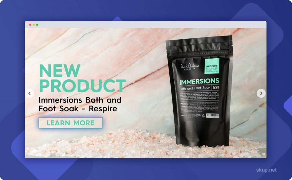
This image should focus on a featured collection or product, and it should have persuasive sales-boosting copy with a compelling call to action.
You can see all of these features in the example from Black Chicken Remedies below:
Your homepage should also contain a collection, or multiple collections, of your best selling, lead items.
Show off your new or most popular items to hook your visitors’ attention and keep them shopping.
Avoid what I like to call product dumping.
Product dumping is throwing up multiple rows of unrelated products on the homepage in hopes that someone will hook onto something.
It won’t work.
It looks sloppy, and there is no organization, so your customers won’t be able to digest all the products thrown up there visually.
Moreover, your featured collections should fit within one row next to other products similar in nature.
If you want to offer more than 4 or 5 products for your featured collection, you can add more, just set them to appear as a carousel. Your customers can then effortlessly scroll through to see the products in the collection that interests them.
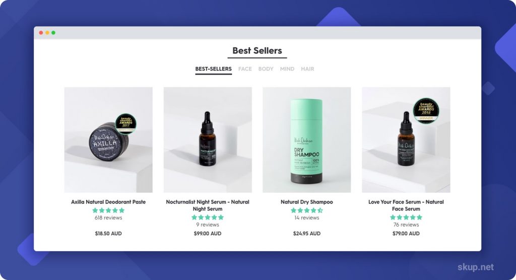
Check out the Best Sellers collection on Black Chicken Remedies site below.
They fit all of their best sellers in one row and offer other collections directly above the list.
The exit intent pop up doesn’t necessarily appear on the homepage, but it’s worth mentioning here.
Take note of its name: exit intent pop up
The pop up should only appear as a visitor is leaving your store.
Don’t harass or annoy your visitors by interrupting their shopping experience so that they can subscribe to a list for a store that’s unfamiliar to them.
They will disregard it entirely, and you will gain 0 leads.
The design of your pop up should have the same color scheme as your store and phrase it along the lines of:
“WAIT! Enter Your Email Below To Recieve X% Off Of Your First Order!”
You need to incentivize your customers to give you access to their precious inbox space.
For example, check out Black Chicken’s flawlessly constructed exit intent pop up:
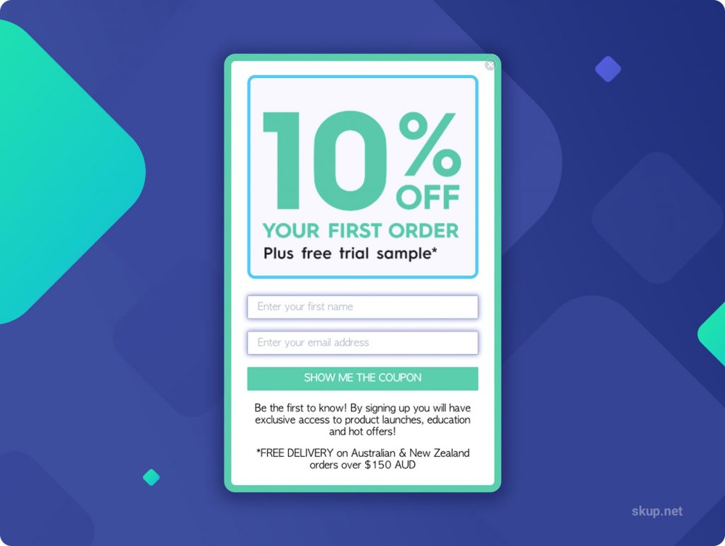
The 10% incentive boldly catches your eye, not to mention the offer is compelling enough to provide an email. The only downside of their pop-up is that it requires too many form fields. You should only request the visitors’ email.
Including social proof on your homepage is a great way to add a layer of validity for your brand, which may be new to some visitors.
Social proof on the homepage can take many forms, such as:
You aren’t limited to including only one kind of social proof – you can layer all three types onto the homepage!
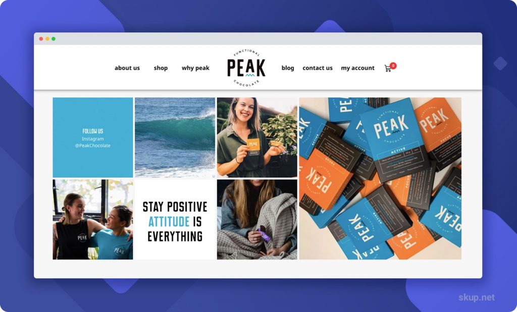
As you can see below, Peak Chocolate has its Instagram integrated into the homepage, directly above their testimonials.

For those of you who are new to eCommerce, you can take advantage of product review apps like Loox to integrate testimonials into your homepage.
Using Loox is an easy and effective way to add social proof to your site when you may not have the sales or resources to add your own.
The footer is going to house your logo, newsletter section, links to your social media accounts, legal pages, customer support links, and hours of operation.
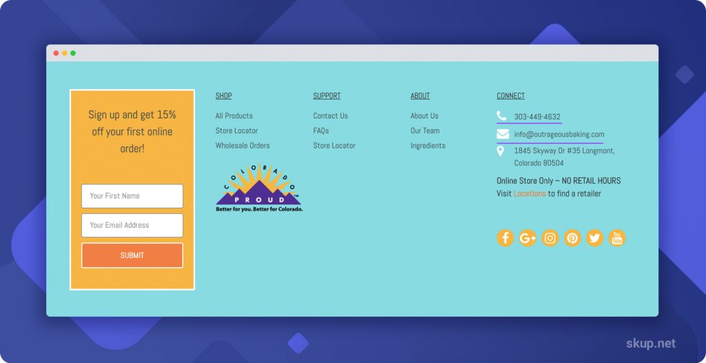
You can also include trust badges and trust seals, such as a 60-day money-back guarantee for instance.
Just make sure whatever badges or seals you use will match your stores’ policies.
There’s not much to be said for these in-between pages. However, there are some crucial features regarding layout and product images to take into consideration.
First, you should be able to fit 25 products per page.
So, 5 products per row and 5 rows of products per page.
The goal for your stores’ design is to make navigation as simple a possible. And that means reducing the amount of scrolling and page sifting as much as possible.
Second, your product images should be uniform in size and composition.
Meaning, they should be the same size, have the same backdrop, and be shot at the same angle.
The results?
Beautifully displayed products that your customers won’t help but click to view.
Since we’re on the topic of product images, let me start with this helpful tip:
Make sure the image that loads on the product page is the same image that was in the catalog.
Don’t redirect to an image of a different variant or angle; the image should be congruent from one page to the next.
Moving on.
Certain product page features must appear above the fold.
These features should be easily accessible, and you should NOT make your customers search around the page to find them.
On the right side of the page, your customers should see:
On the left side of the page is where your product image and its thumbnails reside.
The product thumbnails should lie to the left of, or below, the main image.
The thumbnails should also be set to a carousel function to clean up the appearance of your product page.
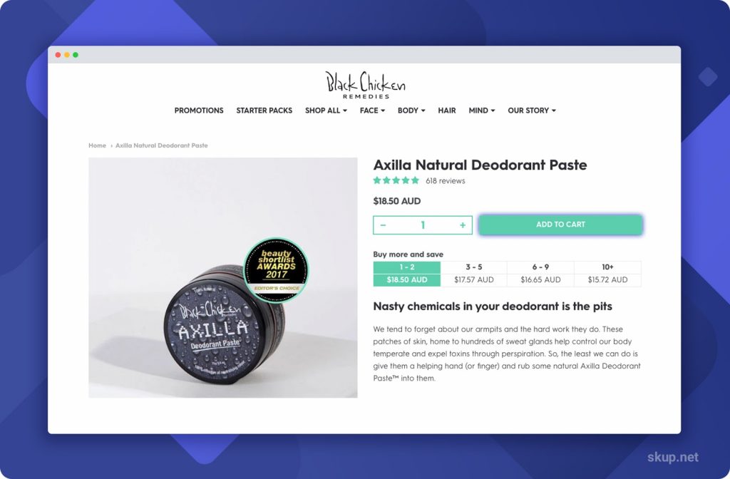
Your add to cart button should be the only actionable button on your product page.
That means no social media sharing buttons or wishlist buttons. Visitors think they can always come back to purchase since it has been ‘bookmarked’ in a sense, but that never happens.
Your add to cart button should be distinguishable from the other elements on your page.
You can choose a color from your color scheme, or black with white text.
And trust badges directly below your add to cart button. If a visitor sees icons of brands they know and trust, they will feel more confident handing over their credit card information.
Tabbed product descriptions organize the information into consumable, bite-sized pieces of information that allows your customers to read the information they need to know to make a purchase.
Tabs should include:
Make sure to include shipping time estimates in your product descriptions.
Facebook crawls the landing page your ad leads to. If they don’t see shipping times listed anywhere on the page, they will flag your ad, and it won’t get approved.
Want a quick an easy way to increase the average order value of your store?
Include a recommended products section on each of your product pages.
These recommendations must be related or complementary to the main product on the page – otherwise, this technique won’t work.
The recommended products should target the visitors’ interests, so linking irrelevant products won’t get any clicks or extra sales.
The product review section should be openly displayed directly above the footer on your product page.
Each one of your products must have its own product reviews section.
Why?
Because consumers read an average of 10 reviews before feeling able to trust a business…
…And 91% of those consumers trust online reviews as much as personal recommendations?
Yeah, it’s that important to have reviews for each one of your products.
A sticky add to cart button allows your customers to easily add a product to their cart, no matter where they’re at on the page.
Maybe they read something in your product descriptions that compelled them to buy?
They can add the item from there and go to checkout.
Maybe they saw a product review that made them feel like they NEED your product RIGHT NOW?
*Add* and proceed to checkout.
The sticky cart eliminates the need for unnecessary scrolling and allows easy access to purchase the product.
Below is an example from Black Chicken Remedies.
They have a product recommendation section, tabbed descriptions, reviews directly below the elements that fall above the fold. And their sticky cart appears once you scroll past the add to cart button.

Now that we have covered the essentials for your perfectly designed store let’s cover the one theme that can make it all come together.
The image examples I’ve used throughout this post have all been of live stores using the Providence theme.
There are a few reasons I chose this theme in particular:
The theme also comes with 3 different presets, so you have options when it comes to the expression of your design.
The sections of the pages are dynamic, meaning you can drag and drop sections wherever you’d like them to appear.
Dynamic sections avoid the usual cookie-cutter appearance of other themes.
Providence was also designed to include sales-boosting elements that eliminate the need for you to spend hundreds of dollars in monthly recurring app fees.
And, there’s a 24/7 support team that backs Providence, with ticket times of less than 2 minutes. So no matter what time of the day – or night – you’re working on your store, Providence support is always ready to help.
Ready to build a high conversion store? Click here to get started with Providence today!
All you have to do is stick to the design elements mentioned in this post, and you’ll see a noticeable increase in sales once these elements are in place.
Want to dive deeper into conversion-boosting tactics you can quickly implement on your store?
Check out our free Shopify Conversion Checklist PDF and use it alongside your store set up!
Our Shopify Conversion Checklist covers an in-depth analysis of design elements that go beyond the scope of this article.
You’ll also find useful tips, unrelated to design, but still integral for the maintenance of your store.
The checklist also features tools and applications that will raise your stores’ average order value and optimize site loading speeds, which are essential for increased revenue.
Don’t waste any more time; download your free Shopify Conversion Checklist!
This is really Nice Information you shared with us appreciate it
Glad you liked it David 🙂
I really need some help with adding themes to my shop
Hey Bill, just contact smar7apps.com/support and they should be able to help you out 🙂
What all would I get for the $2500.00? There are a lot of things that I’ve learn that I just can’t do myself, is it a complete store with all the bells and whistles? Thanks
Probably a dumb question but, do you have to use a theme and customize it just like you would in WordPress.
Or can you build your own funnel and host the site yourself.
Second, if you have to use a theme can you use video or any other plugin or app anywhere
on the page.
Hey Bart! Not a dumb question at all, you do have to use a theme for your Shopify store. As far as your second question goes, there are plenty of apps on the Shopify app store to add whatever features you’d like 🙂
Hi,
I own some of your other apps.
I tried to buy your Smart Social Proof app, but it rejected my Visa Debit card. I know the card is not locked, so it seems that there is an issue with your gateway?
Thanks,
David
Hey David!
Glad to hear you are building a SMART collection! If you are referencing our SMART Product Reviews, just contact our support at https://skup.net/support
I was able to follow to some degree. Easy part was contact add page. The header menu bar is a mystery to me and logo design color etc. I am useless as I have no skill with marketing ideas of what is fashionable. I still wear 501’s.
There’s nothing wrong with a pair of Levis! It can be difficult to get started, just take it slow and do all you can.
It’s 21 pages if I do it that way! I was hoping you had a pdf version or something more compressed for printing.
Ah, yes, it is quite extensive – We are in the process of making downloadable PDF’s for our readers so I will definitely consider this as an option 🙂
This is fantastic information. I would love a way to print it out though. I want to refer to it when working on my store. Is there any easy way to do that?
Hey Barbara!
You can totally print it out! All you have to do is go to the “File” section at the top of your browser and click “Print” at the bottom of the dropdown 🙂
I have always wanted to do Shopify but no sure how to progress. I am in a dental set up and in my place we see over 120 clients / day . It disappoints me that we have to refer them to local boots / amazon for their consumables whereas it could be a great business for me if I were to refer them to Shopify! What’s is the easiest way to get started?!
Mandla
Hey Mandla!
So cool that you want to get started on your own store!!
Check out our blog post on how to get your store up 🙂 https://skup.net/shopify-store-on-a-budget/
I plan to purchase your survice. It is a headache trying to figure it out myself
We are the best in the biz! Excited to see you on board 🙂
Hey!
quick question, If I buy the Market hero packet, would I receive as well the smar7 apps?
Gerson Gonzalez
Hey Gerson,
If you want to get our apps through MarketHero you’d need to purchase our HCOM3030 Course