Less is more.
That should be the first rule of any business pursuit.
I get it, discovering a new business opportunity opens up so many doors. And behind each door lies hundreds of shiny objects that pull you in.
Between the thousands of apps and millions of products to choose from, decision making tends to get out of control.
We become so preoccupied with implementing too many tactics that we don’t realize the hazardous effects that result.
It’s time to take it easy on the overkill.
Let’s take a look at the most common ways store owners let themselves get carried away, and how to resolve each one.
It’s easy to get stuck in a dropshipping vortex due to the millions of products available on Ali Express.
Thirty minutes on the site wreaks havoc on your once cohesive product line.
Your niche store becomes a general store, or your general store ends up with 30 different product categories.
We’ve all been there.
The enormous amount of products makes it difficult to stick to your original product plan, but it’s important to stay focused.
When you’re first building your store, you should only have a product line of 1-5 items. If you start off with a robust line, you’ll end up spreading yourself and your ad spend too thin.
Once your store gains traction, you can expand on the original line based on what’s selling.
When you do expand, keep the less is more mantra in mind.

Product Dumping, verb: the act of throwing random products into a chaotic collection on the homepage.
I see this far too often to keep it to myself.
The best selling items should be on display in an organized collection on the homepage.
If you own a general store with different types of products, don’t worry. There’s a way to avoid product dumping while putting your lead items on display:
Create separate collections composed of products that complement the best seller. And always place the best sellers at the beginning of the list.
A cohesive product line looks organized and professional, which should be two goals for your store’s overall design.
This is one of the most neglected tasks for some store owners.
Fulfillment apps, like SMART Express, import products from Ali Express to the product pages of your store.
In addition to the products – variants, product descriptions, prices, and titles are imported as well.
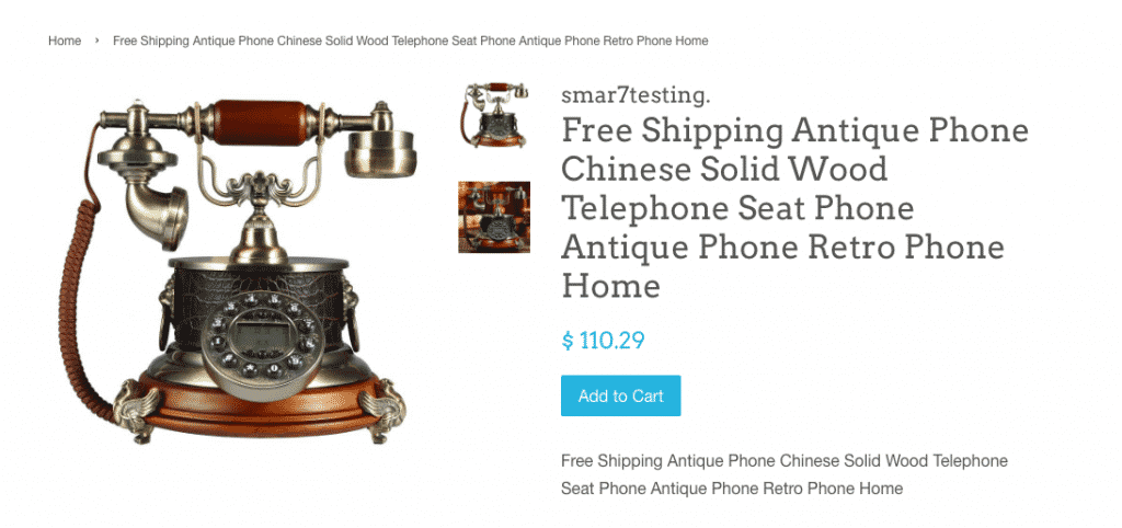
It is essential to customize your product titles.
What’s the first impression you get from looking at this product accompanied by that title?

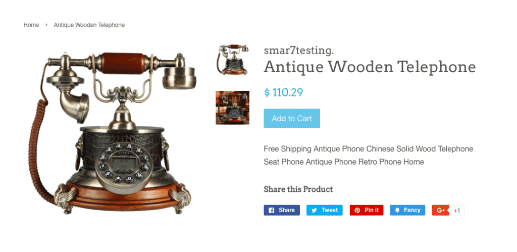
What’s your impression now?

Was there a noticeable difference in the perceived value of the item? There should have been.
If your initial thoughts had any negative connotations, you’re not alone. A customer would have thought the same thing.
Shortening the product titles and making them relevant to your store and products makes it less likely for negative opinions to form.
For this section, it’s worth stating again: LESS IS MORE.
Now do it two more times on your own for the message to set in.
Have you guys ever read of the Paradox of Choice by the psychologist, Barry Schwartz? If not, you should.
Let me break it down for you real quick.
In essence, customers avoid buying an item when they are faced with too many decisions. The decision-making process becomes too overwhelming, so they end up avoiding the purchase altogether.

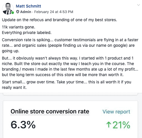
That’s a post our SMART CCO, Matt, made earlier this week.
Can you see how eliminating variants has helped increase his conversions? A 6% conversion rate is outstanding.
Get rid of your variants.
Look at your sales reports and find what isn’t selling. Remove the duds.
If you are adamant on having variations for your products, that’s fine, limit it to three options per product.
Another popular tactic I commonly see amongst stores is store-wide discounts all year round.
Unpopular opinion: ditch it.
Don’t offer discounts on each of your products, unless of course, you’re marketing yourself as a discount or bargain store.
Excessive discounts cause visitors to perceive the items to be ‘cheap’. This perception of your products will also form the perception that your brand is ‘cheap’ as well.
Having a separate “sale” collection is great, but you should save the storewide sales for major annual holidays.
Less is more.
Go easy on the price comparisons, too many store owners decide to mark down a product 50-75%.
Large markdowns don’t make your customers feel like they’re scoring an awesome deal. It seems like you are trying to bait them with false advertising of the products actual worth.
Markdowns should stay within the 40% range.
The layout of your store should be simplistic and easy to navigate.
Limit the number of pages your customer travels through to make a purchase. The home page, catalog and product page should be the only pages your customer has to engage with before they reach the cart.
Any extraneous pages or pop-ups should be removed.
The navigation menu should be simple as well. The tabs should include only the pages that help make a sale; home tab, catalog, about us page (optional), contact page.
A FAQ’s page or tracking tab are suitable replacements for an about us page.
We have reached my favorite topic, and one I’m sure you’re tired of hearing me talk about.
I’m not going to dive too deep because I have quite a few articles on design basics. But since we’re on the topic of less is more, it wouldn’t feel right to leave design out.
So let’s begin.
The color scheme. The number of color combinations is unfathomable, which is why it quickly gets out of hand.
I’m going to let you in on a lil secret. Choosing a color scheme is super easy!
Take the main color from your logo and find its HEX#.

If you have no idea what I’m talking about, that’s ok! A HEX# is a 6-digit code that’s associated with a particular color.
You can get the HEX# from the designer or Photoshop and GIMP.
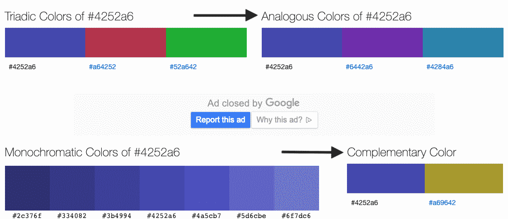
Once you retrieve the HEX#, go to color-hex.com and type the code into the search field.

When the results populate the list of colors, search for the ones that are classified as complementary or analogous.

Those are the types of colors you’ll want to include in your color scheme. Choose 2-3 colors, less is more.
The next issue is something I will continue to bring up until the message sinks in.
Scarcity tactics. LESS IS MORE.
Your product pages shouldn’t look like a billboard in Vegas.
Eliminate flashy text, gimmicky “buy now before…” pleas, and, most definitely, pop-ups about who bought what, where, and when.
Your product pages should be as tasteful and welcoming as possible.
If you want to use scarcity as a sales tactic, a simple countdown timer is extremely useful.
Less is more.
Before we head our separate ways, I think it’s important to jot down the main takeaways from this post.
Hi Patricia,
Thank you for another awesome blog. I am based in Australia. I am wondering if the advice given in the Cookie.io webinar training and here in your blogs are relevant to the Australian market. I’m also interest to know if there are any others in Australia following this course.
Any advice/tips would be greatly appreciated, as I’m super new to ecommerce.
Many thanks xxx
Hey Emma!
The Cookie.io webinar training is applicable to any market. A lot of the instructors are based in different countries 🙂 According to our analytics, a large portion of our customer base is from Australia, the UK, Canada, and the States – so you’re not alone! Just subscribe to our blog and stay up to date with the Cookie trainings and you will be set!
Thank you
Excellent tips to build our store the right way.
So happy to hear that, Carlos! Make sure to stay up to date with all of our articles to get more tips on building your store 🙂
Thanks for your time and help. I find your info very helpful
Absolutely, Doris! Thanks for taking the time to read 🙂
I would love to open my own store I a business man this a new year thank you
We would love to see you open one up, Tyrone 🙂 Stay up to date with our blog for assistance in your pursuit!
This is a fantastic + useful post, thank you! PS Would love to have ‘Pinterest’ also added to your sidebar options of social sharing so that I could save it there too (I see you currently have FB, Twitter, and Linkedin and would appreciate Pinterest!). Thanks again for providing great value 🙂
We will definitely get that Pinterest button up for you! Thanks for your awesome feedback!
What is the initial start up costs?
It’s dependent on each store. You can check out our post on how to get a store up and running for only $150/month 🙂
https://skup.net/blog/shopify-store-on-a-budget/
This are some sweat tips, now am sure the requirements for this run.. thank you.
Don’t mention it, Jon 🙂
Thank you so much for these posts. I’ve been working hard on my 1st store and feel like I’m overthinking everything because I just want to be successful. So I definitely needed this at this time. Thanks again.
This is great info… looking to launch something for the spring ????
I’m excited to hear about your stores’ progress along the way!
I enjoyed reading it.
Completely agree and find it as very helpful information.
Thanks a lot!
Don’t mention it, Natalia!
Wonderfully written and a ton of value here! Great job!
Thanks for the feedback, Gemino! Glad you found it useful!
I think I like the idea nothing scares me more than getting stressed with to much going on I understand a lot of what you av said even though am going over it a few times write down the key factor s am not in massive hurry to be successful just nice to make a living less is more not keen on fancy background and when I say things I like to believe in them then I think others will thanks dev ! I definitely need to take this in more though thanks tony
Tony, you are totally right, having too much going on definitely causes some stress! Stick to the less is more plan and you’ll get yourself to success 🙂
Thanks, just what I needed to read as I am starting to put my first store together. If rather not have to correct a mistake.
Check out our other posts for some useful tips while setting your store up 🙂