Home » Blog » How to Create Facebook Ad Images That Sell for Print on Demand (2026)
Quick Answer
The best Facebook ad images for print on demand show your product clearly on a real person (not just a flat mockup), feature high contrast between the design and background, and include minimal text. Your ad creative is the first thing that stops someone scrolling—so it needs to communicate your design’s appeal in under two seconds.
Why Your Ad Image Matters More Than You Think
Here’s the hard truth most POD beginners don’t want to hear: you can have perfect targeting, perfect copy, and the perfect audience—but if your ad image doesn’t stop the scroll, none of it matters.
Facebook’s algorithm rewards engagement. When someone pauses on your ad, clicks, or reacts, Facebook shows it to more people like them. But the opposite is also true—boring images get buried fast.
Your ad image has about 1.5 seconds to make someone pause their scroll
From hundreds of coaching calls at Skup, we’ve seen the same pattern repeat: sellers with strong designs but weak ad images struggle to get traction. The moment they improve their creatives? Their cost per click drops and sales pick up.
The 3 Types of Facebook Ad Images That Work for POD
1. Lifestyle Photos (Highest Converting)
These show real people wearing or using your product in natural settings. A dad grilling in your “Grill Master” shirt. A nurse in scrubs holding your “Healthcare Hero” mug. These images work because they help buyers see themselves in the product.
Pro tip: You don’t need professional photography. Services like Placeit let you put your designs on realistic lifestyle mockups in minutes.
2. High-Contrast Flat Lays
A clean product shot on a solid background—usually white, black, or a color that makes your design pop. These work well for bold typography and graphic designs where the artwork itself is the hero.
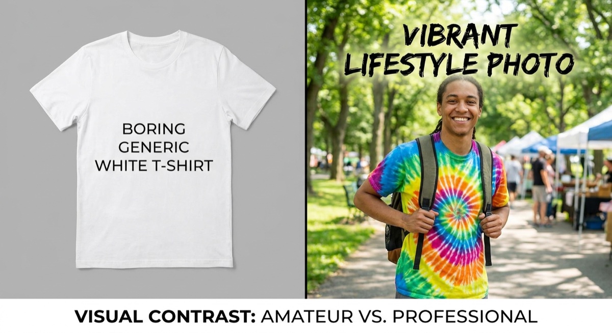
3. Before/After or Comparison Images
Show the boring generic option versus your unique design. “Basic coffee mug” on the left, your custom design on the right. This creates instant contrast and positions your product as the obvious choice.
The difference between a generic mockup (left) and lifestyle photo (right) is dramatic
What Makes People Stop Scrolling
Facebook users scroll fast. Your image has about 1.5 seconds to make them pause. Here’s what gets attention:
Faces looking at the camera — Human faces naturally draw attention, especially with direct eye contact
Bright, contrasting colors — Avoid muddy or washed-out images that blend into the feed
Clear focal point — Your design should be instantly readable, not hidden in a busy background
Unexpected elements — A surprised expression, unusual angle, or something “off” that makes people look twice
Common Ad Image Mistakes That Kill Your Results
These are the errors we see constantly in Skup coaching calls:
Mistake #1: Using manufacturer mockups. Those generic flat-lay images from your POD supplier look exactly like everyone else’s ads. Facebook users have learned to scroll past them because they scream “dropshipper.”
Mistake #2: Too much text on the image. Facebook penalizes ads with heavy text overlays by showing them to fewer people. Keep text under 20% of the image—or better yet, put your message in the ad copy instead.
Mistake #3: Tiny or unreadable designs. If someone can’t read your shirt design in the ad, they won’t click to find out what it says. Make sure your design is large and legible in the thumbnail view.
Mistake #4: Low resolution or blurry images. Pixelated images destroy trust instantly. Always use high-resolution mockups and check how they look on mobile.
Mistake #5: No person in the image. Products on people consistently outperform flat product shots. When buyers see someone wearing your design, it feels real instead of abstract.
How to Create Scroll-Stopping Ad Images (Step by Step)
Step 1: Start With Your Best Design
Don’t waste ad spend testing weak designs. Pick your strongest artwork—the one that gets compliments, has clear appeal to a specific audience, and looks professional.
Step 2: Choose the Right Mockup Style
Match your mockup to your target customer. Selling to nurses? Find a mockup with someone in scrubs or a medical setting. Selling to dads? Find a backyard BBQ or workshop scene. Context sells.
Step 3: Check the Design Visibility
Place your design on the mockup and zoom out. Can you read it clearly at thumbnail size? If not, either enlarge the design placement or choose a different mockup with better visibility.
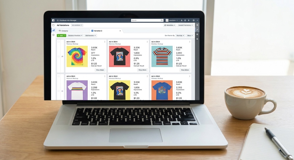
Step 4: Test Multiple Versions
Create 3-4 variations of the same design on different mockups. Run them as a split test to see which image your audience responds to best. Often, the winner surprises you.
Testing multiple ad image variations helps you find what resonates with your audience
Tools for Creating POD Ad Images
Placeit — Massive library of lifestyle mockups, easy to use
AvatarIQ — AI-powered design creation that handles mockups and ad creatives (what Skup students use)
Canva (Free) — Good for simple text overlays and basic editing
Smartmockups — Another solid mockup option with realistic templates
The key isn’t which tool you use—it’s that you’re creating custom visuals instead of relying on generic supplier images.
Image vs. Video Ads: Which Should You Use?
Both can work for POD, but here’s the general rule:
Start with images. They’re faster to create, easier to test, and often perform just as well for simple products like t-shirts and mugs. Once you find a winning design with image ads, then consider creating a video version to scale further.
Video works best when you need to show the product from multiple angles, demonstrate quality, or tell a story. For most POD sellers starting out, images are the smarter first move.
FAQ
What size should my Facebook ad image be?
Use 1080×1080 pixels for feed ads (square format) or 1200×628 pixels for link ads. Square images take up more screen space on mobile, which can improve visibility and clicks.
Should I put my logo on my ad images?
Generally no—especially when starting out. Your logo doesn’t help sell the product, and it takes up valuable visual real estate. Focus on making the design itself the star of the image.
How many ad images should I test at once?
Start with 3-4 variations of your best design. Test different mockup styles (lifestyle vs. flat lay), different model demographics, and different backgrounds. Let the data tell you what your audience prefers.
The Bottom Line
Your Facebook ad image is the gatekeeper to everything else—your copy, your landing page, your product. If it doesn’t stop the scroll, nothing else gets a chance to work.
Focus on lifestyle mockups with real people, keep your designs visible and readable, and test multiple versions. The Skup students who nail their ad creatives consistently see lower costs and higher conversions.
Want to see how top POD sellers create winning ad images? The Skup Incubator includes live coaching calls where we review real student ads and show exactly what to fix.
Quick Answer Building trust on your print on demand store requires a combination of social proof, professional design, clear policies, and transparency. The most effective trust signals include customer reviews, secure checkout badges, a compelling About page, clear shipping and refund policies, and professional product photography. Stores that implement these elements see significantly higher conversion…
You've got a POD store, your designs look clean, and the ads are running, but the posts still feel generic. That usually means the product is fine, but the culture and marketing layer is missing, so the brand isn't speaking in the language of the people you want to reach. Once you start matching your…
You're staring at a crowded marketplace, a fresh POD idea in one hand and a dozen nearly identical storefronts in the other. The panic is real, because if every shirt can be copied, every mockup looks similar, and every ad sounds the same, it's easy to assume there's no room left. There is room. The…